HOME | DD
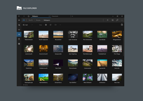
 Metroversal — Windows 10 - File Explorer Tablet mode

#metro #awesome #concept #microsoft #mockup #tablet #win10 #windows10 #metroversal
Published: 2015-02-23 20:52:29 +0000 UTC; Views: 5640; Favourites: 22; Downloads: 99
Redirect to original
Description
Since Microsoft is listening to feedbacks I decided to try to contribute with some mockups. I hope that it will come to their attentionWhat's new:
- Transparency (optional - customizable opacity level)
- New icons (Office 2013 flat style)
- File Explorer Overhaul
- File Explorer Tabs support
- Ribbon UI
If you want to see this in Windows 10 please add 3 votes on UserVoice:
windows.uservoice.com/forums/2…
Related content
Comments: 16

Amazing!! I registered here just to complement you. 😁 I want that explorer too!
👍: 0 ⏩: 0

Please if Microsoft not chose your design, please do a transformation pack. I just want my PC look like this. Simply, Good, Awesoomeee.... You are wery talented!
👍: 0 ⏩: 1

Thank you so much for the support!
I'm not sure about a transformation pack, we'll see
👍: 0 ⏩: 0

Thanks again for the kind words
👍: 0 ⏩: 0

needs a bit more color on the icons to the left tree, and would look nicer than any other concept. i hate going backwards to black and grays, this is not the 70s we have full hd monitors and 4k resolution for COLORS.
Microsoft should stop copying the ugly gray design ideas of iOS.-
👍: 0 ⏩: 1

Well, initially I started with having colored icons on the navigation pane, but then I changed idea due to the fact that this is an Universal app (the same app will run on phones and tablets too).
Anyhow I do get your point, I know that colors are very important today, but personally I think that users should focus more on the actual content rather than the UI.
Colors aren't completely gone though, you can still chose between Light or Dark theme and set an accent color.
👍: 0 ⏩: 0


