HOME | DD
 Metroversal — Windows 10 - Tabs in File Explorer

#metro #windows10 #metroversal #awesome #concept #explorer #microsoft #mockup #tabs
Published: 2015-02-21 12:33:09 +0000 UTC; Views: 26083; Favourites: 82; Downloads: 969
Redirect to original
Description
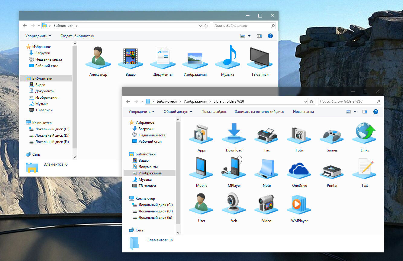
Since Microsoft is listening to feedbacks I decided to try to contribute with some mockups. I hope that it will come to their attention (Smile)")
Update (09 Mar 2015):
- Minor fixes
- List View
- New Wallpaper
Update (23 Feb 2015):
- Minor fixes
- New Ribbon UI (minimized)
- Universal app (check desktop version here: fav.me/d8l17id )
What's new:
- Transparency (optional - customizable opacity level)
- New icons (Office 2013 flat style)
- File Explorer Overhaul (removed Ribbon, streamlined, modern)
- File Explorer Tabs support
- File Explorer Split View (not in this mockup)
If you want to see this in Windows 10 please add 3 votes on UserVoice:
windows.uservoice.com/forums/2…
Related content


Comments: 48

Windows 10 would have blown if this was the initial explorer.
But because of the need of backwards compatibility, this is probably not going to happen soon.
👍: 0 ⏩: 1


thats so nice. i'd love for my files to look like this
👍: 0 ⏩: 0

It looks so damn good. Why is this not a thing yet. Thank you for making this.
👍: 0 ⏩: 0

Please make this so people can use it. it looks great!
👍: 0 ⏩: 0

It is just a concept or you have any theme.pack of it???
👍: 0 ⏩: 0

I just suggested your theme to MS through that Feedback app. Hope others will too. Hope they will listen like promised. Default Explorer is so ugly. Folder icons are ugly.
👍: 0 ⏩: 0
MS is listening to the user feedback like you said but not on the page you linked anymore. They use the Feedback app from 10. How should I upvote you there?
👍: 0 ⏩: 0
MS is listening to the user feedback like you said but not on the page you linked anymore. They use the Feedback app from 10. How should I upvote you there?
👍: 0 ⏩: 0

That's actually really good. Why don't we have tabs in explorer?
👍: 0 ⏩: 0

Absolutely perfect. Would love to see this on my Windows 😍
👍: 0 ⏩: 0

I have to say you're so talented.
This mockup perfectly infused classic windows functionalities with new windows universal app aesthetics, and even some Yosemite styled translucency touch in the right amount.
Perfect.
👍: 0 ⏩: 0

Can i please download this? Clover won't work on Win10...
Could y'all add an option for 'double click to go up one level'?
I gotta have tabbed file explorer
👍: 0 ⏩: 0


New design coming later this week!

👍: 0 ⏩: 0

Now thats what I call elegant! Excelent job mate.
3 votes 4 ya!
Question: You designed the icons yourself? Is there any chance I can get a copy of them?
P.S.: I'm trying to implement a working version of your mockup (just in case the guys in MS don't listen to us). But that's classified information.
👍: 0 ⏩: 1
Thanks for the votes highfive:
Yes, I made the icons but they're not ready for a release yet.
👍: 0 ⏩: 0

Yeah, truly looks amazing!
but we r not gonna see it in W10 no matter how many votes you get, looks a bit like OSX, also too stylish for MS!
So....do us all a favor and make a theme out of it!
👍: 0 ⏩: 2
Back in Windows 8 days I would've agreed with you, but things change, and MS is really taking user feedback into account.
About the UI, I guess they are already going in that direction.
Just take a look at the latest Music App Preview:
www.thurrott.com/wp-content/up…
Change the blue tone, add some transparency/blur and you got yourself a Yosemite look-alike.
👍: 0 ⏩: 1
The thing is that for whatever reason MS is making a difference between modern apps and traditional desktop desktop UI, like explorer.
winaero.com/blog/wp-content/up…
👍: 0 ⏩: 1
Yet the desktop's UI still looks like a modified Windows 98.
I'm really hoping that MS takes our opinion seriously in this matter. I've been using W10 since the first released build and I didn't see any changes in the UI based on user feedback.
👍: 0 ⏩: 0


know-how amazing. I see a lots projects but you have a great talent. I've never seen anything like it.
👍: 0 ⏩: 1
Thank you so much! You make me want to do even more!

👍: 0 ⏩: 0


Very nice. I like your Mockup
Too bad that you can only vote 3 times.
👍: 0 ⏩: 1
Thanks for the votes mate
Much appreciated!
 (Wink)")
👍: 0 ⏩: 0

needs a bit more color on the icons to the left tree, and would look nicer than any other concept. i hate going backwards to black and grays, this is not the 70s we have full hd monitors and 4k resolution for COLORS.
Microsoft should stop copying the ugly gray design ideas of iOS.-
👍: 0 ⏩: 0

Featured on deskmodder.de www.deskmodder.de/blog/2015/02…
👍: 0 ⏩: 1

Only if it gets a lot of votes I think
👍: 0 ⏩: 0

Thanks! Your gallery is really nice!
👍: 0 ⏩: 0

Thank you very much
Don't forget to vote please
")
👍: 0 ⏩: 0

Wheres the Ribbon? Where's the fullscreen toggle? The transparency effect doesn't look right on the sidebar either.
👍: 0 ⏩: 1
As I told you earlier Ribbon (a sort of) is coming in a new mock up.
The full screen toggle is present. Please check again.
Transparency is optional
👍: 0 ⏩: 0