HOME | DD
 NightmareGK13 — ..::Marble Tower::..

Published: 2009-06-14 21:17:34 +0000 UTC; Views: 14291; Favourites: 327; Downloads: 0
Redirect to original
Description
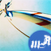
The Marble Towerit was originally meant t be the Ivory tower but i wanted to take a different approach so i named it marble instead of ivory
the basic and main purpose is still the reaserch and study of magic
well in my book it is
")
this is where Mirabell Grunt works as a teleporter
also i tried to take this one step beyond and instead of this just being a tower basically i turned it into a complex of structures and whatnot surrounding the main building that is the true tower
im not sure how this idea will have its impact on the story
honestly i want t hear what the viewers have to say
and yes the first book is nearly done
hopefully ill finish it this summer
~ Cheers

Related content


Comments: 101

This great piece is now in an Art Feature on my journal called "The White Tower" jagrier.deviantart.com/journal… !
👍: 0 ⏩: 1

thanks for the feature once more
 (Smile)")
👍: 0 ⏩: 0
heh heh... the bridges were a good idea. as were the mountains that led to the bridges..
👍: 0 ⏩: 1
Congratulations, I have included this wonderful artwork on the front of the journal in the fourth group feature "Some of my favourite submissions from artists 'L to T'. Thank you for being a member

👍: 0 ⏩: 1
thank you very much for featuring my work there  (Wink)")
a very good way of getting more exposure and a nice birthday gift
")
👍: 0 ⏩: 1
My pleasure for such a great artwork and I hope your birthday was a wonderful one

👍: 0 ⏩: 1


Pois claro, uma das imagens que vi na Imagine FX. Bem, acho que já te fizeram críticas construtivas, e como já puseste isto há um ano, já melhoraste.
Aproveito apenas para dizer que, apesar do desfoque das montanhas mais longínquas, as montanhas do plano médio também podiam ser menos nítidas. Acho que há alguma falta de contraste nas torres. Mas isso é algo em que já deves ter reparado muito antes de eu dizer.
Então, andas a escrever a tua história de fantasia há quanto tempo? Já vais em quantas páginas?
👍: 0 ⏩: 1
começei em 2006 acabei este ano apos alguns anos de paragem
o segundo livro começei logo apos o final do primeiro
ainda não ha data de lançamento estou a espera das revisões, depois disto editora provavelmente, se for rejeitado registo a patente e edito sozinho
👍: 0 ⏩: 1
Boa sorte com a editora. Já agora, como se faz edição de autor?
Contigo aprendo coisas.
👍: 0 ⏩: 1
edição de autor?
tipo ser eu a editar?
ora bem
pago para registar
pago para encadernar
pago para distribuir
conclusão mais prejuizo que lucro
👍: 0 ⏩: 0


it has a bit of Minas Tirith look in it, yet it has its share of original elements. i think it would make a really good wallpaper, why don't you submit it at a larger resolution?
👍: 0 ⏩: 1
don't really feel willing to do so
too many thieves :\
👍: 0 ⏩: 1
yeah, i was thinking you might say that
it is a shame, though.

👍: 0 ⏩: 1
i had a bad experience with a thieve previously so better safe that sorrow
or something like that
👍: 0 ⏩: 0

Hey mate I'm sending this for a feature recommendation!
👍: 0 ⏩: 1
hey dude
thanks for that
by feature you mean DD or regular news feature
thanks buddy
👍: 0 ⏩: 1
ah 
i'll keep track of you and what you do
👍: 0 ⏩: 0


I like it colored! It really brings out the detail of the buildings in the background, you can see them a whole lot better. The only thing I'd like to see is maybe more black in the shadowing to give it some more substance.
👍: 0 ⏩: 1
hmm
that is an interesting idea
if it looks good ill update it
thank you
👍: 0 ⏩: 0
Wonderful work! The colors and the lines make it looks very regal and powerful.
👍: 0 ⏩: 1

Wow passaste os teus limites nesta, entre aspas. Está brutal!
👍: 0 ⏩: 1

adoro o ambiente da imagem. até pode ter aquela pitada de cartoon devido às cores mas é isso que, na minha opinião, a torna interessante, senão vejamos, quando ves um artbook de algo ou ilustraçoes estas por vezes não são feitas todas do mesmo modo, porque desse jeito * me liga vai XD* eram aborrecidas para o observador e monotonas
confesso que existem alguns defeitos na torre principal com a cor/forma mas acho que se observarmos o portal percebe-se claramente que é cilindrica
mas uma coisa, todas as torres estao ligadas por pontes, aquelas duas no lado esquerdo estao mesmo isoladas ou esqueceste te de por pontes?
em geral, muito boa
<3333 amoteeee
👍: 0 ⏩: 1
LOL
tens razão mas eu acho que isso do cartoon e mais por causa las linhas pretas que eu deixei
mas isso das diferenças de estilo e pk um artbook são mais do que uma pessoa a fazer
no meu caso sou so eu mas sou multi facetado
sim eu tbm acho mas e dificil pk é de frente ne :\
ta tudo interligado pode e n se ver
thank you
<3333333 amoteeeeeeeeeeeee
👍: 0 ⏩: 1
nao, já vi mesmo sem ser mais que uma pessoa, mas mesmo assim nao deixa de ter esse efeito
por um lado o multifacetado pode ser entendido como inseguro e teres que experimentar de tudo pra encontrares te mas por outro lado é a forma que tens de te diversificar de modo a enriqueceres mais o teu portfolio e mostrares que sabes fazer de tudo um pouco
oki :>
nu peças bebesh, tou sempi aki hihi
<33
👍: 0 ⏩: 1
hmm ata e se for em vez de insegurança o contrario?
sabr varios estilos e dominios
eu pelo menos faço/faria essa intrepretação frente a um artista k me apresentasse um portfolio ou um artbook assim
<33333333333
sempiiiiiiiii
👍: 0 ⏩: 1
pk n? pode ser inumeras coisas :> pelo menos pra nos, pa stora de desenho por exemplo era outra coisa XD
👍: 0 ⏩: 1
o k ºAº
im dumb now
e pk sera wii
👍: 0 ⏩: 1
hihihihihih peto buwo

👍: 0 ⏩: 0
nice, sick hill, althou (to me) the left sky is better than the right one, (but still liked it a lot!)
oh and the light? awesome!
overall? great pic
PS.")
👍: 0 ⏩: 1
sim sim na boa
don't worry
thanks
👍: 0 ⏩: 0

I really like the pink-celestial contrast that gives that fantasy atmosphere to all!
👍: 0 ⏩: 1

| Next =>