HOME | DD
 Not-a-kitty — Elora

Published: 2005-07-14 01:01:20 +0000 UTC; Views: 2900; Favourites: 18; Downloads: 208
Redirect to original
Description
This is my first large scale piece. It took me some 8+ hours spanning over 3 days (I was busy with work and other things, so I could never put in too much time at once). Though, I was never sure where I was going to go with this, and my lack of experience may explain for the large amount of time consumed. Its 38 layers of almost entirely brushwork, of which the majority was for abstract lighting. Although there is no replacement for hours of airbrushing, I also used several of my own abstract lighting brushes. A brushpack containing these will be posted soon (today or tomorrow). I don't currently have a 3d program, so mad props go to thedobofdob for the 3d render [link]Elora is a greek name meaning light. I thought it was a fitting choice for this as I spent the vast majority of my time creating abstract light.
Unfortunately for me, I'm very new here, and am currently being watched by no one. I wanted to get a good piece posted up early that will hopefully be liked, however I am not sure if anyone here will even see it
I think its a very good piece, but thats up for everyone else to decide. If anyone has any suggestions I would love to hear them, as I'm used to working on much smaller things (like sigs). Or if you just like it a
 would be great
  (Smile)")
Related content


Comments: 20


hmmm, pretty good, although i dont like the elctric effect on the brushing, i feel its out of place...
good job though!
👍: 0 ⏩: 0

you have really done an amazing job with this piece. i love the effects you have added and the color you chose. this has such a cool explosive feel to it
")
👍: 0 ⏩: 0

the focal point is way too centralized. maybe place it off slightly higher or to the side to get the desired effect you are going for. also, what you might want to start trying is making a triangular pattern in your art work. this doesnt necessarily mean actually make a triangular, you can also make 3 focal points in the piece. its a technique that many artists use in their artwork to force the viewers eye to move around the artwork and take everything in, not focus on one area. some of the edges seem a bit jagged and unrefined. soften them a bit and this would look a little more organic.
this is a very cool concept, i love the little details like those strange swirling things in the lower left and the shading and lighting is very nicely done.
keep going with this, i think you got something interesting going on.
👍: 0 ⏩: 0
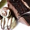
wonderful shape, light and colour, this is really good.
👍: 0 ⏩: 1


Wow, this is gorgeous. The powerful movement, intricate detail, and delicious colour. Definitely a fav.
👍: 0 ⏩: 1


Its my favourite style (well, really the only one that I'm good at).Though, I'm trying to brach out a little, not too much progress yet.
👍: 0 ⏩: 0


like the way you distorted the render, gj
a few suggestions though,
use more than one colour
make the focal point not in the center
sharpen the brushing
~Zeal
👍: 0 ⏩: 1
It is slightly multi-colored, but just between a dull green and blue that really looks like one. Next time I'll have a stronger difference.
I'll keep in mind the tips, thanks
👍: 0 ⏩: 0

This is gorgeous.
BTW, if you want the person you are replying to, to be able to get a notice of your reply...you have to hit the reply link right below their message.
👍: 0 ⏩: 1
Thanks a lot for the tip. I'll keep that in mind.
👍: 0 ⏩: 0
Thanks for the comments, and the +fav, aaron.
I'll be sure to keep in mind the central definition, and work on my brushing a little more. Thanks.
👍: 0 ⏩: 0

Hi, I think it works fine, by the way some suggestions :
The central render should be less defined,some blur or something should help, for a more intense fusion with the background.
The lights on down / left should be less regular in shape and location.
About the lack of deviant watchers I understand you, I have the same problem

👍: 0 ⏩: 0

This is really beautiful ^_^
Enjoy your time on DA, after a while, people start to pick up on your stuff, then it starts getting fun.
👍: 0 ⏩: 0