HOME | DD
 oOMadCatOo — First Manipulation Attempt - Angel And The Light

Published: 2014-07-13 20:23:13 +0000 UTC; Views: 364; Favourites: 4; Downloads: 0
Redirect to original
Description
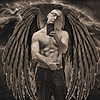
So my fucking first attempt on real photomanipulation with stocks and stuff...You may leave some suggetions here and tell me, if I should do more of that (actually I had more of that series in mind).
If it's too worse, just say it xD
Wings used by: alegion-stock.deviantart.com/
Related content
Comments: 13

It is very bright but I think it's an awesome first attempt. So many manipulations on this site are obviously two images poorly put together. This one feels like one image.
👍: 0 ⏩: 1

I got sooo much problems with the light xD it was either too bright or too dark so the face would not be seen good enough...but thanks for the compliment ^-^
👍: 0 ⏩: 0

Hi, ein schönes Foto, ich finde das Licht etwas zu weiß, dadurch wirkt es ein wenig steril, wie in einem Krankenhaus...
Auch wenn du das weiße Licht aufgrund des Engels haben wolltest.
Ansonsten tolles Foto
👍: 0 ⏩: 1

Ich habe noch überlegt ob ich eher ein blaues leuchten hätte nehmen sollen 
👍: 0 ⏩: 1

Na da bin ich mal gespannt
Gibts das auch ohne das Licht
👍: 0 ⏩: 0

A bit too washed out and if that was the aim then the face and head should be a touch more washed out too.
👍: 0 ⏩: 1

I had a few troubles with the light-effect....either it was too bright around the hands or the face was too dark...but I agree with you :0
👍: 0 ⏩: 1

Post editing can help a lot there. I would love to help.
👍: 0 ⏩: 0

Oh, absolutely, do more of that. (This one, I think, is just a touch overexposed. It'd be better if you could at least see the outline of the hands.)
👍: 0 ⏩: 1

Thanks for your lovely words and advises. You are totally right with the light...h
👍: 0 ⏩: 0


