HOME | DD
 PatLeeArt — Conceptual Design

Published: 2006-05-29 09:01:50 +0000 UTC; Views: 39511; Favourites: 710; Downloads: 1670
Redirect to original
Description
Here is something I did 2 years ago. I mostly used photoshop on this one with one brush type. The pencils were tight and it took roughly 4 hours to color. For all of my conceptual designs now I mostly shade in gray scale with pencil, then scan it and color using overlay, multiply layers. Works well. Enjoy! (Smile)")
Pat Lee
Related content


Comments: 35

So if there was a theme to extent this piece what bird and weapon along with background!?... conceptual strengthening to further a mural.
She seems fiercely agitated so extend to that idea then manga of grace.
The story of a revision of and to a new inspiration.
👍: 0 ⏩: 0
Beautiful piece... hoping to see more from your library. Thinking of a mural
👍: 0 ⏩: 0

this is really great..
but i was confuse if this character is HE/SHE...????
👍: 0 ⏩: 1
I was kind of confuse at first... but upon closer observation I notice some matches for the better gender. For the groin area is insymmetrical [thighs] and is a cloth. Men would definitely place armor if it's treasure! If s/he has it; they might suggest sexual desire... shredded a little more favorable to woman. Men might like feather a a formal cock piece.
So thinking of a story they got in a war and shave the armor is; unlikely cause manly warrior more commonly fight and are evenly match.
As for a woman they want to stand out and this is a slenderer type of nonmuscular body looking onwards from the legs down.
The feather indicates to me grace on the legs like a ballerina trying to take flight. It's armor is fluffy feathery light or at least that's what it conveys to me.- the dark color and angered face creates a fighting theme than flying fear of sickly... as in the raven or crow's nest or pigeon holding a silver shine; since they have black feathers... but while pondering an eagle (hair) vs. A vulture a carrion warrior - soaring rather high.
I personally was thinking of an ostrich in a way would make it more masculine warriorly figure with the armored top. Fitting for many slayings.
Also considering the legs being that slim; the armor has a lightness to it that makes me think female miserly drunk of history. Men don't show their LEGS LIKE WOMAN! ' PRINCESS TO A WARLORD.
If they had place a sword on that side or something to even out the symmetry, then maybe I'd consider it as more manly. Also the claws make me think female cause of nails a little - woman prize that,
too... more that men.
If a Woman truly then they're pretty [savagely]; explaining the armor's asymmetry... NO SCARS, seriously LUCKY.
It's mark as a concept... so to - me, I look at it as a whole. The artful attraction as a whole make a more perfect statement rather than just the person.
With that said, what bird do you picture it ties to. The theme cause it to have different connotations and attributes? I was thinking of an ostrich because of the footing.
Maybe you can offer some insight to further inspire the artist since you're bordering. Be constructive as this is a place of art please. I understand your confuse about the entailing concept. It's half a skirt to me.
-Unless it later gets edit: to even out in an further update.
👍: 0 ⏩: 0

Since weeks ago I have this draw in my faves, and only now I realized it's a woman!
👍: 0 ⏩: 0


cool,. i like this one, tell me, why you called this work a "conceptual design"
👍: 0 ⏩: 1

I would guess because of the small exaggerations in the anatomy, i.e. the length of the neck etc.
👍: 0 ⏩: 0


God that's cool! When are we going to see more comics from you? I still look at my Warlands, Shidima and Darkminds comics and think of better days.
👍: 0 ⏩: 0

")


i look forward to seeing the site up and running and the mass of work you'll be posting
👍: 0 ⏩: 0


As far as your fantasy/tech stuff goes, i definitely prefer your tech stuff... maybe because i find it harder, I'm not sure, but it has a style that's all yours about it, and I love the darker more subtle tones you use in it. All the designs you do are just incredible and this is no exception! I love the mantle on her shoulders and in particular the way the light is coloured on her skin. All in all, I'm left somewhat speechless by your work.
👍: 0 ⏩: 0

Absolutely amazing and wonderful in the details. ^__^
👍: 0 ⏩: 0

I'm speechless. If anybody ever tells you this drawing is not good, kill him
👍: 0 ⏩: 0
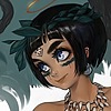

this is really impressive, i love that hardcore uber detail look (loven the mix of samurai type stuff, medivel stuff and those wicked claw like gauntlets, and the sorta soft colour job is really nice it hhas that funky warm feeling too it, one little crit though, i'm not to sure about the colours on the cape it looks slightly woodlike maybe (shrugs) but i porbably wouldn't have noticed that if i wasn't looking really hard X'D, also that's a really nice design of the loincloth there, the way it's waved looks really cool ^___^
👍: 0 ⏩: 0

Haha, I see you've moved quite away from Transformers... or back from, anyway.
I've always enjoyed your colors, that is for sure. The pencil work you've put up has been pretty nifty...
Nice to see you around again.
- P.S: Doubt it matters or if you even know: I used to be a moderator on three of four of the old DW forums.
👍: 0 ⏩: 0

Thanks for the comments everyone.
I'm in the middle of developing my personal flash site right now and it will have a ton more art on it. I'll provide linkage when it's done. Hope eveeryone is doing well and I checked everyones art so far, keep up the good work guys! Kick some @ss out there.
Pat Lee
👍: 0 ⏩: 0


cool as hell man
do you like Magna Carta? it reminds me a bit of that artists style, especially the colors
great job as always
👍: 0 ⏩: 0

excellent pat, great design, amzingdetails and tonalities...keep going!!
👍: 0 ⏩: 0


Good design.
Reminds me of Warlands (those where the days!). She comes across hardcore.
What was the concept for?
👍: 0 ⏩: 1

There is a reason that it reminds you of Warlands..
This is the origional Artist/creator.....
👍: 0 ⏩: 0


wow, pat lee
i remember you from bloodpool and darkminds
👍: 0 ⏩: 0

I like it ALOT. The detail and design of the armour is top notch
👍: 0 ⏩: 0

very nice, could be more sharp, but i like it as well
👍: 0 ⏩: 0