HOME | DD
 Peace-In-Violence — Noir/ The City of locked doors

#fanart #noir #peaceinviolence #bookillustration #characterdesign #thecityoflockeddoors
Published: 2017-02-07 21:15:27 +0000 UTC; Views: 512; Favourites: 15; Downloads: 0
Redirect to original
Description
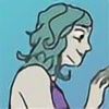
I know this isn't a comic and so I'm guessing that all my imaginary fans are rousing a great ruckus over the fact. Never fear, I shall endeavor to post one later this week but no promises.As for the man in the portrait, his name is Noir and he's the main character in our (my brother's and mine) second book. As for his personality, he's a giant and unrepentant Anti-hero whose come to unleash bloody, painful murder on those poor idiots who did him wrong. This totally unoriginal tale of revenge takes place in the city of Umbras, a place of towering skyscrapers built entirely of black steel. Here's where things gets interesting, every night the city's caretakers lock the inhabitant inside their homes because everyone turns into bloodthirsty monsters at the fall of dusk. This is the City of Locked Doors.
Related content


Comments: 11

Hello, I'm Jessica from ProjectComment to critique your work.
Based on your description of the character, you've done an excellent infusion of his personality into a physical being. The clothing folds in the shirt and pants are very natural looking. The white vest looks stiff making me think it is more armor than cloth. I don't know if that was intended or not, but it looks good with his build. The white ribbons falling behind him is a great addition to it, but I think they need to be reshaped a bit to display their cloth characteristics. Here is a good youtube tutorial I found for ribbons. youtu.be/xJEY7PyvGII
Funnily enough, hair can also be drawn and shaded based on ribbon shapes. You've got a great foundation for some serious locks of hair. Your hair has a good bit of details already, but if you wish for more realistic strands there are a few things you can tweak. First thing would be shape. I don't know if he has dreads or some serious amount of gel in his hair, but the tendrils of hair are very stiff especially on the top. Shading is another thing. When I draw, I always have to have an arrow pointed towards a figure to remind myself of the light source. You have kept a consistent light source for the most part in the face and hair.
I noticed you've shaded the hair furthest from the light with grey strokes but some white still coming through. There looks to be only one shade of grey. If you want to further the hair's realistic quality, adding a larger range of tone will greatly improve a piece's realism. I learned to shade hair by visualizing the individual strands clumped together into ribbons and keeping it consistent with the light source.
The face has a great deal of shading and for the most part is on target with the bone structure vs light. His eyebrow looks a bit short compared to his eye. The only shading that to me doesn't look natural with his bone structure is right below the left (our left) eye on the apple of the cheek and parts of his chin/bottom lip area.
All in all, I think this is a great addition to your gallery and I hope to see more of your work soon. Keep it up.
👍: 0 ⏩: 1

Hey thanks for the critique, it means a lot. I can see where you going with the hair and the ribbon tutorial is really helpful. Also concerning the hair, the guy's got a bit of a disease that turned it all into steel so yeah it supposed to be a bunch of spikes. Unfortunately I had no idea how to draw that so I kinda wimped out ")
Anyway thanks again.
👍: 0 ⏩: 1
It was my pleasure. That disease sounds like an artistic challenge. It depends on how you want to draw the spikes. Like shards of metal? All you need is a good metal shading tutorial and some jagged shard shapes.
👍: 0 ⏩: 1

Hello, I'm here from the ProjectComment thing.
I would like to begin to say the reason I chose to comment here is at first glance, the blackened face reminded me vaguely of Christopher Walken. But that aside, lets begin.
First I would like to point out that the butterflies all look like they have different sized bodies. Is this because you were trying to show the difference in distance they are from the viewer, or perhaps they are different sorts? I mean, if you wanted to best give effect, make sure the butterflies are a bit more even in shape and size, unless if you gave the sides ragged edges or something...
The anatomy for Noir is fairly decent, save the hand gripping the uh...is that a sword, or a cane? Or perhaps something different altogether. Anyway, the hand is a little bit off. Mind you, I understand the difficulty of just drawing a hand from a simple angle, vs the one you have. I rather like the twisted black tentacles, twisting round the cane/hilt.
The face is decent. He looks slightly old, is he supposed to be middle aged/30's? The hair seems fairly well done, although practice on how hair falls, where the shadows lay, and just. It looks a bit stiff. Those lips though, are rather nice. I'd pinch em.
Overall I like this, but there is plenty room for improvement. Keep up the good work.
👍: 0 ⏩: 1
Thanks a million for this critique. Its really helpful. As for the butterflies, their size difference is in no way intentional, they're a facet of the character that I sketched in at the last moment and on a whim. As for the sword/cane, that's actually a goblet he's crafted from his shadow lol  (Smile)")
👍: 0 ⏩: 0

Hello, I'm from ProjectComment . I'm terribly sorry if I make any grammatical mistakes; english isn't my first language.
First off, the structure of the face, nose and mouth is stunning. The shading and blending technique that you applied to the face is beautiful- you must have studied a lot about the structure of the face. I absolutely love the design that you applied on Noir. However, there are many things that you need to work on. The placement of the pupils is a bit off. I understand that if you cover the right pupil with the inner corner it'll look weird and how the left pupil has a white space, but that's how the human body works. Also, the shading of the hair does not have that much contrast with the strands of hair, however, when it comes to the outline, there is a huge difference. It causes the picture to look a bit weird. I don't know if you did this on purpose, but the eyebrow is a bit short and thin. I'm pretty sure that thick and moderately wide would make the illustration look better.
Overall, I think you should use (human) references and you should make the outline blend with the palette (eg, a grey outline for white hair). And if you want to make a bigger step, I believe you should remove the outline, and make it an outline-less work.
Once again, sorry for my terrible english.
👍: 0 ⏩: 1
Thank you so much for this review, it helps a lot especially about that part with the pupil
👍: 0 ⏩: 0
There's so much detail in the hair! ")
👍: 0 ⏩: 1
Thanks for stopping by and thanks for the complement.
👍: 0 ⏩: 1
most welcome! ^-^
👍: 0 ⏩: 0