HOME | DD
 Pulvis — Mr. Darkness Mrs. Moonlight
by-nc-nd
Pulvis — Mr. Darkness Mrs. Moonlight
by-nc-nd

Published: 2009-09-24 12:55:22 +0000 UTC; Views: 2115; Favourites: 59; Downloads: 60
Redirect to original
Description
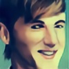
We sold the blues to Lucifer and dropped them at the crossroadsOh…my god, oh…my god
In the cosmos, all over the world, and throughout my body
Mr. Darkness and Mrs. Moonlight, it’s as hot as the fires of hell (с
 (Wink)") Buck-Tick
Buck-Tickand again I'm inspired my Buck-Tick's songs

SAI + Photoshop, ~3+ hours
Related content


Comments: 30

👍: 0 ⏩: 0

Ah Buck-Tick, ever the inspiration!
At first I didn't really like Mr. Darkness & Mrs. Moonlight, but as I kept on listening to it, it grew on me.
It's a overall wonderful and very fun song to listen too :3
👍: 0 ⏩: 0

your art makes me so happy
you did brilliant work here with the shades, clever use of colours

👍: 0 ⏩: 1

Thaaanks ^__^ the drawing is a bit sloppy cuz i drew it right after i've heard the song for the first time and i was kinda tooooo excited
👍: 0 ⏩: 1
you definitely captured the essence of the song! once again you made him so gorgeous
you did a wonderful job!
👍: 0 ⏩: 1
Thanks^_^ does the guy look like Acchan?O__O i didn't plan to draw him as Mr.Darkness, really
👍: 0 ⏩: 1
he does look like him, i suppose you are infested by the Atsu disease lol!
and there is no cure for it..
👍: 0 ⏩: 0


This is truly wonderful. I hate making comparisons, but "Mr. Darkness" looks my "Javiusnocht, II", both faces are alike, undeniably.
👍: 0 ⏩: 1
Thanks ^_^ well, he world is full of coincidences !)
👍: 0 ⏩: 1
Welcome. ")
👍: 0 ⏩: 0

This is a relly great piece. beautiful profiles and nice colors.
👍: 0 ⏩: 1
Thank you very much! 
👍: 0 ⏩: 0
Не обвиняй меня в скудоумии, но просто нет слов!  (Smile)")
👍: 0 ⏩: 1
спасибо
👍: 0 ⏩: 0

oh geee, i've been preparing for the whole day and i've made up the "speech" to write a proper critique, but they just say i have to be a premium member too
oh my god, i feel as if spitted in the face
But still, i'll do it right here.
So.
first of all the obvious merits of the work - colour, manner, strokes.
The choice of the colours is really good. Dim greenish blue (or vice versa) creates the feeling of softness and depth, so that we feel the inner space of the work. I also agree with the previous speaker concerning the hints of the red - the lips and the sparkling thing on the collar. Being used only once, the red could spoil the harmony of the work, but, reflected, it gives some extra ballance and increases the connection between the characters.
the ballance between the shadow and the light is also good. The figures stand out from the darkness in the pale and tender moonlight - well, nothing more is needed
My special credit is given to the manner of the strokes. It reminds of the real painting - tempera, i think; and it makes the work delicious. The way the soft strokes are fading is the most, to my mind, precious device here. Not a single harsh line, soft shades, modest highlights - a brilliant technique! Bravo!
Now i want to mention several issues that i wouldn't call minuses, but that made me surprised, or a kind of
The most is the slight strangeness of the way the figures are situated to each other. The are standing near each other but at the same time they look somehow separate. Maybe the effect is caused by the size - the man's head looks bigger than the woman's and (though it may be just natural) it somehow breaks the perspective and confuses.
And it may be only my own subtle view, but it seems to me that his nose is a little bit... hm, left-sided?.. i'd make (wahaha as if i could make it at all!))) the nose a little more turned to the left for the greater symmetry. But this remarque means only that there are so few flaws that i have to dig for the comparatively wry nose
or so
as for the plot.
The name gives it all. I haven't heard the song that inspired you so i haven't got a chance to compare the atmosphere, but i think it is rather exact. Mr. Darkness is dark and frowning (though the general meaning of his expression is a mystery for me. I can't guess what he thinks/feels and it onfuses and catches the same time). Mrs Moonlight is lit and soft and calm as a moonray should.
I've already mentioned, the characters look alike and yeah, you might have a point. They are alike as a long accustomed couple of companions that have been together for so long that grew familiar so much that they even don't need words between them. And it suits.
All in all the picture is catchy - if i'd seen it in a small version i would definitely press the zoom button.
My humble comment here is a lind of incompleteness. I'll try to explain - it is the incompleteness of a part of something bigger. As a poster for a movie. As a page in a book. As an illustration. We can never guess what the author means by the work itself, we sould watch the film/read the book or at least read the words of the song here
So, all in all. i like the work and give you a big fat CREDIT! You are growing into a cool professional artist and i do feel proud
PS special thanks fo the glove - i'm won!
👍: 0 ⏩: 1
honestly i was afraid to answer such a long and great comment ^___^ thank you for the critics! at last!! yeah, i agree with everything you say and i'll try to emit mistakes next time
and about the song - there are not that many words in it and there was only one part which inspired me and i put in the artist's comment so feel free
👍: 0 ⏩: 1
just keeping my word
an' i think you shouldn't bother too much about sophisticated stuff - everything you do is sophisticated by a kind of default
👍: 0 ⏩: 0

I really love the little hint of red on her lips and the jewel on his collar - it sets off the other colors on the painting really nicely. Well done!
👍: 0 ⏩: 1
Thanks! 
👍: 0 ⏩: 1
I believe it; the jewel looks so real it feels like it could touch it! Wonderful job. ^_^
👍: 0 ⏩: 0

Thank you! I'm glad you like it!

👍: 0 ⏩: 0

i hate u beeing so good!! >3< hahahah ^3^ ur so talented!
👍: 0 ⏩: 1
