HOME | DD
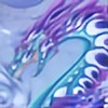 rachaelm5 — Dawn Patrol colored

Published: 2009-07-22 11:02:02 +0000 UTC; Views: 1836; Favourites: 83; Downloads: 0
Redirect to original
Description
This is a long-outstanding trade with .The Drow-centaur is Daeni and the dragon is Setanta. Mangled with permission.
")
I decided to let a lot of the watercolor show through on this one - I used a fan brush to play with the textures in the grass and little flowers. The taur and the dragon I colored with Prismacolor pencils. I tweaked things a bit in Photoshop to improve contrast and color balance.
Related content


Comments: 34

Thank you. It was kind of ruined for me (BY me) when one of my commentators pointed out that the top and bottom wing structure do NOT match. What really boggles my mind is that I got through the drawing, painting, and colored pencilling without realizing it!
👍: 0 ⏩: 1

I didnt notice that either... that is until you said something... It looks good still although i like the wing on the left more though
👍: 0 ⏩: 0


It is a beautiful, wonderful picture, you know how to draw with skill!  (Smile)")
I like this.
👍: 0 ⏩: 1


I love the use of colors! You've struck a perfect balance between the warmer shades of the meadow grasses/wild flowers, and the cooler shades of the dragon and centaur.
I have a question – and I admit that I must be seeing this wrong somehow, because I know you use tremendous precision when drawing your dragons – but why do the dragon's left and right wings appear so different from each other? I realize I am seeing the underside of the left wing, and the dorsal side of the right wing, but aside from that, they almost look like they come from two different dragons. The left wing appears to have far more "fingers" than the right wing, and it seems to be painted/drawn in a slightly different style than the rest of the dragon.
What am I missing? 


👍: 0 ⏩: 1
I think the difference between the wings something I wasn't watching closely during the coloring process. The original pencilwork shows the wings a lot closer in shape and style.
Rose's notes on the dragon indicate that the underside of the wings is reflectively shiny, so my first thought was that they would look almost like liquid metal and pick up a whole lot of color from the surroundings, hence the weirdness in the shapes in the interior of the wing. I was thinking of them in two separate layers - upper wing layer and lower reflective layer. Evidently it didn't work out quit right if the wings read so differently. And now that you draw my attention to it, I see exactly what you mean. Yowch. Good of you to point it out, though, and thanks.
👍: 0 ⏩: 0

Ooo~! nicely done! o.o I especially love how you drew the dragons face and scales. I love the simple-looking scenery as well. :3
👍: 0 ⏩: 1
Thanks very much.
It's more like... I lost patience with the scenery. I am definitely not a landscape person.

👍: 0 ⏩: 0

the colors ar amazing... i can't believe it's water color!
👍: 0 ⏩: 1
Well, some of it is watercolor. I tend to be a mixed-medium junkie, and that's sometimes because I lose patience with one medium and go on to another to get the colors or effects to work the way I want 'em to work. The texture thing that I got in the field with my fan brush, though, is very difficult to duplicate with colored pencils, so I left most of that alone once it dried.
I'm also using watercolors that come in tubes, rather than the little cakes that come in pans - I get much bolder color with the tube watercolors.
 (Wink)")
👍: 0 ⏩: 1
JESUS! that patience!!! thank for the tips!
👍: 0 ⏩: 0

It's beautiful. I love the way the colors seem to go with each other so well.
👍: 0 ⏩: 1
Thanks very much. Blues and greens are among my favorite colors. Next to the eye-poppers, of course.
👍: 0 ⏩: 0

Oh my gosh!!! It's so amazing and beautiful!
I like how you stuck to the cool colour scheme with just a few dashes of warm. Makes for a very... calming piece, for lack of a better term. 
👍: 0 ⏩: 1
Thanks very much.
It's nice to do a calm, cool piece after some of my eye-burning work from last week.
👍: 0 ⏩: 1
Hehe, well, it's always good to have a mix. And some of your "eye-burning" pieces are GOOD.

👍: 0 ⏩: 0

Wow, I love how you combined the two traditional mediums and made something so smooth! It looks gorgeous! I love the.. the... the whole thing! o_O There isn't a part that I do NOT like! O_O
On a somewhat related note... I'm going to attempt a large watercolor painting... Would you mind if maybe I borrowed some of your ideas for the field? I would credit you unless you don't think it would be necessary. 8)
👍: 0 ⏩: 1
Thanks very much!
Believe me, it takes some effort to get the two mediums to cooperate, and it doesn't always work out smoothly. I actually did some serious balancing in Photoshop this time. The original doeesn't pull together quite as well because I finally lost patience with it!
By all means, paint! You don't need to credit me on technique unless you want to; either way is fine.
👍: 0 ⏩: 0

It's so pretty! T_T
Outstanding my dear! Truely outstanding!
👍: 0 ⏩: 1
Wonderful! Glad you're pleased.
👍: 0 ⏩: 0

One of my favorite color combinations, that blue and green. After the retina-searing colors, of course.
👍: 0 ⏩: 0


It's so pretty!
The colours and anatamy are just so gorgeous!
Nice stuff!

👍: 0 ⏩: 1