HOME | DD
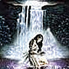
 radijad — High priestess

#aesthetic #barefeet #characterdesign #conceptart #demon #demondevil #demoness #demongirl #demonic #devil #devilgirl #dress #fantasycharacter #fantasygirl #fantasyillustration #fullbodyportrait #golddress #nailpolish #nighttime #prettybeautiful #prettygirl #redhead #space #sparkle #stars #tarot #tarotcard #whitedress #woman #womanbeautiful #womanfemale #womanlady #womanportrait #womanwomen #critiqueplease #barefootgirl #critiqueswelcome #redheadredhair #womangirlsexy #critiquesrequested #critiquewanted #barefeetgirl #aestheticart
Published: 2019-03-07 01:10:30 +0000 UTC; Views: 271; Favourites: 42; Downloads: 0
Redirect to original
Description
Inspired by tarot cardsRelated content
Comments: 16

👍: 0 ⏩: 1

👍: 0 ⏩: 1

👍: 1 ⏩: 0

I’m from www.deviantart.com/projectcomm… and I’m here to give you some critique on your piece.
The great highlights
· The hair: It is very beautiful. The shape of it and dhow it lows looks very natural. The shading on it gives it even more dimension and movement.
· The background is very fitting: the colors are simple and they do not take the attention away from the high priestess. The tiny details catch the feel of a usual tarot card.
· The overall shadows on the character are done well also- they are soft, but not too soft and they are not harsh- that is always great to see. I’m a bit confused about the light source though. The light seems to be coming from up above (according to the shadows on the character), but it also seems that the shadows are coming from the orb of light behind her.
· Her hands are also done really well. The finger to palm ratio is in place and that is always great to see.
· The frame of the tarot card is also very simple and smooth.
The things you could improve on:
I’m assuming that the demoness has a human anatomy. If I’m wrong then the following should be dismissed.
· The proportional height of a human in art is considered to be 8 head lengths of the character. This is the height of the character that is the most harmonious to the eye. If the height is more than 8 heads the character seems too tall and anything below 7 seems too short. Your character seems to be about 9 heads tall (I’m not taking the position of her feet into that height consideration). To fix the situation I would suggest making her head a bit bigger.
· Also a hint that some proportional ratio is off is in hands. A persons hand is supposed to be the size of the persons face. That is what they tell you in art books and art classes. In real life it can be off by a few centimeters. With your character it can be seen that her hands are clearly bigger than her face.
· As I understand there is a lock of hair in front of her (from the characters point of view) left arm. The lock of hair makes it seem that her upper part of the left arm is curved inside. That situation can be fixed by adding some shadow to her arm and adding some light on her lock of hair.
· With the position of her feet the foot that is behind the other should still have a hint about where the knee is. This hint could be some tiny dimples or sth.
· Also the hind leg seems to be going up in a smooth curved line. In the lace where there is a knee the musculature of the leg is different and because of it there should be a change in the curve.
All in all this is an amazing piece of art and it is wonderful that you’ve creates something like this.
👍: 0 ⏩: 1

Hey I’m glad you like it and this was actually really helpful! Thanks for taking the time to give me this advice!
👍: 0 ⏩: 1

I’m glad to have been of help. Keep creating because your art IS AMAZING.
👍: 0 ⏩: 1

Holy
Nice. Well done. You really convey the royal part of the High Priestess too.
👍: 0 ⏩: 1

She looks like something from a dream…a wonderful dream.
👍: 0 ⏩: 1


