HOME | DD
 RedStar-Sama — Rosemary - Pop'n Music

Published: 2012-06-17 17:34:11 +0000 UTC; Views: 489; Favourites: 21; Downloads: 0
Redirect to original
Description
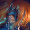
She is super Victorian Lady asdasdas >/////<Like on Facebook : D!! --> [link]
Commissions are Open!
Info here: [link]
Temporarily Pay-Payl Commishes Only!
I do Tarot Consults: [link]
Cute Adoptiables Here [link]
Related content


Comments: 14
Overall

Vision
Originality
Technique
Impact
(I should preface this with saying as far as the ratings go, I'm probably a bit on the critical side, so take that with as much salt as you'd like)
The first thing that comes to mind is that her torso and arms are disproportionately smaller than her head, and her neck looks a bit thin to support a head so large. Her collarbone also doesn't align well with the way her shoulder's positioned. A study of human anatomy would do you a lot of good in making more natural poses and proportions, as well as improving your grasp of structure.
Her hair also looks quite strange with the ponytail having a wildly different texture from the rest of her hair (though it is nice to see something besides straight hair on a lady for once). Also, when shading hair, sometimes less can be more; it can help to focus the detail on the parts you want to come out the most at the viewer, rather than go for a scribbly look throughout the hair's length. This reduces the amount of work, while making the art look a little more dynamic.
It's also a bit unclear just how the front of her outfit is staying up, and this makes it look a bit strange. I feel like you could work with this more to improve the design. Also, it'd help to have the lines follow the curved contour of the arms when you do a netted material such as the gloves. The straight lines are faster, but look a bit stiff and unnatural.
I do like the color choices used for her make up, hair, and hairpiece. The contrast between the vivid red and blue is something I personally find appealing.
Overall, a piece with some good points that could use better fundamentals.
👍: 0 ⏩: 1

Personally I disagree with your criticism and I think you should meet to review the character and drawing style of the original game (here I leave a link where you will see the original style and character: [link] ) what I did was merge my style very detailed with simple and rectilinear style of the game, hence the contrast of the arms and the ponytail, I agree that the clavicle is badly placed, but if you look at the truly original character movements and posture concordance with those of my drawing, another thing to keep in mind is that I draw manga and especially the head-neck proprcion each artist is very different as the thickness and length of the neck, and you can not expect a manga drawing style is perfect anatomically because when I semi-realistic style I have in mind that the neck and shoulders are thicker when drawing manga.
As for the hair texture I normally do much more realistic but much manga and that defines my style, but since the original style of the game is so simple I decided to do her hair differently, leaving the texture difficult to define.
Sorry for my English, I am Spanish and I have to use a translator.
Anyway, I invite you to criticize truly original works.
👍: 0 ⏩: 1
I think the side profile makes the head/neck proportion look a bit odd, maybe then it may help to make it look like it transitions a little more naturally, rather than altering the thickness.
And I see now that this is a character from a game, I was previously unaware of whether that was so or if it was just the title of the piece. In that case, then the outright design issues aren't your problem then. My apologies for the confusion on that point.
👍: 0 ⏩: 1
there is no problem, and as I said, I invite you to criticize my original works and thanks for the criticism and the watch ^^
👍: 0 ⏩: 0

That's cool, I like this eye! I think your drawings are oryginal.
👍: 0 ⏩: 1
Thank you >////👍: 0 ⏩: 1
 (Wink)")

Oh dios! Me encanta lo que hiciste con su cabello y su ropa >w<
👍: 0 ⏩: 1
Gracias ")
👍: 0 ⏩: 1
Yo lo encontré de casualidad, pero es muy chulo xD
👍: 0 ⏩: 0


love your colors and the fishnets
that hair with the green eyeshadow really works nice
👍: 0 ⏩: 1