HOME | DD
 roxination — GANG RUN

Published: 2008-12-30 19:17:16 +0000 UTC; Views: 6850; Favourites: 210; Downloads: 108
Redirect to original
Description
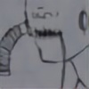
THESIS WORK no. 1Oh hey look the wood grain for the bat looks wrong let's complain
-------
15" x 10.5" Ink, watercolor, colored pencil, Photoshop
Related content


Comments: 21

👍: 0 ⏩: 0


Very nice, diggin the perspective and the dynamic. Once again, great work.
👍: 0 ⏩: 0

I really like the composition and the way you've created the shadows quite traditonally. haha I was gonna comment on the bat, but then I read your description, that would be my only crit. Fantastic work

👍: 0 ⏩: 0

COMPLETELY AWESOME <3333333! ahh i love the feeling of this very much!
👍: 1 ⏩: 0


"Oh hey look the wood grain for the bat looks wrong let's complain" not wrong, quirky. nanywhoo, I do love this... and I agree with *pirate-trish that really does look like Shaggy XDXDXD
👍: 0 ⏩: 0

Haha, no one's complainin' here! I love your use of textures in your images. You'll have to tell us how your thesis flies with the class. This is really great stuff. I'm loving the dutch angle on this one, and the great space that the characters take up, and create.
👍: 0 ⏩: 0

"Oh hey look the wood grain for the bat looks wrong let's complain"
I get stuff like that all the time at Ringling during critiques, except it's more along the lines of "Oh my balls that character isn't on a third, YOU DIE NOW."
What medium did you use for the skin and shadows? It looks like crayon or pastel. I like it, it brings a nice contrast to your very precise and flowing ink work.
👍: 0 ⏩: 1

I KNOW it is the worst. Nerds, all of them.
Hmm, I know the shadow was crayon, but I can't really remember what the skin was. Either crayon that I later changed the color of in Photoshop, or colored pencil. Thank you!
👍: 0 ⏩: 0

man i love how you draw men and boys - also that really looks like Shaggy bringing up the rear C__C yoinks!
👍: 0 ⏩: 0

 (Smile)")

All of your submitted works today, I can't stop fav whoring. These are all brilliant!
👍: 0 ⏩: 1
.. 
could that be Shaggy in the corner?
👍: 0 ⏩: 1
Possibly, possibly! I've gotten that comment from like dozens of people, and it doesn't bother me in the slightest that I subconsciously drew Shaggy into my thesis.
👍: 0 ⏩: 1

This is a phenomenal mix of natural media and digital.
Seriously, that's rad.
👍: 0 ⏩: 1
Oh, thank you. That is how I make up for the fact I can't paint!
👍: 0 ⏩: 0