HOME | DD
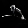
 SilenceNocturne — End of a Journey..

Published: 2012-05-01 01:12:58 +0000 UTC; Views: 2497; Favourites: 56; Downloads: 0
Redirect to original
Description
Entering contest Game of Swords atOhgod. I spent so much time on this. I'm not used to it anymore.
") Just finding the right stocks for what I had in mind took me so long ! Anyway.. I got inspired when I saw this contest and I really wanted to do something a little different from what I usually do.. This is how it turned out.
Just finding the right stocks for what I had in mind took me so long ! Anyway.. I got inspired when I saw this contest and I really wanted to do something a little different from what I usually do.. This is how it turned out. ")
Also, I tried really hard to work on lighting/shading since this is one of my weakest spot, really spent a looong time on this part. So, I hope it shows at least a little bit..
And I would very much appreciate any feedback/critiques on this, if you feel like it  (Smile)")
Anyway, I hope you'll like it !
Note : Yep. I'm REALLY bad at titles. D:
[Edit] Woot ! Won the first place, I'm so happy, thank you everyone ! See all the winners here : [link]

Credits :
: Knight/[link]
: Cliff/[link]
: Grass/[link]
: Valley/[link]
: Castle/[link]
: Horse/[link]
: Horse 2/[link]
: Lake/[link]
: Water Lilies/[link]
: Sword/[link]
: House/[link]
: Mountains/[link]
: Texture on the sword/[link]
: Texture/[link]
Thanks to all the amazing stocks providers !
Related content


Comments: 41
")


Thank you very much !
👍: 0 ⏩: 1

You're very welcome
👍: 0 ⏩: 0

You're quite welcome!
👍: 0 ⏩: 0

Great concept, layout, idea, work...I could go on and on. Nice use of color. Color, I think, is SOooo important in a piece. Yes, the shadows need some help. Keep them going in the same direction. The shine of the sun is a wee bit off, as well. To the right of the house going up the hill should be brighter since you have the sun coming in from the left (as per the sword's shadow). The texture on the sword is great! The perspective is awesome! Depth, wow! I love this idea totally! A wee bit more clarity close up might help it look more realistic. Overall, you have done fabulous!! Hope this all helps. YOU GO!
👍: 0 ⏩: 1
Thank you so much for the compliments and feedback, I really appreciate it, it will definately help me !
👍: 0 ⏩: 1
I am glad and congratulations on your win in the contest!
👍: 0 ⏩: 0


Your beautiful work in featured in my journal : [link]
Thanks for using my stock
 (Wink)")
👍: 0 ⏩: 0
PixellyPerfectStock [2012-05-02 11:00:32 +0000 UTC]
Wonderful! Thanks for using my stock.
~Monica
👍: 0 ⏩: 1
Thanks a lot, glad you like it !
👍: 0 ⏩: 0

Thank you very much !
👍: 0 ⏩: 0

Thanks a lot, I'm glad you like it !
👍: 0 ⏩: 0


sahdows needs a lot of improvement..
but this is just O.O!!! bleeddingg my eyes..
👍: 0 ⏩: 2
Yep I know, still working on that, I'm always trying to do every new piece better than the last especially in that aspect ^^
Thanks for the comment ! 
👍: 0 ⏩: 0
by the way you could of dome some lens blur... and it would off TOOK MY EYE OFF MY HEAD :]
👍: 0 ⏩: 0


wow! you put this together really well. i like it. thanks for choosing my texture.
👍: 0 ⏩: 1
Thanks a lot, I'm really glad you like it !
👍: 0 ⏩: 0

It's well done. Love the nature scenery and the knight looking across the distance at it. The sword is fantastic. Maybe emphasize the shadows under the horse and on the belly part and under the tail? Not really good at shading myself, but just thought the intense light on the sword would be the same for the knight and the horse. Other than that, I think the picture is well done as if you're there
👍: 0 ⏩: 1
Thank you so much for the kind words and the feedback ! I really appreciate it, and I'll definately look into that ! 
I always kinda sucked at shading personally, there was a time I used to think it was unnecessary and I could cover it with whatever colors/textures or anything else I could think of..

👍: 0 ⏩: 0