HOME | DD
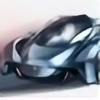
 sk8nrail — BMW Oleria final board
by-nc-nd

Published: 2008-02-08 22:52:02 +0000 UTC; Views: 3101; Favourites: 24; Downloads: 0
Redirect to original
Description
This was part of the final presentation board showing some of the key features of the Oleria. Line sketch was done in Painter 9.5 and then rendered in CS2. Comments welcome as always!Related content
Comments: 10

This is really nice rendering. I feel that the front wheel shields are impractical however. The fact that they have to pop out to turn will only make this vehicle even more costly if it ever went into production. The belts rendered in the wheel shields to help it extend, seems like they'd have an awfully difficult time not making contact with the tires.
But this is all just judging from the looks of the render.
Still, this is really cool and I love futuristic stuff. Always reminds me of Back To The Future 2.
Keep rockin' it pal. You're one talented genius.
👍: 0 ⏩: 0

amazing. nice shapes but it doesnt looks like beemer.
still superb.
👍: 0 ⏩: 1

Thanks, but again, it's not supposed to look like a beemer.
👍: 0 ⏩: 0

great presentation.
i like the concept of wheel light functionality.
its just that may be you need to cover the whole rim with that body to get this futuristic feel.
i don't feel like saying anything because this is far better then my work.
rock on dude.
👍: 0 ⏩: 0

Thanks again everybody for the comments! I appreciate them all. Keep 'em coming...
👍: 0 ⏩: 0

presentation is magnificent !! The car well done to, creative but strange.
👍: 0 ⏩: 0

Hey
Indeed one can very well see the passion how you dealt with the project! Bravo!
However, the Mazda-like theme of the swung graphics shapes is really couragous, but as Slavche already said, it is not really BMWish/ Bangleish.
In addition, the whole plot appears a bit too dark too.
👍: 0 ⏩: 0

I like the presentation.
The car just hasn't enough Bmw feeling to it. I don't know, maybe it's just me. Maybe it's just first impression.
The idea about the wheel panel I had 2 years ago, check it out: [link]
👍: 0 ⏩: 1

This was intended to represent BMW's next revolution in design, similar to the way the X coupe did for this generation. You'll notice the x coupe completely redefined bmw's design language, which is what this concept is to do. As for the wheel panel, mine has a different concept/purpose behind it.
👍: 0 ⏩: 0


