HOME | DD
 strangelet — Thrones of chaos logo
Published: 2006-08-08 22:58:09 +0000 UTC; Views: 2914; Favourites: 23; Downloads: 64
Redirect to original
Description
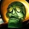
This is a commissioned work by myself. for use as the splashscreen and web art logotype on an in-development fantasy MMO, Thrones Of Chaos - [link]posted here with kind permission of the developers, LoudAntSoftware - [link]
my first foray into fantasy modeling/texturing.
Related content


Comments: 19

Hey.
We have a team here of around 20 professional artists and we love your work. Would you be interested in doing some artwork for us as a volunteer(will get paid once game is complete and comes out). We are currently making a 3D MMO online game and are all serious about it. If you or anyone in the Deviantart community wishes to come along please just post a reply or email me at vxtream@gmail.com .
Our site is also found here [link]
Thank You
The VisionXtream Team Management
👍: 0 ⏩: 0


Very nice texturing mate.
Absolutely great. Deserves 
And hey, isn't that the MMORPG Kris showed us sometime ago on AFF irc channel ?
👍: 0 ⏩: 0


Wow...
looks fantastic. I especially like the pearls in the bigger letters.
👍: 0 ⏩: 0


")

That's intense...the quality of your work is awesome.
👍: 0 ⏩: 0

oh wow...that looks really cool ^^
good work with the modeling
👍: 0 ⏩: 0

Absoluted splendid! Nice to see you do other works apart from space craft.
Great piece, Stranj!
👍: 0 ⏩: 1

Heh - yeah im actually enjoying the lack of straight lines. also because this job involves alot of character texturing (pix to come when theyre not so sekrit) i'm getting to up my skills with the old tablet.
👍: 0 ⏩: 0


It's neat. I like the opalescent jewel-like objects embedded into the letters.
👍: 0 ⏩: 0

Ok, thats cool. Contsruction? Splines extruded with a texture? Or did you model the swirly between letters part by hand?
Very nice. Very Believable lighting + texture. Mabey once aff finaly decides on a damn studio name, we could have the same too?
👍: 0 ⏩: 1
nah no nancy +1 sword-of-righteousness fantasy art for AFF. gunz and gubbinz ftw
yeah its mostly lofted splines. the gold detail is just a munged pattern in the bump channel. used procedural denting to de-tile the base stone tex, and an anisotropic specular on the gold.
")
👍: 0 ⏩: 1

And if anyone says gunz and gubbinz are wrong, I'll hunt them down with a baseball bat.
👍: 0 ⏩: 1
well - a baseball bat with guns and gubbinz on it anyway.
👍: 0 ⏩: 0