HOME | DD
 TheArtrix —
Girls' Night Out
by-nc-nd
TheArtrix —
Girls' Night Out
by-nc-nd

Published: 2009-11-07 21:29:52 +0000 UTC; Views: 154331; Favourites: 2851; Downloads: 4416
Redirect to original
Description
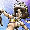
Daisy had to catch up because she had trouble parking the Daisy Cruiser at the docks of Hotel New York... illegally.After extensive research on girls' fashion, taking pictures of various street corners and filing a restraining order against Rosalina for stalking me in an attempt to be included, I present to you Girls' Night Out.
This is essentially Rush Hour , but in the night life scene. Focus here: gritty city street, extensive artificial lighting and, of course, girls. While I think it might look a bit crowded, it neatly conveys the over-the-top atmosphere of the Rotterdam night scene.
I was greatly inspired by the French movie Les Lascars for the backgrounds. Unfortunately the movie isn't available with English subtitles or dub, but the art direction is breath taking. If it managed one thing, it's to portray northern Paris as cynically and depressing as humanly possible.
Any citizen of Rotterdam (or anyone who frequents the place) who can tell which street this is earns +3 street cred.
Edit:
Hooray, Daily Deviation! Since everyone is asking (and speculating, which amuses me to no end), here's the characters and their respective franchises.
From left to right:
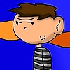
Sam Manson , Danny Phantom
Vicky , Fairly Oddparents
Kimberly Ann Possible , Kim Possible
Princess Daisy , Super Mario
Officer Dibble, Top Cat
Kent Mansley, The Iron Giant
Princess Peach , Super Mario
Coraline Jones , Coraline
Azula , Avatar, the Last Airbender
Ty Lee , Avatar, the Last Airbender
Meg Griffin , Family Guy
Frankie Foster , Foster's Home for Imaginary Friends
On a closing note, you may want to check out these sketches I did in preparation.
Related content


Comments: 361

👍: 0 ⏩: 0

👍: 0 ⏩: 0


So my first critique post e.deviantart.net/emoticons/s/s… " width="15" height="15" alt="
 (Smile)")
Anyway, as expected, your challenge works always show you put extra effort in it.
I see you as usualy hide some standard known character into a new design. which is fun. But as always it's hard to copy their style into your own.
So here are my points of interest;
First, the girls figures are all to your style of drawing.
The breasts are pointy, with all. It's probably that perkyness that gives it a youth status, but most women have rounded breasts that won't point, the pointyness usually comes from bra-less-ness. So none wear a bra. Yet they all show push up effects without rounding their breasts off. These bra's exist, but can only be found in sexshops. e.deviantart.net/emoticons/let… " width="15" height="15" alt="
")
It's not wrong, but breasts make a woman really noticable.
that's why it sticks out. no pun intended.
the rest is just great. Just mind the O-legs.
The hips of a woman don't end at the knees. just like on Kim Possible here. Her thighs seem to end at her knee, which exists. but only on woman that are very overweight.
Meg is actually fat, but here she seems to miss that. And her appearance is male, since her right thigh muscle is sticking out further than her behind. and her face looks skinny, so Meg now is looking fat, yet she doesn't. no muffintop for instance. Just look around. those girls usually have part of their stomach hanging over their pants like a muffin. because they want that size 30 pants, but they actually don't fit. Yet they refuse to accept that they are a size 32. very common.
So much for the girls.
The lights are great, yellow light, evening setting citylights, etc.
The characters are lit with an obvious low hanging yellow light close by, but then their shadows.. they all point in the same directions, but the light on their body obviously looks very close by, which should pan their shadow, more left to left, and right to right. and they would be darker, now the shadow seems to have backlit area, but there is no backlit area.
Because the lights are so intense, I miss the intensity and illumination of the other lights, like streetlights that appear to be bright as candles.
I like the background buildup, a little background blur, and un-inked lines. It shows what is important to look at.
The street is mighty clean, cleaner than any street I've seen here. This work really gives me a great idea to draw.
👍: 0 ⏩: 2
It wasn't really at attack to the style, because i know you render your own will in characteristics, which is fully defendable. However 5 stars, simply because I thought to give less on originality, yet even though you used existing characters, it's not a copy of the original, but a bastardation of the character. "the NOT so.....princess" exactly.
Meg is ugly, she was designed to be the losergirl. It's how Family Guy made her be the loser girl.
Round glasses, fat, large nose, and the obvious scenes.
Same as bad guys never have big puppy eyes. Big eyes say gleeeeeee instead of Arrrrrrr.
So basicly your work is just perfect. I had to look really good to point out any flaws, since your works in these quality range usually are near perfect.
But at least I can learn from it. The knowledge, it feeds me.
👍: 1 ⏩: 0

It's intriguing how each critique focuses on different aspects of this piece, and I don't see many deviations with this many critiques to begin with. The first thing I'd like to note that I find it kind of quaint that you bring up some very stern points of critique, but still rate everything five stars. I'll try to go through the points in your order.
My drawing style is a mix of realism and cartoon design, especially in the latter months. Therefore, I take liberties, but not too many, and finding this balance is the trick.
Your focus is certainly on the anatomy of the girls, and even I see that I made some glaring mistakes back then. The breasts aren't really bothering me that much, and there's actually variation in the roundness/pointy-ness of them. For instance, Daisy and Peach have more rounded breasts while Kim and Franky have more pointy breasts due to their original designs.
As for the O-legs, I kind of see your point. In defense of Kim, her leg is bent forwards, but I'm definitely working on improving my understanding of hip-thigh anatomy.
I don't really like to defend Meg's design because I'm not satisfied with her, and she's the most "meh" character in the entire piece.
The lighting is kind of a tricky part because I wanted to have a more extreme color setup initially. Doing this would sacrifice a lot of the color variation of the girls, because they would basically be yellow and red. I do agree that it's not very clear where the light source is coming from, adding more shadows of various degrees and different angles may have been better.
Anyways, thank you for your critique, your first one, no less. Hope to see your idea come into fruition.
👍: 0 ⏩: 0

Overall
Vision

Technique
Impact
I like this picture a lot. I may not know who most of these characters are, but I like it.
Everything down to how they are walking and running just really catches my attention. The expressions are priceless! Azula looks irritated, Franky looks overjoyed, all of these are just amazing to me!
The colors in the picture are really good. I have seen a lot of good coloring though.
The picture is unquestionably original.....to me at least. I haven't actually seen a work of art on here like this.
I am one for modesty. I don't like the outfits the ladies are wearing. I mean, I like Franky's shirt, but the skirts and the shirts.....Too low cut for me.
👍: 0 ⏩: 1
Thank you for the critique, it's really appreciated. Glad to see you like it so much.
As a note on the skirts and shirts being too low cut, I must say that I'm somewhat surprised. I freely admit that the very first idea did involve much skimpier clothes (as in shameless fan service), but I quickly realized that such a thing would be tasteless and quite frankly, boring. Early concept sketches did involve terrible designs (especially for Azula).
From that point of view, I think they ended up with rather decent outfits that fit their personalities. But then again, that may be due to my male sensibilities.
👍: 0 ⏩: 0

Overall
Originality
Technique
Impact
First off, congrats on the Daily Deviation!
Second, like the suggestor of this DD noted, great job on the background, lighting, and over all feel of this. The combination of a bright yellow light source and darker brown and black tones (and even the red lighting on the two officers and azula/ty lee) really give off the feel that they are walking through an urban environment. On top of that, the body language and expression of each figure speaks to the character (Peach seems psyched to see Daisy, Azula looks upset, Meg looks awkward). This piece is highly representative of the uber-expressive, line-art based way of drawing you have.
There are definitely some places where the hands-arms-foreshortening combo look a bit strange (I wouldn't normally point it out, but this is a Critique, so: particularly Meg's hands, Azula's hands, and the girls to the very left and right sides of the picture). But I can't say much without being a TOTAL hypocrite. Hands must be the most difficult thing ever, so props to you where they worked out, and good luck next time where they didn't.
Regarding the shading and to some degree drapery, did you these without reference? They look good, but I feel a reference here or there would have strengthened the entire piece by providing more clothing-material variation. Similarly, though I find the walks to be unique to each character, some of the movements seem a tad awkward and stilted. I don't know if you used references, but I feel one or two could have helped to strengthen this piece.
Finally, I have a huge pet peeve for expression, but that could entirely be stylistic difference. e.deviantart.net/emoticons/s/s… " width="15" height="15" alt="
Anyway, this is a good piece! Good job. I can't wait to see works from you in the future.
👍: 0 ⏩: 1
This is without a doubt one of the best comments I've received to date, and I really like how you mercilessly dissect the picture without losing track of what you do like.
Let me start off by saying that ironically, I don't consider this my best work, but I do think I understand why it was awarded a daily deviation. It came out differently than I intended, and I do see flaws that I didn't see when I made this. Nonetheless, you do point out things that went unnoticed to me.
Yes, not as much as feet, hands have always been tricky for me, and I bet virtually any artist agrees. As for references, I didn't used any for the movements, but I did extensive research on fashion, something I freely admit is not exactly my passion in life (shocking, I know). I observed girls on the street, searched on-line and asked my female watchers here on deviantART. I think the fashion styles kind of balance out, but I'm sure my limited knowledge on fashion clouds my judgment.
On a final note, I don't really understand your last remark about expression being your pet peeve. This may be a lingual thing, as English is not my native language.
Once again, thank you very much for this very intriguing critique.
👍: 0 ⏩: 1
Sorry to get back to you so late on this!
Expression through body language and facial cues is important to me. What I mean by that is every character should have a unique way of carrying himself, how the head is tilted, the quirk of an eyebrow, the weight of the shoulders--all these things should add up to a specific and human expression exclusive to the character and the environment they're in.
It's a pet peeve to me when artists draw without considering real human reaction. I admit that the above description of the treatment of expression is ideal, but it is nevertheless something I strive to. I think you did a pretty good job of capturing the personality of some of the characters! I really would love to see more humanity though, if that makes sense--people as they really move and simply are.
👍: 0 ⏩: 1
And now I'm the one who takes too long to get back at ya.
Thanks for clearing that up. I definitely see your point. It may be due to my more cartoony approach, and I usually notice that when I do more refined things like this, it tends to take away some of the expressiveness. That, and trying to get the outfits right may have shifted my attention from other aspects.
Once again, thank you for the very intriguing critique and the response. It's one of the things that make deviantART awesome.
👍: 0 ⏩: 0
👍: 0 ⏩: 0

Frankie (to Meg): Hey... is that a real Prada bag~?
👍: 0 ⏩: 0
Wonderful, I love how you draw all of them, the perspective is good and I identify all of them without reading the comment.
👍: 0 ⏩: 0

Seems Mansley found himself a new job. Let's pray that he won't screw this up than the other one.
👍: 0 ⏩: 1
I'm sorry. I didn't mean to reply it to you. It keeps doing that for some reason. I do appreciate your reply though.
👍: 0 ⏩: 1

That's okay and thanks.
👍: 0 ⏩: 1


Thank you for adding Azula AND Ty Lee to this pic! They're my favorite characters from the show and my favorite canon couple!
That being said, would you say they're a couple in this pic?
👍: 0 ⏩: 1
Nope, just friends hanging out.
👍: 0 ⏩: 1
Ah, ok. Just checking. Nice work, Again!
")
👍: 0 ⏩: 0

Wow; great pic!
I like the most girls here, but not Vicy and Azula.
👍: 0 ⏩: 0

2/10 does not include Artrixina on the finished pic : / Redraw it.
👍: 0 ⏩: 1
Okaay, at least tell me, is my female version is Largina? because that sounds just nasty : v
👍: 0 ⏩: 0

Yay! He's so tiny back there!
👍: 0 ⏩: 1
Yea, looking at it now there might be a perspective error.
👍: 0 ⏩: 0


Are Ty Lee and Azula together in this pic? I.E. is this a Tyzula pic?
👍: 0 ⏩: 1

I see this and listening to this grooveshark.com#!/s/Big+Time+B…
👍: 0 ⏩: 0


LOVE THIS!!! I love how you something for every one in this pic, so cute. great job
👍: 0 ⏩: 0

oh my god, you actually put those two guys in the background XD
👍: 0 ⏩: 0


oh wow i never noticed it until now
Frankie has the power puff girls on her shirt.... O.O
👍: 0 ⏩: 0


Nice! I love it, and I love their different facial expressions too! You nailed it.
👍: 0 ⏩: 0


I immediatly saw Kim, and then was filled with happiness as I recognized a bunch of the others.
👍: 0 ⏩: 0

I just had a thought why did you have to include Meg she is a buzzkill at parties, next one instead of meg put Mai Kasumi in that palce and make it that she and Frankie are talknig.
👍: 0 ⏩: 0

| Next =>