HOME | DD
 TommyPhillips — CapeTOWN COVER

Published: 2010-01-18 18:06:11 +0000 UTC; Views: 682; Favourites: 18; Downloads: 27
Redirect to original
Description
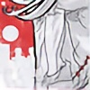
CapeTOWN COVERwork in progress
Pencils by: Inks By: Tommy Phillips
Related content


Comments: 15

In general I like this piece, but the two characters in the background are holding it back in my opinion.
Unless you had an art brief that requires them in the cover I think you should focus on the character in the middle ground for a cover and see how it looks without those two. If you need a different background how about a city street from one of the pages.
I would probably have avoided covering the title.
Still, it's overall good work.
👍: 0 ⏩: 1

Thanks Man... it was kind of important to have the other characters on the cover. Especially since left out 3 other main characters that are in the book.
👍: 0 ⏩: 1
Fair enough. I think you ccould even include them all by increasing depth in the cover, or showing them standing together in an action pose. Obviously that sort of change would have to be a lot of work in a separate draft though so more something to think on in later works.
Crossgen comics had a series called Crux that had 6 characters pretty regularly featured on their covers. If you have access to those you might want to check out how they used the space and arranged the characters for reference in any future covers you do with so many characters.
👍: 0 ⏩: 0

do you have this one with out any coloring on it? chomper
👍: 0 ⏩: 1
It is a pour scan I had to slice it. I hope to get the cord for the scanner tomorrow so I can send you a good image... what did you think of it?
👍: 0 ⏩: 1
well it not bad at all, if i where able to draw i think that the only thing that i would have done differently is that the umm smoke or blast what ever it is that is coming off the girls hands i would have going behind the title then maybe coming out of say maybe the "a" or something like that but that would only be for the aspect of intergrating the smoke and the title into each other but then again it may make it look cheesy....
what up with the bare metal over-lay with the brownish orange coloring to it?
👍: 0 ⏩: 1
it is just a quick color for my profile page...
👍: 0 ⏩: 1
ummmm yuck brother.... you can do ALOT BETTER.....
i work on after i finish last piece of crap ..... last page baby yeah!!!!!!
👍: 0 ⏩: 0

 (Wink)")
Yea the more I looked at the pencils of the other design I did the more I did not like it... so this is what I can up with...
👍: 0 ⏩: 0
 (Smile)")
👍: 0 ⏩: 0
Thanks man... I could not wait to post it... It was really fun to illustrate...
chomp chomp chomp
👍: 0 ⏩: 1

ya, i can tell haha i love where you put your signature ")
👍: 0 ⏩: 0