HOME | DD
 tseudo-nimm — Playing with Filters - Try 2

Published: 2014-01-22 01:11:51 +0000 UTC; Views: 6886; Favourites: 19; Downloads: 0
Redirect to original
Description
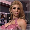
Well since my first try wasn't received so well due to the cartoony look (The one labeled AFTER), I figured I'd give it another go. This time it's slightly more cartoony than the original, but it retains most of the detail.Thank you all for the constructive criticism by the way, I really love the honesty. I want to grow as an artist and I take what you guys say to heart. Please don't ever let that stop. Tell me when something looks off or outright disagreeable and I'll do my best to learn from it.
That isn't to say that I will try to change who I am or what I'm doing though. If you dislike the content itself, I can only say I'm sorry for wasting however much of your time it took to view it, and we can go our own separate ways.


 - But honestly, I love the critiques. It means that people take my work seriously enough to see potential, and that's big for me.
Related content
Comments: 21

My drive to write "descriptive actionable" as apposed to "generic I like/do not like" critiques sometimes clouds what I "really feel."
I like, no, scratch that, Love the story. For example, you have created a serious plot issue as the end of the second sequence that I am dying to see how you work.
👍: 0 ⏩: 1

Well thank you. So far I have three chapters out. Two more to come!
👍: 0 ⏩: 0

Back when I was doing photography work, I always had two extra tiny auto-flashes. The reason was to add enough light in the "shadows" without making the dramatic main lighting washed out.
I do not have a clue if this is something relevant to what this community does, but if there is a software equivalent of a small flash one meter from the right hip, same height, "aimed" at the nose, the mustache and other artifacts should disappear while maintaining the dramatic lighting.
Other notes.
thanks on the eyes.
If I am right, the character is being punished for being a pig, so the overly large lips and breasts work as part of the story, despite my personal campaign in general on such.
P.S. I like try 2 best. Cannot tell you why, just do.
👍: 0 ⏩: 2

This software allows the placement of various lights, so I'll definitely give your recommendations a go. Lights are the thing I'm having the most trouble with actually, having no experience in photography and very little now in actual art of any kind. Thank you for the recommendations.
And you're quite right There's a bit more depth to the story than that, but without giving any spoilers for past and future chapters, he was a pig and was punished accordingly. I can appreciate the campaign against false beauty and the pop culturally defined "female" look, but sadly it's one of my biggest turn ons. I don't know if it's because it's an extreme, if it's because it's entirely fake and unreachable, or perhaps I just simply love parodies. I don't know, but sluts and extremes are my thing.
Being female myself, I definitely get why some may be frustrated with it. Too many aren't confident enough in their look (guilty) and setting the bar to unreachable is a bit much. But that's reality and I only face that when I have to.
Don't take me to heart though, I guess I'm an anomaly of sorts. A female who's attracted to slutty women and drag queens, with an interest in TG fiction... lol.
But thanks for your hints and your feedback, I'm partial to Try 2 as well.
👍: 0 ⏩: 0

not bad, not bad but now i can't decide which i like better, i could go either way at this point
👍: 0 ⏩: 1

I think it's safe to say that the middle one is out.
👍: 0 ⏩: 0

Perhaps try going MORE cartoony? I don't think you can just go a little without it looking like a bad render. Maybe also try a pic where upping the contrast doesn't give Kylie a moustache?
👍: 0 ⏩: 1

Also - do prefer 'Try 2' to 'After'
👍: 0 ⏩: 1

Hmm, I could try more cartoony. I'm trying to find a comfortable niche... And in other news, I never realized how dirty the phrase "comfortable niche" could sound until just now.
👍: 0 ⏩: 1

Yes, niches should be tightly defined, well maintained, and fitted for your customers.
And now, back to the image: Have you tried playing around with cartoon settings with your render? If you are using 3Delight, it can do some nifty subsurface toon effects (I believe Age of Armour sells some presets). There is also a toon shader kit on daz.com somewhere that I used for the pic in 'Illuminated Requests' that would be cool for an entire comic.
You probably have a better idea what you want it to look like, though. 
👍: 0 ⏩: 1

That made me giggle a little.
I have no idea where to go with other render formats, and I'm terrified to mess with those settings in case I can't go back, lol. They're the last avenue I'm likely to explore, since I didn't see a straight up "default factory settings" option.
In photoshop however, I'm trying to tease around with the filters. What do you think about this try? [LINK]
👍: 0 ⏩: 1

Yeah, that looks alright. As long as it's consistent, I don't think there will be a problem. 's comics look very 'different' but they work well as a whole.
These two products simply use shaders to create the effect in Daz (i.e. Change the skin mat to 'pink tone', hair to 'brown', etc.) You would have to do it to your entire scene, though... (They also have settings for 'outline' and amount of shadow, etc).
www.daz3d.com/visual-style-sha… (the one I used on this
And this newer one - www.daz3d.com/subsurface-toon-… , which uses the new subsurface abilities.
👍: 0 ⏩: 2

Hi, just so you are aware I don't use poser or Daz filters for the comic effect I do.
I render very high quality (like you do for 3d art picture) and then do a lot of post work on them to help make them more comic looking. I use a tool also that helps with that (now) so it makes it more standard. However, the biggest issue I have is that lighting and shadows do effect, so a number of times I pull into photoshop and find the lighting is too bright, or not enough shadow (or the wrong position of shadow) and then have to render again.
Thanks for the mention also
👍: 0 ⏩: 0

Oh wow, those look fantastic! I'll have to shell out a few $$ to play with them, once I buy some proper erm... "parts" for my male and female models.
You're the best!
👍: 0 ⏩: 2

You did see all the Generation 5 pro packs (which is the only way to get the 'parts') were all 70% off on the weekend? The sale literally ended less than an hour ago. I feel I shouldn't be telling you this now.
👍: 0 ⏩: 1

Story of my life, lol. Well it'll be a while before I can afford upgrades anyway.
👍: 0 ⏩: 0

This style is what I think I would really enjoy working with.
👍: 0 ⏩: 1

Yeah - comics would stand out. (Also - reply to my message, or I don't get a notification for this 
👍: 0 ⏩: 0


