HOME | DD
 UdonCrew — Exalted- Infernals

Published: 2008-12-18 01:59:04 +0000 UTC; Views: 49323; Favourites: 1331; Downloads: 2033
Redirect to original
Description
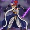
Artwork: Chris StevensCover painting for the Exalted 2nd Edition supplement Infernals.
These brand new signature characters were designed and illustrated by UDON's Chris Stevens.
Exalted and all related characters copyright © White Wolf Publishing
Image copyright © UDON Entertainment
Related content


Comments: 70


Did the Exalted become super heroes when I wasn't looking? Because between "Sister Dominus" the sexy-dominatrix-nun and the platform-boots-ninja-girl, that's kind of what I'm getting out of this cover.
Nice art though. It's not really entirely to blame for my confusion. White Wolf confuses the hell out of me lately.
👍: 0 ⏩: 0


Yay! I finally get my Green Sun Princes! Any idea when this is coming out?
👍: 0 ⏩: 1

We haven't been told a release date, sorry.
👍: 0 ⏩: 0

This fills me with sadness and anger
Your art is good but I have nothing but contempt for the characters.
Why is there a nun?
Why is there a "Crab Mummy," for crab battles?
Why is there a super heroine?
I am sorry but I don't understand a single one of the design choices at all.
👍: 0 ⏩: 1

And the guy with the gun looks more at home under the Neverborn than the Yozis.
👍: 0 ⏩: 0

why dont you also put a 2 headed pink frog with a living giraffe instead his right hand and a pair of scissors as his weapon?
👍: 0 ⏩: 0

Nice composition. I don't really like the designs very much, they're more Warhammer Fantasy than Exalted (especially the nun-ninja woman), but I suppose that's a personal opinion.
👍: 0 ⏩: 0


Never fear! It's Vampirate, Stripper-nun, Crab-mummy-ninja, Gaelic-axeman, and Some-other-ninja-girl to the rescue!
👍: 0 ⏩: 0


Really awesome work! the standard is brilliant as expected as part of the udon crew
I hope its ok to give a Crit on some of the elements though? :s
I think probably most of my comments I have are because the characters were probably designed separately and then complied at the end (but i don't know that as fact).
Basically the first bit I found visually uncomfortable was the closest of the Celtic type character's hand to the ninjas head. The other two similar things are the ninjas spikes to hand of red nun and the back foot of the blue woman with talons.
The only Crit as a whole is that the black'n'white dude is too monochromatic and that removes him slightly from the scene, plus merging a little with the blue talon characters hair. Maybe introduce a some colour at a very low saturation.
My last opinion is that maybe the Celtic character should be towering a little more over the others, but that's really just a design element.
Hope I've not offended anyone with my Crit, I think the work and characters are amazing and well produced.
Cheers
")
👍: 0 ⏩: 0


Love the red nun and the guy with the claw is cool
👍: 0 ⏩: 0


Normally, my artists shouldn't be posting any of the art from upcoming projects, but since we've already leaked this cover, it's cool. But no showing your artwork off early Sunamori. It's not time yet.
-Brian
That Art Director Type Guy Over at White Wolf
👍: 0 ⏩: 0


Wait a minute. Has the book been already released?
I've been illustrating it, too, but it should be due for next year... is it already possible to publish one's work...?
And another question. Was the character design completely created by your staff (Udon Crew) or you got character descriptions by the developers or the Art Director and then worked on those imputs?
👍: 0 ⏩: 1
We received overall art notes in terms of the type of characters they wanted to see and then Chris ran with the ball from there.
👍: 0 ⏩: 0

A bit more European-influenced in style than usual for Example, aren't they? Not that I'm complaining...
👍: 0 ⏩: 0


YAR! Pirate! Heard of Exalted, never read up on it or played it or, well, anything. xD Looks spiffin' though
👍: 0 ⏩: 0


 (Wink)")

Reminds me of some Warhammer characters, actually.
Awesome, like it alot!
👍: 0 ⏩: 0

So let's see if I've got down what they all are...
The guy with the big axe: Lunar infernal
The guy with the crab arm: Dragonborn (most likely earthen) infernal
The blue ninja lady: Sidereal infernal
The gunslinger guy: Abyssal infernal
The red Vegas nun: Solar infernal
Am I right?
👍: 0 ⏩: 0

")


Great work guys  (Smile)")
👍: 0 ⏩: 1
This piece of art is overlaid on top of a textured cover with the logos, so no environment, but also not flat grey either.
👍: 0 ⏩: 1
Ah thankyou, that's really good to know - while I love your groups art I've always found the backgrounds dettracting a lot from the pieces. It's great to know that that gets remedied
👍: 0 ⏩: 1
That flat grey is a 50% grey (halfway between black and white) so that it doesn't distract from the colours of the art when it's intended to be overlaid. The grey parts represent the transparency.
👍: 0 ⏩: 0

| Next =>