HOME | DD
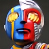
 vest — Aiyana Daystar COLOR

Published: 2009-07-30 06:50:59 +0000 UTC; Views: 10164; Favourites: 308; Downloads: 730
Redirect to original
Description
Feel free to compare this directly on top of the source lines. Figured I'd try out a new little Flash trick programming a fade effect without using the timeline (all action scripting).If you'd like to see a high resolution version of this image, check here: [link]
&
Original Lines - [link]
By ~Crimsonsea
Getting this one wrapped up for ~Crimsonsea . Already did two of his characters from his series, so might as well go for the hat trick on this one.
Photoshop CS2
Wacom Tablet
CGTextures.com
Comments appreciated. Criticism honored.
Related content


Comments: 56

Whoa!!!! 
👍: 0 ⏩: 0


This is SCARY good color, I'm so glad I stumbled on to it... very inspiring!
👍: 0 ⏩: 0


I see it now, its the eyes, I think it would of looked alot better if you sharpen the eyes a bit.
👍: 0 ⏩: 0
Please dont take offense, but I think it looked better without colors. The lineart was amazingly done!
👍: 0 ⏩: 1

Ooooh, man. I must be gettin' a bit rusty. I'll make it a point to put a little more effort into the next work, then. I will admit, it's tough to match CrimsonSea's drawing ability to do it proper justice. Thanks for your honest input, it's much appreciated.
👍: 0 ⏩: 0
Thanks sooo much again 'vest. Love it to bits. It's gorgeous, glossy, earthy and gritty, exactly how I imagined her. You have mad MAD skills.
👍: 0 ⏩: 0

That's a cool way to compare the lines with the colors!
👍: 0 ⏩: 0

Not only did you do an awesome job, but you managed to use a kickass method of presentation.
👍: 0 ⏩: 1

Hmm seems that a few of the lines on her legs and such seem so thick they take away from you hi-lights. Over all a very good pic.
👍: 0 ⏩: 1
Hmm, true that. Something to keep in mind on the next run.
👍: 0 ⏩: 1


That is a an excellent color job and now a really great idea with using Flash!
👍: 0 ⏩: 1

I think i just died, that not only is an excellent coloring job but the character comes right out of the picture!
👍: 0 ⏩: 1
np does she remind you at all of dani moonstar
👍: 0 ⏩: 0

Super sick and professional stuff, as usual. Could you color a piece that's inked and painted in a black and white ink-wash? Theoretical question.
👍: 0 ⏩: 1
Something like this? [link]
I could definitely make something out of that. I don't just need solid black/whites to implement my coloring formula.
Thanks for the compliments!
👍: 0 ⏩: 1
You cut me right to the chase. Wow, you have mad skill; you probably have a lot on your plate but I'd love to see what you'd do with something like the Spiek piece. You deserve the compliments.
👍: 0 ⏩: 0


You gotta warn me faster than that lol. When my mouse fell over it I yelled "WHAT THE HELL?!". Lol I thought something was going wrong. I just woke up  (Smile)")

👍: 0 ⏩: 1
Yep, it startles a lot of people, apparently. I've gotta put a bell on it or something so people know to treat it gingerly.
👍: 0 ⏩: 0


awesome :] is it just me or does it strangely like captain jack?
👍: 0 ⏩: 1
Uh-dee-dah, doooh...dee-dah, doooh...run along with Captain Jack. Uh-dee-dah-DEE-dah, dooooooh!
👍: 0 ⏩: 0

Killed it!?
QUICK! Grab me a shovel and a wood chipper, we must HIDE THE EVIDENCE!
👍: 0 ⏩: 0

That's a neat idea with the flash thing, but personally I would prefer a clickable link. Or at least, a large fullview of this image! I am unable to zoom in and look more closely at the details.
Okay, y'know what. While this is beautifully coloured, I think you picked the wrong style of colouring. (ie. the only digital colouring style that you seem to be able to do, does not fit with this picture.) Why? Well the thicker outlines call for a much more simplistic, perhaps cartoony or comic-book style of colouring. Not the semi-realistic "videogame promo poster artwork" style that you generally use (")
I think a style like this would have fit much better:
[link]
[link]
[link]
What I am getting at here is that the thick, bold lines don't work well with the soft, realism-ish colours. I think that they call for a much bolder, more stylised, less realistic approach.
But, because you've gone for a realistic approach, the result is that the bold outlines look really out of place. In fact, she looks as if she has some kind of black forcefield around her body.
This reminds me of something else I dislike about your gallery. I mentioned the content previously (not enough variety in content). Now I want to mention the style. It never varies. It seems you've learned to do an almost perfect colouration, but only in one particular style. And god forbid you should stray from that! ")
The hair is still looking like lots and lots of bits of wire as opposed to hair. (I think I mentioned that before, if I'm mistaken I can elaborate)
Aside from this I don't have much else to say. You are still colouring very well in the same style you always use. You have pretty much mastered it. Try something new.
👍: 0 ⏩: 2
Oh hey, and I've added a high resolution version of the image to the description. So there you can find an image file.
👍: 0 ⏩: 0
Hmmm, a very interesting challenge. Couldn't hurt to take a stab at a whole new coloring style. Admittedly, my coloring style is very formulaic; following a very particular set of steps to acquire a consistent result. I should try that buffman style, I really like it.
As always, your time and input is greatly appreciated. I'll make an effort on the next image to hazard a completely different style...one that would also fit with the lines given. Thanks a bunch!
`vest
👍: 0 ⏩: 0

Damn, that's all kinds of awesome. Very detailed linework and great colors.
👍: 0 ⏩: 1

Dude, beautifully done as always. I'm really diggin your flash effect. Any chance you can learn me somethin'bout it?
👍: 0 ⏩: 1
Sure, I'll post a .fla file soon so you too can create the effect.
👍: 0 ⏩: 0

Wow epic coloring skillz.
Your work is so beautiful
👍: 0 ⏩: 1
| Next =>