HOME | DD
 viperv6 — MIRVANA

Published: 2003-10-29 12:43:12 +0000 UTC; Views: 840; Favourites: 16; Downloads: 395
Redirect to original
Description
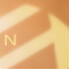
hmm..im not sure about the color....
but there are a lots details inside
 (Wink)") ?? ..lol
?? ..lolrender=bryce,time=3:37:06
sum layers and brushwork done in PS7
brushes used from....look at the pic and u will know it
Related content


Comments: 58

i like all the bits and tips down the bottom but the whole chunk in the middle might have a bit too much. the colour is not bad accually.
👍: 0 ⏩: 0

Can't see anything wrong with it, but dunno why this piece doesn't really work for me.....I'm picky!!
It's a great work anyway!!
👍: 0 ⏩: 0

Great brushing... the render needs more clarity though... kinda blends too much.
👍: 0 ⏩: 0

The muted purple colors look really nice in my opinion. The render is top notch and the brushing is nice. The 2d doesn't really seem to fit in the piece. The 2d bunched at the bottomg just hurts the pice more then help it. The typo for the name doesnt really seem to fit well either.
👍: 0 ⏩: 0

I have to agree there's a very dreamy feel to this one.
And need I parrot myself again? Excellent... gorgeous... you're awesome. I say the same thing each time, but it's true.
👍: 0 ⏩: 0

Nice Job Bro ..ccol render .really dreamy feeling to this one .But would like it in your nice green
👍: 0 ⏩: 0

hmmmm......interesting how u did this and how u played with diferent effects  (Smile)")
👍: 0 ⏩: 0


The color is great, there is a subtility that I like in it.. The render kick ass.
👍: 0 ⏩: 0
well iuno bout the colour either viper")
👍: 0 ⏩: 0

Times like these, your 2D and 3D just seem to work so seamlessly. I like it. My only qualm is, like breakerr, the font of the title. Even so, it's still a :fav:
👍: 0 ⏩: 0

Yea, I would have used a different color, but other than that, this is amazin. Good job
👍: 0 ⏩: 0

omg... u person ")
")
👍: 0 ⏩: 0


Ah, beautiful! Design is top notch in this great job man. Center really stands out i like it.
👍: 0 ⏩: 0


nice little put together, i wish you made the old pictures though, the renders that you spent days and days on...
I can't remember which one it was, its was all white, kinda ghosty, that piece was absolutely amazing, deffinately your best in my opinion, i just wish you made those again.
👍: 0 ⏩: 0


i'm diggin' colors here,
colors give this piece very fresh feeling, brushing is really neat
👍: 0 ⏩: 0

Nice bulbs man...i really like it. Can i do a manip of this work of yours?
👍: 0 ⏩: 1

sure...do what u must do
👍: 0 ⏩: 0

Nice bud 
")

👍: 0 ⏩: 0

wow kewl, ich liebe die farben. Render is auch geilo, würd aber mehr an dem " focal point" arbeiten. Trotzdem, 
👍: 0 ⏩: 0

hmmm very very good.. the colour is the right one.. the brushset used is quite nice.. i see inception8 and worklash right? the typo used for the mirvana name isnt the best d00d... i'd go 4 a high-tech look on it.
i really enjoy the wavey purple smoke coming out from beneath the bottom of the piece in the middle. overall a very good job!
👍: 0 ⏩: 0

yeaaaah. awsome.color is good, 2d same ( wurklash , inc8 ,eh?
oh...and i see some thingie kinda like a rose somewhere a bit lower and to the left..red thingie
ohyeah . congrats man
👍: 0 ⏩: 0


Also des gefällt mir schon eher
Des mit den details is auf keinen Fall zu viel versprochen! Echt gut! Und um die Farbe mach dir ma keine Sorgen, hat auch style!
👍: 0 ⏩: 0


You'll never stop, do ya!? Another masterpiece made by you. Nice work... and about the color... it's just great

👍: 0 ⏩: 0


styleoooo d00d... great piece...und lass mich raten die brushes sind by inception8 oder ??? 
👍: 0 ⏩: 0

damn nice work here
👍: 0 ⏩: 0

excellent colors, nice softness to it. You're right, there is a ton of details too, great piece!
Stevo
👍: 0 ⏩: 0

awesome 3d dude, really liking that deep red part down the bottom great touch. well done
👍: 0 ⏩: 0


some nice 2d, but needs another colour maybe?
still great work
👍: 0 ⏩: 0


awesome... work man, indeed.... some sweet detail in there, love the render and color, very... wicked...
👍: 0 ⏩: 0

weltklasse. die farbe ist perfekt 

👍: 0 ⏩: 1

Wooo, go me for being able to read some german
👍: 0 ⏩: 1
yeah i thought that too
👍: 0 ⏩: 0
| Next =>