HOME | DD
 Zehful — AIB Class- Hands

Published: 2007-12-03 21:55:50 +0000 UTC; Views: 1447; Favourites: 20; Downloads: 15
Redirect to original
Description
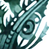
First- if someone wants to tell me the correct category feel free. I don't think this is really technical art, although it shows technical skill.Second- It's kinda big. But it's kinda big in reality, too.
Third- Light charcoal, light pencil sketch underneath. Photo doesn't really do justice but, it's not too bad. Merely a study, but it took a while.
Finally- I realize the one in the right hand corner at the top isn't really on par with the rest. This is because I was trying to draw the hand I was drawing with in that pose in an attempt to keep the composition more balanced. I also realize that odd numbers are generally better for these type of things; originally there were seven but things don't always go as planned.

Related content


Comments: 17

Wow, this is amazing!!! My favorites are the three hands that are more to the left side, but...they ALL look great! I need to do something like this sometime soon... Hands are difficult.
Y'know, this kinda reminds me of Burne Hogarth a little, but I promise I don't mean that in a rude way! (I added the last part because some people get offended by comparison, and I meant no offense at all)

👍: 0 ⏩: 1

Why, thank you! I hadn't heard of him until you mentioned the name, but now some of his books look worth looking into, so thanks doubly so! <3
Hands are difficult indeed, they look so foreign after a while. And feet are even worse, haha. But good for practice, of course.
👍: 0 ⏩: 1
Hehe, you're most welcome.
Burne Hogarth's works are indeed amazing. He teaches you how to draw the human body, but not in a step-by-step way; his methods involve things like how "the space between the eyes should equal one eye length" - stuff that's easy to remember. I have all but one of his books (Dynamic Anatomy - you can't find the original version anymore except for maybe on eBay), and they're great!!
I think I have more trouble with feet than with hands sometimes, but I guess it just depends on what the angle is... With the type of art I normally do I don't have to worry so much, but whenever I draw people I'm like... "Oh crap, how am I gonna get through this!?"

👍: 0 ⏩: 0

This is a very good study. Good job with all the detail. I'd give you some crits but chr already did, haha. So. This is the kind of work that builds us all as artists. Very well done.
👍: 0 ⏩: 0


Okay, sorry it's taken so long for me to get to this; I've had exams for the past few weeks . . .
Anyway, these studies are absolutely gorgeous. They remind me of some of my high school art teacher's work (a.k.a. your observational skills, as you well know, are very advanced). I particularly adore the arm in the upper, left corner: it's just very pleasant how simplistic it is in contrast to the hand. That particular hand, though, does feel a little overly-busy. There needs to be a bit more contrast between the ring and middle fingers to ease the transition. It looks like you tried to compensate a bit there by enhancing the lines, but I think it may have worked better if you had exaggerated the atmospheric perspective instead (that would also make the piece less busy and chaotic).
The middle hand on the top row seems to have a similar problem with being too busy and detailed in the mid- and background, however I think making the midground darker would remedy the situation. (I'm convinced you were working under atrocious lighting, as that always screws with depth, and most people are afraid to tweak reality in the name of aesthetics (and most instructors will tell you that you shouldn't, but they don't stick with that in their work, so don't feel obligated))
I definitely have to agree with Nora:the one in the top right is my favorite. You're right it's not as well done observationally (though you've pulled off the hand-switch a hell of a lot better than I've ever managed), but it has this awesome and yet creepy surreal feeling about it. I think it's the way the index and middle fingers seem to float as the intense shading on the hand make it appear to shrivel and sink. It's just such a lovely and fun contrast.
Okay, the bottom, left: I ADORE from the knuckles down. The contrast is so beautiful and soft; it just has a very humane feel to it. (I'm particularly drawn to the knuckle of the index finger: it flows with such a nice rhythm; I just wish the highlights leading into the finger were a bit brighter.) The fingers themselves seem a bit stiff, though that may be the model. The thumb seems very thin in proportion to the fingers, also the index finger seems attach a bit too far into the hand. Like, if you look at your hand flat, the outer edge of your index finger is going to align maybe a centimeter or so outside your wrist (or it does on mine, anyway), and in your drawing, it seems to align about a cm inside the wrist, which also kind of adds to the "extra finger" feeling of the thumb.
The mid, bottom is my favorite of the more observational hands. The composition is beautifully balanced and the contrast is excellently executed (also, I'm in love with that wrist; you should be a wrist artist ")
Finally, the bottom right. I think you overworked this one a bit; it seems too dark overall, though, again, that wrist is gorgeous. It looks like you fixed the knuckles to wrist thing on this one; those proportions look about perfect. Unfortunately, now your fingers look a bit thin in comparison to the extreme angle at which the thumb is attached. Also, I tried getting my hand into that position and angle, but it didn't quite work out; it looks as if your angle changed when you were drawing various parts of the hand, which is probably what caused it to look disproportionate.
Sorry if any of that seemed mean or nit-picky; I do adore this piece, and it has so much character (which is really exceptional for an observational study)! Also, sorry about becoming lax on the last half; I was getting a bit drained . . .
BTW, did those image links I put in your journal go through/work? My internet's awful and has a tendency to pseudowork so I think it's working when it isn't . . .
👍: 0 ⏩: 1
Yes, they all worked. I had intentions of emailing you back...with something...I forgot. Christmas vacation has crept up on me and today I just started a self portrait that looks like me but several years older...meh. I also finally got a huge creative piece done, which I will likely snap a photo of soon. More in progress.
As for the critique...I thank you again, SO MUCH, for your feedback! I need the nit-picky feedback because over the next few years it'll be all I'll get.  (Smile)")
These were all my hands, so I had to stop periodically, naturally, to let them rest. You bring up a good point, though, I hadn't noticed the having character aspect, since it wasn't an original objective. I'm glad they came out effective though.
👍: 0 ⏩: 1
Sketcheeeeeeeeeeesssss. *froths*
But, yeah, breaks do that. They're a very bad time intellectually, and I'm not entirely sure why they still exist, but I assume the Republicans have something to do with it.
Ooooh, self portraits are fun. And horrible. The same art teacher I mentioned before is OBSESSED with self portraits, so we'd end up doing like five a semester. I developed quite a distaste for them as an exercise, but they are incredibly useful developmentally for both technical and stylistic skills. And they're evil.
I'm VERY excited to see your "huge creative piece"! It sounds fun. ♥
Oh, have you ever tried using grey markers? Prismacolor has three very nice grey marker sets, and they're excellent for observational drawings. I found them very useful for learning light gradients; since the shades are predetermined, you really only have to pay attention to where to use them. Also, the lack of an eraser forces you to become better attuned to subtle lights and darks. (markers also force you to work uber fast, or you get a cell-shaded effect.)
👍: 0 ⏩: 0
Nicely detailed and shaded. I really like the anatomy and tones. Well illustrated.
👍: 0 ⏩: 1
")

holy shit, ashley, you are like. god D8 KJSFKLSfj these are fantastic. ;;........ amazing job on shading with the bone structures and everything, and the wrinkles are just. love. i love all the different poses the hands are in. my favorites are the first and second ones in the bottom row.
👍: 0 ⏩: 1
KLSJFsdf lol wtf. D: for some reason I thoughtyou were ~aashleyy because one of her deviations was beneath this one. xD; Sorry :<
👍: 0 ⏩: 1
lol it's ok, I read it and said, "Shit, did I make up a name and totally forget about it or has she thought my name was Ashley all along?"
👍: 0 ⏩: 0

I think this is just so amazing! I love how it pops right off the paper. My favorite is the top right one. ooooh yeeeessss...
👍: 0 ⏩: 0

-shrug- I don't expect a lot nowadays, fanart seems to get all the attention.
Thank you.
👍: 0 ⏩: 0