HOME | DD
 Zombiebaile — Leliana.

Published: 2012-10-15 23:58:52 +0000 UTC; Views: 516; Favourites: 17; Downloads: 8
Redirect to original
Description
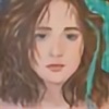
My finished project of Leliana. From Dragon Age Origins. This is based off of the CG version of her. I really hope you like. This is my second well portrait. I'm trying to for Realism. This is my first attempt at blending. As I find it actually looks really good. I think I'm going to end up getting blending sticks. Because it's awesome.Related content


Comments: 22

 (Smile)")

Thanks man, and thanks for adding for the fave.
👍: 0 ⏩: 1

"I'm here on behalf of because your piece was in the group's critique requested folder."
I'm really into black and white graphite portraits, and therefore I was attracted by your work! I really appreciate the fact that you started to try and draw in a realistic way. The only thing I'd suggest you to improve your work, is to 'smooth' your stroke: if you look at a picture, for example, you won't see exact outlines or definite 'edges', for example for what concernes the lips and the nose in your drawing; moreover, I'd suggest not to be 'scared' to draw more evident and dark shadows, to give more sense of depht and three-dimensionality. Try, for example, to darken lips and eyes corners, the hair, and the side not directly hit by the light.
I hope I managed to explain myself properly, since English isn't my mother tongue, and I also hope you will find my critic useful and not offensive! Keep on drawing, you'll definitely improve (:
👍: 0 ⏩: 1
Thank you for the critique. I have actually done more portraits since this one. Here is one [link] , and the other. [link] . Also I never take offense to constructive criticism. Thank you again. I am glad for your support.
👍: 0 ⏩: 0

one of my favorate characters (under morrigan of course) great job
👍: 0 ⏩: 1
Yes I totally agree Morrigan being the best. Leliana has a lot of great moments. Thank you.
👍: 0 ⏩: 0
This is very nice. I see a bit more shading here, area-wise. The shading encompasses a bigger area now, the problem is it still isn't getting any darker.
👍: 0 ⏩: 1
I actually have a fear of getting darker... It's not the shading itself. It's the pencils I use. I used F for her face, and HB for her clothing, B for her armor, and I think I used either 2B, or hB for her hair. I've been told that I go to light. My next picture is going to be a little darker. I think HB, and 2B for the face, 6,7B for the hair, and 2,3B for the clothing.
👍: 0 ⏩: 1
O.O I don't have those 1B 7D 8H whatever pencils so I don't exactly get what you're referring too

👍: 0 ⏩: 1
Ohhh. Okay. So there are different pencils for different shades of graphite. H means hard. Usually it's used for sketching, drawing out the base of a picture. It's usually very light on paper. B is for soft. It's for shading filling in areas. There are differing levels of both for instance H would be the softest of the pencils Hardness. 9H is the hardest I believe. Vice versa for soft.
👍: 0 ⏩: 1
Alright. Me shall awaits yur next art ^_^
👍: 0 ⏩: 0
Thank you. I had a lot of fun drawing it.
👍: 0 ⏩: 0
Thank you so much. I worked waaaaaay hard on this. It's nice to have a good pay off.
👍: 0 ⏩: 1

keep up the amazing work man
👍: 0 ⏩: 1
Gracies. ")
👍: 0 ⏩: 1
....... Okay I forgot an A.
👍: 0 ⏩: 0
