HOME | DD
 Zombiebaile — Neliel Espada.

Published: 2012-09-14 01:38:01 +0000 UTC; Views: 364; Favourites: 24; Downloads: 7
Redirect to original
Description
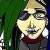
Neliel When she was a full Espada. I even added the three for cool effect.


 Enjoy. Also that mask was bloody difficult. I really enjoyed doing this one. I'm happy it turned out well. I am going to back, and blend this one. Also improve on the shading a little bit, and make it darker. I loved this picture. It is one of my personal favorites.
Related content
Comments: 10


It's not bad, but it could be better.
For starters, I think you should've shaded some of the areas better. They just look like random pencil marks mushed together.
Second, the chin on the girl is a bit pointy. It's not TERRIBLE, you just might want to change that the tiniest bit.
Third, it really would be better with color.
OK, on to the good and great parts:
First, the mask, like you said, looks pretty hard to draw, but I think you did a pretty well job on it.
Second, I just love the intense eyes! They are so, well, INTENSE.
Lastly, her hair is very messy, but in a good way. Very detailed hair.
Thanks for letting me critic your pic!
👍: 0 ⏩: 1

Thank you so much on the critique. They really do help me get better. Also thanks for not pulling any punches. That helps me improve ten fold.
👍: 0 ⏩: 0

Thank you. I honestly never thought about color. 
👍: 0 ⏩: 1

Your traditional art is significantly better than mine, but color makes a substantial difference, I make sure all of my art has color it makes it fun to look at. 99% of the monochrome pictures I see I don't ever view them I just go to the next thing.
👍: 0 ⏩: 1

Thank you for the suggestion. I wonder are there any drawing colored pencils? I'm not the best painter.
👍: 0 ⏩: 1


