HOME | DD
 zort — summer

Published: 2006-07-08 12:08:11 +0000 UTC; Views: 1158; Favourites: 32; Downloads: 357
Redirect to original
Description
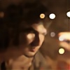
mind the brilliant title. yes, i'm really fond of it.i'm not 100% pleased with the crop/composition. rotate? brighter?
doing nothing at all is pretty cool. fooling around in a park.
35/2 at 2, m6, kodak plusx125
Related content


Comments: 44


Nice! I wouldn't change this photo. I think your instincts were correct when you submitted it.

👍: 0 ⏩: 0
Nice! I wouldn't change this photo. I think your instincts were correct when you submitted it.
👍: 0 ⏩: 0

hübscj hübsch, erinnert mich irgendwie an Mäuschen aus "Muxmäuschenstill".
kennst du den film?
👍: 0 ⏩: 0

pure beauty
starnge how monorcolour photos can be so detailed and full of emotions.
👍: 0 ⏩: 0


this is just classic. You can put all technicalities and rules aside. It's good however you look at it.
👍: 0 ⏩: 0

I think it's a nice pic. she's got a great expression. I'd try a square crop, cutting off the grass at the bottom to see if you like that better.
👍: 0 ⏩: 0


Your right something just not right.
Brighter... but then the shirt and the lines.
Rotate maybe anything between 15-45 degrees but I think her being horizontal is best.
Crop maybe about 15% at bottom? nahh
I think there's to much blurred grass.Just a lil more grass in front of her.
👍: 0 ⏩: 0


I like this a lot. The composition is great if you ask me
👍: 0 ⏩: 0


zur Kamera plus Objektiv: wirklich beneidenswert..hätte ich lieber als einen Ferrari. (wenn ich mich jetzt spontan entscheiden müsste und die Sachen nicht verkaufen dürfte - sonst wärs bisschen unklug  (Wink)")
zum Bildausschnitt: naja es wirkt ein wenig unharmonisch..irgendwie ist sie rechts ziemlich schnell abgeschnitten, und das Gras in der unteren Hälfte ist doch ein wenig zu beherrschend (auch wenns grün wär - außer es ist das ur flashige grüüüüüüüüün).
Mich persönlich stört dann auch das "weiße Ding" das hinter ihrem Kopf herausragt. Man kann nicht erkennen was es ist und lenkt ab. (mich zumindest ")
Bokeh ist wahnsinn und die Haare (wie auch bei anderen Fotos von dir) finde ich überhaupt gut. Fast wie gezeichnet.
Die Blume ist ein nettes Detail.
👍: 0 ⏩: 0

Lovely shot. I love the angle, and her expression is very welcoming.
👍: 0 ⏩: 0

the depth of field is stunning, such a crisp shot too for wide open.
My only grudge is the foreground, i woulda liked to see it sharper....... although ive no idea what the lighting was
the chicks a fucking stunning lookin girl too, she seems to have nice eyes.
👍: 0 ⏩: 0

Too much blurred foreground, otherwise very nice!
👍: 0 ⏩: 0

I dont' see a problem with the grass, the choice for wide open helped there... but a little brighter wouldn't hurt I guess. that leica is really a beast ahah
It's a good protrait.
👍: 0 ⏩: 0

Brighter, no ratation. If you have it in orginal colour (and you're using photoshop) make a "Channel Mixer" layer mask, then go to 'green' and change it from 100% green to 0% green and 0% red to 100% red, it should make it just light enough, then use a black and white 'gradient map' layer mask and set the blend mode to colour if you need to.
well, that's my suggestion anyway 
Also... about the cropping... I'd crop it so that it's in 2:3 ratio, portrait.... if you understand what i mean by that
👍: 0 ⏩: 1

hm, im shooting film. there is no ps except for removing dust.
👍: 0 ⏩: 1
Then I suggest adding a little bit of yellow filter, widening the aperture by a stop and bringing down the exposure time by an appropriate amount.
👍: 0 ⏩: 1
please take the time and read the comment next to the shot - it says: 35/2 at f2... so i cant shoot more wide-open. i dont like filters tho.
👍: 0 ⏩: 1

I personally feel that shots on the grass, would look better in colour, most of em. Cause well, the green of the grass tends to compliment a picture. And when in b&w, green turns out to be flat, i think red does too cause of the colour temperture. Unlike like her white shirt, that pops out, which definitely save this shot, plus her beautiful bright smile. Her shirt looks more like a piece of cloth wrapped around her. Composition is fine, but i'd personally prefer a close up for her, as I said the green grass in black and white, makes it look flat, although there is the depth there, it just doesn't seem to work.
It is however, a spontaneous shot. If you were to prolly do what I mentioned above, it wouldn't look spontaneous, rather set up. It's fine just as it is. If this was a shot of me, I wouldn't mind having it up on my wall. And that is what matters. Can't be perfect all the time.
👍: 0 ⏩: 1
not sure whats wrong with the grey-grass. still, i shot a roll of reala too.
well, getting closer is impossible with an m as the min focus distance is 0.7 m - an slr feature i miss sometimes.
👍: 0 ⏩: 1
Hehe, i'm just being picky. ")
Ah yeah, focusing distance, that is why I like my crappy 18-55mm kit lens. Haha. Well, in the end, we've just gotta work around with whatever limitations we have. Sometimes these limitations bring out the best.
Heh. Kay, stop preaching now.

👍: 0 ⏩: 0

Lovely photo
I wanted to make in ID for here just like that photo, I've been trying it with my sister but no one came out right...
👍: 0 ⏩: 0
Lovely photo
I wanted to make in ID for here just like that photo, I've been trying it with my sister but no one came out right...
👍: 0 ⏩: 0

that m6 sure does look purdy!! what? there's a girl in the shot?? oh...
serious. i think the crop cuts her off awkwardly. there is much dead space (which is fine if used right), her, and then more dead space. no flow and no reason for the composition. portrait crop might've been more appealing here. if you wanted the dead space perhaps you coul've used it to the left of her or something. just my thoughts.
👍: 0 ⏩: 0

when rotated her face doesnt look like herself
or
i don't know
but yeah it looks weird. hmm.
i envy your new toy you know that.

👍: 0 ⏩: 0

Mmmmmm6! Gor_geous_ bokeh!
And just overall such an amazing atmosphere, so free and airy.
I think I'd have took this shot horizontally... but I kinda like it to see it like this, because it makes me think out of the box, you know?
👍: 0 ⏩: 0

Nein, ich denke, dass das Foto die Art fein ist, wie es ist. Es gibt kein Bedürfnis, zu rotieren oder sich aufzuhellen. Sie taten einen guten Job. Nette Arbeit.
👍: 0 ⏩: 0


Great Bokeh!
Lovely lens.
Lovely shot.
She looks so happy!
👍: 0 ⏩: 0


ich hätte ihre haare leicht angeschnitten und mehr von oben in den frame genommen. überhaupt finde ich photos im gras immer recht anspruchsvoll wenn man b/w schießt, da man umdenken muss das die wiese sogar störend wirken kann wenn sie in eine graue masse übergeht... ist mir aufgefallen das solche photos in farbe immer besser kommen *shrug*
👍: 0 ⏩: 1
ja, die haare etwas anschneiden wär sicher besser gewesen.
hab auch einen reala verschossen... mal sehen, was da drauf ist.
👍: 0 ⏩: 0

Perhaps try to rotate it a bit, so her eyes are in a straight line.
👍: 0 ⏩: 0

Great blur and bokeh.  (Smile)")
👍: 0 ⏩: 0

I like the crop, and i like the bright on this one... i cant see why you are not pleased
👍: 0 ⏩: 0

