HOME | DD
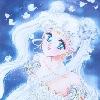
 2beats — Bleach: Volume Cover

Published: 2006-04-09 03:59:23 +0000 UTC; Views: 10955; Favourites: 196; Downloads: 491
Redirect to original
Description
Just something I threw together with this Ichigo/Rukia pic I've been working on. I tried to make it as authentic as possible to the actual manga covers (Japanese version, 'cause it's easier ) Does it work? D: I was never good with desktop publishing...
As for the pic~ gaahh... hakamas (is that what Ichigo's wearing?) are hard to draw. =__= I had outlined the whole thing before actually researching hakamas on the internet, and found out there were specific details on them, i.e. number of folds in the pants DX Too late! Deal with it, perfectionist peoplez~ Bwaha...
And I was surprised how much those anatomy studies paid off =O Don't think I could've drew Ichigo's torso without them!
 Sank yuu, George Bridgeman :3
Oh yesh~ don't forget to FULL VIEW! Details, details, details....
")
openCanvas & Photoshop7
Related content


Comments: 54

 (Smile)")


You did a really good job on this!! 
👍: 0 ⏩: 0

Really sweet idea of cover! Reminds me the first volumes of the comic...
👍: 0 ⏩: 0

jeez folds in the pants
"oh no i'm missing a fold! i have to reiron my pants *fapfapfap*"
👍: 0 ⏩: 0


This is a criiiiime to not fav. ;O; The anatomy is awesomely done, and I love how Rukia turned out on so many levels. The shading and the poses is impeccable, and the only thing I can find that needs a little tweaking would be Ichigo's face. The nose is just a tad too long-- that's all I could find in the entire thing that bothered me. xD You're so good! Wonderful work! You make me wish I had no homework so I could draw. XD This works very well as a manga cover. <3 Lovely!
👍: 0 ⏩: 1

Aw thanks so much! >< You're too nice
👍: 0 ⏩: 1
I think the reason that the artist doesn't like whatever they make is because they see it through the entire process. xD If just one little swipe of the digital paintbrush goes astray... XD
I need to take some life drawing classes. :0! Being self taught is sort of hard. XD
👍: 0 ⏩: 0

yeah...hakamas are japanese (ie - v. symbolic and...somewhat meticulous)
but otherwise this picture is sooo accurate and so cool! *squeals like a little girl*
hm. perhaps you can gather that...i like it!!!
👍: 0 ⏩: 0

Awesome work. Perfect poses and clarity for a manga cover. Don't worry about the hakama; they look just fine. I think pleat counts and etc. are mostly ignored when drawing for the manga, anyhow. I really like Rukia's hair and eyes, but my favorite part is the inclusion of the red spirit thread. I think her outfit might be a bit too brown, though...
👍: 0 ⏩: 0


amazing ^^ i'm just starting with photoshop so i can't do something like this, but well i'm still learning  (Wink)")
👍: 0 ⏩: 0


Omg,that guy has got ABS O____O
You always draw such dificult positions. I cant believe how you manige to draw them at all. You are really good
I like the lady and her outfit. She's very cute ^^
I love the shadows beneath them.

👍: 0 ⏩: 0

For once in 2 months, I actually checked my DevAlerts and your pictures were on top. XD yey~
I have never seen/read Bleach, but it seems to be everywhere and seems to star a guy with bright orange hair? ")
That aside, this is an awesome picture with pretty shadows, folds and motion everywhere. I can't explain why, but I really like the curve of the red ribbon relative to the girl's pose. It's like an...awesome red ribbon whip weapon WHAMSMACK. O_O
Nice~ XD
👍: 0 ⏩: 1
Thank you so much! ^___^
o____o
o____O *pop*
Ahem.. yea. Manga about death gods, hawt bishis, and brain-pummeling action panels. Highly recommend it XD
👍: 0 ⏩: 0


Ichigo's nose looks a bit weird to me, but his torso is definetely incredible! *_* Rukia r00cks! She looks so nice! ^___^
👍: 0 ⏩: 1
Nose? o.o *looks closer* Can you be more specific? Is it the shape, the shading? I really appreciate it!
👍: 0 ⏩: 1
I suppose it's both, but specially the shape. His nose looks to flat, while I've always remembered Ichigo's nose as a bit pointy and angular ^^u
👍: 0 ⏩: 1
Ahhh? Really? o_o Well, I did try to draw his nose more realistic, maybe that's why ^^
👍: 0 ⏩: 0

Ichigo and Rukia! It's nice to see your style of them. And of course Ichigo (look at them abs) is hot. I really like it!
👍: 0 ⏩: 1
*pokes the abs* Wants...to grope.... D:
Hahah~ Thank you
👍: 0 ⏩: 0

why, very authentic! but it's gonna be cooler if you add a background. a simple one will do just fine. ")
👍: 0 ⏩: 1
Thanks!
👍: 0 ⏩: 1
ahh.. i see.. it's fine!! by it like it anyways!
👍: 0 ⏩: 0

Your own personal style really looks good "reflected"- so to speak- on Kubo's characters. ^_^
👍: 0 ⏩: 1


i really like their poses...his is especially cool!... both characters look very dynamic...i haven't read bleach so i cant really tell if its authentic... but i like it anyhow...
👍: 0 ⏩: 1
Thanks! 
👍: 0 ⏩: 1
reading bleach was on my to do list anyhow... loads of people have told me that its worth reading
👍: 0 ⏩: 0

lol. very nice torso
for some realy i realy realy realy like their shadow

👍: 0 ⏩: 1
Thank you!
Seriously though, what kind of a 16-year-old has that kind of a body? XD

👍: 0 ⏩: 1
lol. they kind with crazy body-builder parents perhaps
👍: 0 ⏩: 0

Gwah~ Thank you! >< Such a tricky part to draw...
👍: 0 ⏩: 1


ummm ... knowing you have your own style and all ... isnt quite working for ol' ichigo here. everything looks very not fluid and stiff, almost like wooden mannequins. their expressions are very stiff, like something totally different from the manga style. my advice would be to redraw this again and throw some perspective to it to 'kick-it-up-a-knotch'. if you look at the linework made for bleach, or any monga, you can see there's some fluid position in body posture (contrapassoto?) to give life in the drawings. also, play with clothing fold dynamics, that'll totally bring more life to this drawing. i know you prob spend tons of time on this drawing already and would rather never do it again, but for educational sake, do it again and keep learning! even if its not your style, you can always pick up something that you can use later in the future. whelp, enough of my boring typey-type, keep up the good work! d ~ _^
👍: 0 ⏩: 1
Ah, thanks for the crit
"For educational sake", I'll take your advice into consideration and try to incorporate it in my other pics, but I don't think I'll be redoing this pic again

👍: 0 ⏩: 0

nff~ It's a bleachy cover! XD
;_; I can never get the anatomy... *cries* I love your windy clothes blowing effect that u always use~ It's so coolllll~~~ *O*
👍: 0 ⏩: 1
| Next =>