HOME | DD
 depthskins — d2networx

Published: 2005-10-13 17:51:05 +0000 UTC; Views: 3330; Favourites: 17; Downloads: 126
Redirect to original
Description
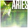
These 3 design structures are for d2networx, a design company that has a promising future should all go well. With some inspiration from other designers at DA I managed to design this for the company. Now, you notice 3 design with different structures. This is because there's d2identity, d2servers, and d2networx. The first 2 comes as a department under d2networx just as depthskins.com would be a department under d2networx. Each dept is responsible for a specific service. I think you get the idea by now.NB: Depthskins only comes under d2networx should it be established well. As of now depthskins is standing alone.
ALSO, NO RIPPING OF DESIGN. It's for a live site so please, let it inspire but do not RIP. All comments are welcomed.
Example of a person that inspires me would be informer ( [link] )
Related content


Comments: 29

Very clean and very well presented man, good work
👍: 0 ⏩: 1

its really nice mate... I like the clean of the interface and the nice use of icons and images, ... simple and effective
👍: 0 ⏩: 1

thanks alot for your comment.
👍: 0 ⏩: 0

Its very gud man!! I like it!! definately a :fav+:
👍: 0 ⏩: 1
thanks alot for comment and fav.
👍: 0 ⏩: 0

")

very nice! I really love the little navigation-icons on top!
👍: 0 ⏩: 1

You should pay more attention on the notebook and his mirror image . in real it isn't like that . think about it
I like it .
👍: 0 ⏩: 1
Thanks. I will. I'll change it.
👍: 0 ⏩: 0

Simple, effective, & professional: That's a really great layout
👍: 0 ⏩: 1


Quite good project. Everything is well placed. I don't like one detail : button "learn more" in the first example.
👍: 0 ⏩: 1
Yea...i didn't want to put it in but my partner who's also in it suggested it go in...i made it look as good as possible. Might take it out.
👍: 0 ⏩: 0
I was wondering about the icons as well. Who did create them or where did you get them from? I have been looking for some time. As for the layouts there very nice there clean and they look pretty dang professional to me. Some of the text are a bit hard to read but I can read them all easily but I have great eyes so it may be harder for others.
👍: 0 ⏩: 1
yes, if anything I'll fix the fonts. I have on anti-aliasing in photoshop for fonts so it would look blurr. Anyways, those things can be fixed easily.
Thanks for comments.
👍: 0 ⏩: 0

nice one ^^ I really like this
Hmm, what exactly do you mean by "...With some inspiration I managed to design this for the company."? Just curious, it sounds kind of weird to me. I mean, you can't really do anything without any inspiration, so to me it sounded more like you got inspirated by another site - aka it looks very much like the site in question (I'm not saying it does, and I don't even know which site I'm talking about, that's just how it sounded).
Over to the graphics. I like the navigation, and all the icons (have you made them by yourself?), but the alignment is somewhat off - there seems to be more space on the right hand side of "Contact" than on the left of "About". The text size of all the content is too small, and setting it in light gray won't really make it easier to read either. The headlines could use with some bigger text size too. Last, the reflection of the laptop (iBook?) is totally wrong - if you think about it can't create a reflection like that (one should see the bottom if it's "flying" above the floor, and if it's lying on a sloping floor one should see the reflection along the whole laptop).
Overall it's really nice  (Smile)")
👍: 0 ⏩: 1
All my designs are inspired by other designers and sites. Some are right here on DA, you yourself is one. I look at your work and I observe and absorb certain things. So no, doesn't look like any site I know of but like i explained...it was inspired. By inspired I mean...style and all that.
About the laptop reflection...that was put there to give an insight about what I want. I'll mainly purchase a 3D Model for the laptop if it was to be developed. That way i can set it how I like.
👍: 0 ⏩: 1
oh and of all the icons, I didn't create 2 of them which I'm hoping to change. Forgot the mention that.
👍: 0 ⏩: 1
that's the spirit!
I actually came across this webdesigner who used loads of stock free icons in his own portfolio, which is just plain wrong in my opinion. So, really great work with the icons ^^
Ah, yeah that makes sense. That's what I think is so great about dA - the inspiration is like, infinite.
I see. That sounds great. Even if one maybe could re-create a more realistic reflection in photoshop, it would really be a pain.
👍: 0 ⏩: 1

I like it - It's very clean and professional looking. Nice work
👍: 0 ⏩: 1
Thanks alot. The aim for design was simplicity, professional and stylish...Sure hope I got that.
Thanks for fav also
👍: 0 ⏩: 1
Yep, that's what you go.
And you're very welcome.
👍: 0 ⏩: 0