HOME | DD
 Faraday-of-Skarabost — Starlight Slumber...

Published: 2009-10-16 02:28:44 +0000 UTC; Views: 1000; Favourites: 19; Downloads: 0
Redirect to original
Description
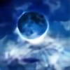
... gifts one with dreams most serenemade for 's Fantasy Landscape contest [link]
Maiden: [link] by
Meadow: [link] by
Clouds: [link] by
Moon: [link] by
Stars: [link] by
Related content


Comments: 41

Well, it's nice overall, but here's somethings I disliked. The sky is very noisy and the woman seems to be floating in air, fix that and the pic will be awesome!
👍: 0 ⏩: 1

noisy? I am not sure I understand what you mean.
and I have edited this piece, how does it appear now?
👍: 0 ⏩: 0

it looks great
only i think you should work a little more with
where the girl is laying down
like its really obvious right now that she was pasted there
bring more grass forward around her head and body
other then that great job with the colors
i think its very hard to get images to be the same tone
but you did a great with that XD keep it up
👍: 0 ⏩: 1
thank you
I have edited this piece, how does it appear now?
👍: 0 ⏩: 1
oh wow great jobb
she looks like she is originally part of the image now
XD great editing ^.^
👍: 0 ⏩: 1
Your welcome ^.^
👍: 0 ⏩: 0

I like the way how the clouds look transparent and how everything is in the same colour scheme.
And the thing with the grass was mentioned^^
👍: 0 ⏩: 1
I have edited this piece, how does it appear now?
👍: 0 ⏩: 1
I think it looks muuuuuuuuch better now
Like real
👍: 0 ⏩: 1

She seems to be flying on top of the wheat - I don't know whether that's on purpose or just because it's really hard to make it look right, but I think it looks wrong. Maybe it would have been better if you had chosen something else for her to lie on.
The sky is really beautiful, but as others have said before me, you might want to make the clouds darker. The moon is perfect!
👍: 0 ⏩: 1
I have edited this piece, how does it appear now?
👍: 0 ⏩: 1
A whole lot better with the way she's lying
👍: 0 ⏩: 1

I agree with :iconspeldor-of-susan:
The stars seem a little fake and Also there seem to be way to many of them. I also noticed that there are stars on top of the clouds.
The clouds should also be darker. Even if you had a full moon it wouldn't be bright enough. You would need to darken the clouds. Another thing. The moon seems to blend in with the clouds.
Also with the girl she seems like she's floating. doesn't look natural. You need to bring grass up around the contours of her body to giver her the sink look.
Overall it's a very beautiful piece. Just needs a few things fixed. ^.^
👍: 0 ⏩: 1
the stars are actually under the clouds
and I have edited this piece, how does it appear now?
👍: 0 ⏩: 1
Makes sense.
It looks alot better. You did a good job.
👍: 0 ⏩: 1
Thanks :-D
👍: 0 ⏩: 1
no problem
👍: 0 ⏩: 0

Like the concept, but there are several things wrong with it. For starters, a lot of your stars look fake. The smaller ones are alright, but the big ones look like your regular dot of a paintbrush in paint, and that's not what you want. Either make them smaller or make them more star-shaped so that they're not perfectly circular.
I love the moon you added in there. That brings me to my second point; even with the moon there, there wouldn't be enough light to illuminate the clouds so. There's not enough light from the moon for that and not enough light from the ground, so the clouds should be a lot darker, almost dark grey.
Lastly, I love the texture of the grass, but the girl is lying on top of the tips of the grass, not in the grass on the ground. It's like she's floating, and that makes it seem as though you just ctrl-V'd her there.
👍: 0 ⏩: 1
I have edited this piece, how does it appear now?
👍: 0 ⏩: 1
Love it. The clouds have been darkened nicely, now they actually feel like clouds at night.
Also... The way the grass now molds around her body and dress is fantastic! She's not floating on top anymore, instead she's really nestled into the grass. It's fabulous.
")
👍: 0 ⏩: 1
Thanks! I am glad you enjoy it and thank you for your suggestions before ^_^
👍: 0 ⏩: 0

From #GimmeFeedback . It's nice. I do like this and I like the concept, but I would comment that I can see white space between some of the added grass and the bottom, which is to say that it is grass sort of sitting on the dress rather than looking like it properly was there.
👍: 0 ⏩: 1
I have edited this piece. How does it appear now?
👍: 0 ⏩: 1
Much, much better.  (Smile)")
👍: 0 ⏩: 1


