HOME | DD
 ivanjs — Abstact Female 3

Published: 2005-03-19 20:23:07 +0000 UTC; Views: 1572; Favourites: 22; Downloads: 78
Redirect to original
Description
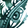
This is the painting I did based on the preliminary drawing I uploaded here earlier ([link] ).Acrylic on canvas, about 56" x 48".
Related content


Comments: 16


I really like the structure and form of the composition. Excellent use of color and really stylish design. Nicely done.
👍: 0 ⏩: 1

Thanks! Appreciate the comment.
John
👍: 0 ⏩: 1

Nice use of vivid colours. First glance reminded me of some sort of a Night on the town piece. I stepped about 10 feet back and immediately saw the figure's shape from the waist and below. However, the upper body still is a little haze. Is she lying on her stomache?
👍: 0 ⏩: 1
Actually, if you look at this drawing, it might make more sense-the painting is from this drawing:
:thumb16194635:
Her hips are on her side, but she is twisted so that her breasts are facing the blanket. The model actually was laying like this when I drew her, as painful as it looked, LOL!
John
👍: 0 ⏩: 1
oh i see, indeed, quite a strange position. Did you have her lying down like this, or was it just a..er..coincidence perhaps?
👍: 0 ⏩: 1
She originally lay on her side, and I asked her how difficult would it be for her to put her head on her arms, so she twisted into this position. I asked her if it felt comfortable, and she said it was fine.
John
 (Smile)")
👍: 0 ⏩: 0

wow .. amazing abstraction and even more amazing usage of colors
i think [sinse i'm a constant nag/nitpick] that u could use some leveling work on it.
i guess u can contact me by notes and i can do it for you
cheers
jaako

👍: 0 ⏩: 0

First I have to say that I'm really impressed by this painting. At first sight (without the title) you wouldn't even notice that this painting depicts a female body. Considering the lines the body merges very smoothly with the rest of the painting, even if the it is nearly clear-cut by the black lines. There are not too obvious differences in the brightness that would define fore- and background, create depth and perspective or distinguish important from unimportant parts. The painting appears as a whole. It's the colour tones that help you at first to "find" what the painting is about. I recognized the legs and the region of the pelvis quite immediately, but I had problems to "see" the upper part of the body correctly. First I thought the thorax was completely contorted and I'm still not totally sure if I assign each shape to the right part of the body.
There are other interesting things: For example the lighting resp. brightness vs. darkness. On the bottom border between body and "?whatever?" (right leg, elbow, ...) the black lines are quite distinctly thick. This would connote shadow. But in the lower middle and left there are this bright blue, yellow and green; brighter than in the top, so that it seems (to me) as if the she was levitating.
Anyway, I like this painting very much. It is colourful (but they seem to be chosen with some consideration or after a good instinct), from what you can see on a photo it is skilfully done, it's catching your attention very easily and it's still very interesting after you have looked at it for some time.
👍: 0 ⏩: 1
Thanks, crimbil for that incredibly professional critique! I struggled with the colors to be honest-now I know how mapmakers feel, trying to create maps with a limited palette! The hair was blue for a long time, but then the whole painting had too much blue, so i switched it to purple, and it still didn't do it for me. So I finally stepped WAY back from the painting, and it became obvious that the hair had to be green if for no other reason that it repeated the green in the thighs and on the lower third of the painting and helped create unity, which is what the painting was missing all along.
Thanks again.
John
👍: 0 ⏩: 0

Thank you Ashleigh! I always appreciate your insight!
John
👍: 0 ⏩: 0

I agree with kuroboom *ooooh ahhhhh* It's almost devasting how beautiful this is!
👍: 0 ⏩: 0

")