HOME | DD
 kayne — grandeur anonymity

Published: 2004-07-19 16:10:48 +0000 UTC; Views: 3043; Favourites: 83; Downloads: 810
Redirect to original
Description
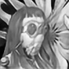
another vector100% illustrator
no 'cheating' involved...
Related content
Comments: 59

See I nearly missed this first time around, but having spied it on your site I fell in love with it - love the shapes and styling at work here - and of course - vector = yum
LL
👍: 0 ⏩: 0

great work...i myself prefer organic and not geometrical shapes...bt i guess i can digest this, 
👍: 0 ⏩: 0

omg i love this. its awesome! i love the whole style and technique used around it 
👍: 0 ⏩: 0

nice... expecially those brown texture things that're coming outta his head. hehe
👍: 0 ⏩: 0

you seriously need to put this up on deviant prints... I'd buy one!
👍: 0 ⏩: 1

It is, it is! 
Thanks so much!
👍: 0 ⏩: 1

Excellent!
This will go great in our pool table room! ^_^
👍: 0 ⏩: 1

* Keeps hoping to see that a new print has sold...*
Hehe, hope you are still interested in getting this one.
👍: 0 ⏩: 1

haha I definitely am!! 
👍: 0 ⏩: 1

I love your use of color...and the soft vs. angular.
Museum quality, methinks.
+fav
👍: 0 ⏩: 0

Wow!
This appears to me as Art Nouveau on speed!
Kinda like someone took that style from the late 19th/early 20th century and put it into a contemporary context, thus creating something unique and fresh.
Kudos to you for this brilliant and outstanding artwork!
👍: 0 ⏩: 0

This is amazing, you really mastered to show much but to stay simple. Cool.
👍: 0 ⏩: 0

its great
the thin distinction between the darkness and light behind the figure give just enough information to make out the forms of the body.
the hair is great, i love those papery-like objects scattered in there.
id love to see this without a frame though, maybe just with the brown background covering all the design, just to see what it would look like. But having said that i can see why you framed it in such a way, so it by no means looks bad the way it is.
infact its a fav.
👍: 0 ⏩: 0

really, really cool. I love the layering. The highlights on the girl are great too.
(if you check out my vector, look in scraps)
👍: 0 ⏩: 0

This is what I call true vector art! I notice that most "wanna be" vector artist only copy photos, this requires vector skills, but absolutely no creativity is involved. And who wants a piece of "art" that's just a photo copy? This is by far the best illustrator work I've seen here at DeviantArt. I can't wait to visit your gallery!
This has to be added to my 
👍: 0 ⏩: 0

Wow... very stylish. I like the natural colours in it and I think the circular curves used in it hold together well. Once again another master piece from the master himself
👍: 0 ⏩: 0

it makes me wish i could get inside your head for only ten seconds. it would show me a lifetime of ideas.
👍: 0 ⏩: 0

If I'm going to buy a print, it stands to reason I should 
👍: 0 ⏩: 0

This reminded me of Dali for some reason. Maybe the colors or that it's abstract. I really like how you kind of used the rule of ninthes... yeah, that's me being technical. Anyway, great work.
👍: 0 ⏩: 0

beautiful colors and lines. I truely admire the 100% illustrator. Great mix of abstract into this as well. Good work
👍: 0 ⏩: 0

This is gorgeous! Looks Grecian...has the Olympics Committee called you for a poster?
👍: 0 ⏩: 0

Holy shit this is good. You are evolving. I thought u had talent before. Now i do again. That looks amazing Scott it really does.
👍: 0 ⏩: 0

The detail in the two-tone face absolutely astounds me: the tiny shapes and curves that show where the lips, nose, and eyes are. The gradient blue circle really pulls it together, too. God, I wish I knew how you came up with this stuff. Top notch.
👍: 0 ⏩: 0

i agree with everyone here
you hit the mark with this one
very classy....like some cubist vector mucha
great work
👍: 0 ⏩: 0

I really enjoy your color choices, they arern't often used together, brown is rarely used anymore it seems. 
👍: 0 ⏩: 0

Wow! I'm a big fan of this one... I might have to 
👍: 0 ⏩: 0
| Next =>


