HOME | DD
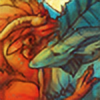 KGMomo — Turkey Vulture Painting

Published: 2011-10-28 06:26:30 +0000 UTC; Views: 4467; Favourites: 111; Downloads: 61
Redirect to original
Description
This is the second half of this assignment;Wow was I tired! Now that I look back on it I can see the problems :'D
Thank you everybody for coming onto the livestream while I was working on this! I couldn't have done it without you. I'll try to have another stream again soon.
Related content


Comments: 19

It looks huge and epic :0 great job on the details!
👍: 0 ⏩: 0

Woooow! This is really cool 8D The foremost wing looks a bit to long or so, the rest is epic 8D
👍: 0 ⏩: 0

ohmigod id be terrified if that was on our table for thanksgiving haha. good job!
👍: 0 ⏩: 0

Hello, SunMoon here from #SeriousArtists  (Smile)")
First off, I would like to say that this is a lovely concept! I really like the idea of combining two birds together to form a new one. ^^ When I saw the thumb I immediately thought of those two birds. C:
Okay now for some help with your piece. I don't know how rough you want to keep it, but right now it is still a bit too rough. What I mean by that, is that there isn't a central point of focus. I haven't got anything that draws my eye, okay my eye wants to go to the head (your eyes always look for eyes too) but it has the same kind of roughness that makes it hard to focus on. Maybe if you work out the head some more, by sharpening your brush-strokes, giving it more details, it will becomes more the centre of attention. But if you don't want the head to become the centre of attention, you can always choose another spot.
And another thing that might need some more attention is, is the background. I know that it probably is a kind of canyon with trees but it could use some refining too. I can tell from the bird that the light is coming from the left upper side, with the sun as a light source, but I can't see that return in the background. I don't know how your layers are arranged, maybe the bird is on the same layer as the background and then it might me difficult to work on it.
Found a few photo's that might help for the background: [link] , [link] , [link] Notice how rich in colour the rocks are and how they get more bluer as the disappear into the distance. Playing around with different colours, also for shading, might help with giving the piece more depth, for the bird as well as the background. You already have lovely colours on the bird and they make a good base for some further experimentation.
Finally I want to say that this is a lovely piece as a whole. With the bird standing proud like that and being alert at the same time. And I still really like the fact that you merged to birds together and that you got something that could walk around for real. I hope my comment helped you a bit and good luck with it too! ^^
👍: 0 ⏩: 1

i'd have to agree that there does seem to be a lack of a focal point, but i had a hard time figuring out why,as the image is pretty well detailed and rendered at the head. there's also a the color difference that should draw the attention to the mouth area. the conclusion i came to was that the colors in the background and on the subject are very similar, which seems to break the image into interesting shapes more than it does the concept you're communicating with the creature, (which isn't to say you haven't communicated your concept really, really well, because you have). i would suggest adjusting the values on the subject to really give it a 3d feel, right now it communicates a flat feeling. in the immediate context around the subject, i would also communicate it's form by hitting the surface it's standing on with a hard shadow from the creature, right now the whole rock looks like it's in shadow. since having highlights on the rocks in the foreground would serve to further confuse the back and foreground, the BG might need some color adjustment at that point to push the depth.
and thank you for submitting this to SA, critting this took a good deal of thought that's pushed my ability to crit!
👍: 0 ⏩: 0

o_o You draw the most epic things. I love how fat/fluffy it is <3
👍: 0 ⏩: 0
Ah, he's so dynamic and awesome. Those wings are lovely, and I'm digging the painterly, organic style/
👍: 0 ⏩: 0


Beautiful again! The design looks really neat and I really like it's pose :3
👍: 0 ⏩: 0


Yay I can see it now! By the way, where can I see Antissa?
")
👍: 0 ⏩: 2

oh!! that's right derp I better go upload the stream doodles :'D thank you for reminding me~
👍: 0 ⏩: 1
Hehe ^^
-bashes computer- Firefox keeps crashing when I use drop down thingys D:
👍: 0 ⏩: 0