HOME | DD
 LivingAliveCreator — Why Me?

Published: 2013-03-03 02:24:00 +0000 UTC; Views: 5741; Favourites: 339; Downloads: 21
Redirect to original
Description
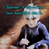
Another Jack Frost picture, he is so fun to draw! 0____________oClearly I'm not getting any better at drawing mountains......
Anyone got any ideas?
Related content
Comments: 41

👍: 0 ⏩: 0


First off, I'm going to start by saying that this is a GORGEOUS piece. No, seriously. From the expression and emotion, to the technique, this piece is seriously beautiful. Even if it is fanart, if I had points or moneys, I would seriously consider buying a print of this. Entirely serious! Now~ On to the nit-picky critiquing.
I do want to note, first, that everything I have to say is of opinion, and of a constructive intent. I by no means intend to bash your work, flame it, degrade it, or any of that nasty shenanigans that some people do. Now, with out further ado, let's proceed~!
The sky: WOOOAH!!! I LOVE this sky! Just... MMMM! GORGEOUS! Hahahaha~! e.deviantart.net/emoticons/h/h… " width="15" height="13" alt="

The moon is very well and realistically done. The different values really give it a feeling of reality, like I will look into the sky and see that very same moon in the sky outside my window. You can see almost individual craters in some areas, while others are too busy reflecting the sun's light to let you see the bumps and grooves. Yet at the same time, you didn't use the same white all throughout; there is value in it. Some of it is lighter than other parts. And all of that combine really makes it stand out, makes it look realistic.
The stars! Again, it looks like I could look out my window right now and see the exact same thing. Some stars are duller than others, while some appear to be just glowing, twinkling. The way you pulled it off was sooo successful. And to top it off, the stars aren't evenly spaced - and in reality, they aren't. Some artists do space out their stars evenly throughout their pieces, and though it may look nice for the piece, it's not realistic. You don't find evenly spaced stars in the sky. So, you did an excellent job creating the stars in the sky. Bravo!
The clouds look great. The technique you used really makes the clouds stand out from the moon and the rest of the sky. The value you put in the clouds is very well done as well. However, the way you've done the clouds, though they are fantastic, do not look as realistic as the moon and stars. The technique you used almost makes it look like they come from a painting. But here's the cool thing: though they do not look 100% realistic, the clouds do not take away from the rest of the sky or the rest of the piece. In my opinion, they add to the piece, giving it a variety. I think the technique that you used was very appropriate for the piece you created. Nice job.
The colour of the sky, though, I think could've had a bit more... well... oomph in it. I mean, yes. If you look at it hard enough, the colour of your sky has different values in it in some areas. And around the stars, the difference in values is evident and very well done. However, I think that the area closer to the mountains needs a touch, just a touch, more value in it. Not like a lighter tint or a lighter value, but maybe a little darker in some areas, areas with a less or no concentration of stars. That is just my opinion, though. You do not have to take my advice on it. e.deviantart.net/emoticons/s/s… " width="15" height="15" alt="


The landscape: Let me start out by saying that I LOVE the mountains. They honestly look like real mountains. Like... I don't know if you live near mountains, looked up pictures of mountains, or what, but you know your mountains my good sir/ma'am. Again, I like how you used different techniques to create the different features of the landscape. It really brings out the different qualities of each, and I am LOVIN' it! Hahahaha~!
The mountains, well... I already talked about the mountains, so I really have nothing more to say there... e.deviantart.net/emoticons/a/a… " width="19" height="19" alt="

The tree, now, is different. I have a few comments to make. First, in comparison to the rest of the picture, it looks more like it came out of a comic or a cartoon. I have no idea if it was your intention, but it really separates from the rest of the picture. Part of what makes it look cartoony is the outline around the side closest to the tree. Now, I understand it's kinda like a silhouette, however, I think that the values in the lightest part of the tree could blend in towards the dark. Of course, you need to leave room for the values in the texture of the tree, but if you smooth out that really light value and gradate it into a gradually darkening surface, the tree will look more three dimensional and realistic, rather than off of a two dimensional comic book. I also think the gradation of value would add to the lack of value in part of the trunk and branch. I feel it needs just a bit more value in those parts. Also, I was wondering if that faded white around the tree was fog/clouds or frost, because it's identical to the white around the mountains. I'm not sure if there is supposed to be a difference between the two or if it's the same thing. Just wondering. e.deviantart.net/emoticons/a/a… " width="19" height="19" alt="

Jack Frost: Now this is where I could see you wanting to leave the tree to look more comic book styled. I like the style you drew Jack in because it makes him stand out from the rest of the picture. And there are a few things I want to point out about him.
First, you've already earned MEGA brownie points with me, and let me tell you why. No... Outlines... NONE! And it makes me REALLY happy because not many fan-artists erase the outlines. The outlines are good for some comics and some pictures, however most of the time, its better and more professional NOT to use outlines. Instead, it's recommended for artists to let the contrast values create that distinctive line, which is exactly what you did! And the contrast is so crisp and neat, it looks great!
Second, the position his is squatting in is well done, but I really didn't think it was in his demeanor to lounge or sit as you have him in the picture. I mean, it looks great as is, but in my opinion, I think it would've been more in character if you would've used a different position.
Third, the value in his clothes is fairly good; however, I think it needs a little more. The value in his clothes need to be a little more dark, I think, to show that there is a gradual contrast between his hoodie and pants that are in the moon light, and which parts are not... kinda like the tree, only not quite that dark. Also, there isn't a lot of value change in his hair. It's honestly done very well, I just think it needs to have more shadowed locks and needs and area that is getting absolutely no moonlight exposure - that small area is, like I said, going to be small, the smallest area of the hair.
Other than that, I really don't have much to comment on him, other than that the staff looks great and the texture shown in the staff is excellent and very well done.
Like I said before, this piece is phenomenal. I really like it and love how much effort was put into this. You did an excellent job. Give yourself an cookie, and keep working to improve~! I can't wait to see what the future holds!
~Dark
👍: 0 ⏩: 1

Wow, that was probably the nicest and most thought out critique I have ever read! Your feedback really means a lot to me. Thank you for taking the time to analyze my work!
👍: 0 ⏩: 1

Hey, it was no problem, and I really enjoyed writing it out. When I analyze someone's work, I try to give the best critique I can possibly give, and to the best of my knowledge. I make sure to give 110% so that the other person can have the opportunity to grow tremendously. I love seeing other people improve, and I love helping them get there. I also enjoy doing it because I, myself, can learn from it.
I hope you find it useful for the future and that you will be able to grow very much~!
👍: 0 ⏩: 1

Thank you!
👍: 0 ⏩: 1

Anytime~!
👍: 0 ⏩: 0

Did you ever realize that the Man in the Moon had a face in the movie? I seriously just saw it the last time I watched it!
👍: 0 ⏩: 1

No, I didn't realize.
👍: 0 ⏩: 1

Haha! I didn't either, until about the 200th time I watched it! 
👍: 0 ⏩: 1

Awsome pic,I love everything about it from the scenery,to the colors,Jack frost is one of my all time faves of fan art,great job
👍: 0 ⏩: 1

poor Jack he was so young when he became Jack frost.
👍: 0 ⏩: 0

It's so beautiful :3 and the emotions in it is amazing, you are very talanted my friend.
And the mountains looks amazing as well, just to let you know
👍: 0 ⏩: 1

Thanks so much, I'm glad they came out because I always struggle with mountains
👍: 0 ⏩: 1

You're very much welcome :3
And they look perfect
👍: 0 ⏩: 0

omg i see a shadow or a form in your picture on the top left hand it looks like mythology like a Pegasus
👍: 0 ⏩: 1

I actually really liked his character! You should draw the battle between Jack Frost and Pitch!
👍: 0 ⏩: 1

Might do!
👍: 0 ⏩: 0


