HOME | DD
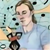
 Lizzy-John — Aqualight

Published: 2005-07-26 16:37:46 +0000 UTC; Views: 10425; Favourites: 206; Downloads: 584
Redirect to original
Description
got to doodlin'")
Related content


Comments: 21

Overall

Vision

Technique
Impact
You are an AMAZINGGGG artist, so I'm just gunna focus on things i think could improve:
First, I feel that the creature's pointer finger is oddly sitting on top of its body and doesn't have enough depth/definition.
I feel that this piece is not as saturated as it could be. For a more dramatic effect or "Impact" with this picture, I'd darken the darks a little more. Otherwise, the viewer will glaze over parts of the picture (like the bottom) since its not arresting their eyes. Its crotch and leg is mostly what I mean. The head of the creature, however, takes the most attention when viewing since it is 1) centered and 2) more detailed in its aesthetics. The head has more shading, more highlights, and is overall more dynamic. As a result, the head seems detached from its body.
This is a doodle, so I know you probably didn't do your full effects and thingse.deviantart.net/emoticons/s/s… " width="15" height="15" alt="
 (Smile)")
The largest thing that I thing I can critique this piece on is its motif/central theme. I feel that your other creatures have a more solid shape and motif that is memorable even as a silhouette.
In contrast, I feel that this creature is not as centralized in its idea in comparison to the others and is just a tad bit weaker. The others have simple ideas with complex design that stay better with the viewer:
i.e. Snowcap= path turned monster, Nuclear Planet eater= bulbous shape, etc.
Its hard to say alot because its only a headshot, but you hinted to its overall shape. I recommend mostly that you continue those yellow bump things a little more around his body to really make this creature unique(cuz those things are really cool!) . I'd also recommend defining the texture of the white things on his head to better bring this creature to life in one's mind.
Its overall a strong picture in which i feel the execution beats the concept.
These are just my opinions as a viewer rather than a senior in skill. I absolutely LOVE your art. Keep it up!!! e.deviantart.net/emoticons/b/b… " width="15" height="15" alt="
")
👍: 0 ⏩: 0


it's so simple, but the glow on the edges are perfect for it!
👍: 0 ⏩: 0


I love the colors. O____o Now I'm afraid it's gonna eat me next time I go swimming.
Excellent job!
👍: 0 ⏩: 0


 (Wink)")

It's kinda all the same color. But the subject is damn cool.
👍: 0 ⏩: 0

Why that's a scare but cool pic another demon to ice
👍: 0 ⏩: 0

I like the lighting, but IMO you need to do more dramatic stuff with it. The majority of your pieces have practically a "Deafult lighting" with some highlight off to one side. I'd like to see something different from ya!
Also, all your hands look the same, nice, slender fingers, monsters have claws. Try doing something a bit more rugged too, because all your hands seem to be getting repetative!
And if he is underwater, how can he drool like that o_O
👍: 0 ⏩: 1

who...said he was underwater... O_o
and I like slender hands and fingers... So I draw them a lot O_O totally silly but can't help it XD thats how it is.
I should do different lighting though, you're right, I'll try to be a bit more creative in that respect in the future XDD thanks a lot dude
👍: 0 ⏩: 0

Looking at yer doodle and tracing the lines with my eyes. I can see a lot more flowing and motion going on..Its got more life and freedom almost. At a quick glance it is your usual cool skillful style, but at closer look this one has a different feel, character and life from some of your other pieces. Did you feel a bit differently when you made this fine doodle?.
Also i am wondering how the whole you getting a prints account or not is working out..Decided to get one or not?.
👍: 0 ⏩: 1
well... usually I try to do a bit of plannin with my drawings, but this one was sorta spur-of-the-moment-draw-what-I-feel-like-kinda done O___o;; maybe that's it?
as for the print account, I will probably get it...I dunno how soon though. In the end I was convinced into it by my family... though they offered a really depressing argument XDD ack.
Thanks much for the kind comment
👍: 0 ⏩: 0


