HOME | DD
 mediocrelife — Sabino

Published: 2006-02-05 23:07:18 +0000 UTC; Views: 724; Favourites: 21; Downloads: 88
Redirect to original
Description
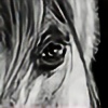
Uh, practice. Nothing I did turned out very realistic (disappointment), but I happen to like the mane despite of that. I am so slow though, I started this in January. Hopefully the next drawing I post will include a background, or at least more interesting subject.Related content


Comments: 50


screw realistic. This is awesome. I love the texture and the colours, the way you did the white areas... and that mane!! It's gorgeous! I love how you made it wavy. The blue eye is really nice too.
I love the blaze and how the brown flecks into the white. this would look nice on a model actually
👍: 0 ⏩: 1

Well, if you get the inspiration, feel free to paint it on to a model. XD
👍: 0 ⏩: 1
lol I will definitely consider that
 (Wink)")
👍: 0 ⏩: 0

i am a huge fan of your drawings bridgett, and i always get excited when i see your name coming up in my watch centre as well as i love watching you and seeing your improvement! 


sorry for the late comment btw, i've been pretty busy lately

👍: 0 ⏩: 1
Oh thank you so much! You always have such nice comments and they mean a lot to me.  (Smile)")
👍: 0 ⏩: 1
you are mostly welcome bridgett! ")
👍: 0 ⏩: 1
It's okay! lol. I know sometimes we go through that "busy phase"... Ive been doing a lot of school work lately, so it's being taking up a lot of my time!
👍: 0 ⏩: 1
i am extremely busy too ")
however...


👍: 0 ⏩: 0

The mane is just fantastic! Nothing to improve there.
Since you asked for critique, I think the reason why it isn't looking as realistic as you'd hoped is due to the way the shading was done. It's not that you go from light to dark to quickly or anything, that's fine. What it is, is that the darks are all the same tone

👍: 0 ⏩: 2
Wow, that's why I love DA because of the thoughtful and helpful comments. You achieved what I wanted to do in the first place. I understand what you are saying and I take your advice to heart. I never would have thought of the midtones for their own sake, so thank you. You make sense, so hopefully in my next colored picture will show even more improvements. Thanks for taking time out to show an example and correct my drawing (I was going for that anyways.) It's greatly appreciated.
👍: 0 ⏩: 0
(continuation from last comment after accidently hitting the submit button 
👍: 0 ⏩: 0


Thank you. I made sure to stay away from purple cause last time I did a bay with purple tones, he looked so weird because I didn't do it right. lol.
👍: 0 ⏩: 1

Yeah. Purple believe it or not goes better with shading for horses with palameno coloring.
👍: 0 ⏩: 1
really? wow. thanks for telling me.
👍: 0 ⏩: 1
Yes it does. Sorry for using my picture for an eample but in Kleos home [link] . I knew her coloring was an orangy broun so i got out my handy dandy color wheel, [link] 
👍: 0 ⏩: 3
I hope you do. The trick is to keep layering color and keeping your hand light so that the color doesnt get so thick that the page wont take any more. I spoke to a coored pencil artist at an equine expo a couple of years ago and she said she would put at least 25 layers in each area of each picture she had ever done.
👍: 0 ⏩: 0
Lmao, that's okay, I just figured the weirdo stuff was just a freaky computer accident. That's interesting though... and bold to me. haha. I'd be terrified to use those colors... I am... but I will get daring and bold and do it one day. XD
👍: 0 ⏩: 0
ok please ignore the mumbojumbo after the smiley and the smiley. I copeyd and pasted a site I've useds before and it did that but the link still works.
👍: 0 ⏩: 0

I think it's indeed the eye-ear thing that's looking wrong, further you've captured everything pretty well, I love your style 
To add a bit of critique myself - since you asked for it. *thinks* I think the shinyness - while it's one of the prettiest things too - is one of the things making it looking unrealistic. I think the shine is too... exaggarated. You use to do a lot of highlights, but there might be too many in this pic... It's bit difficult to explain it in English for me, I'd have added a better description of what I mean, but I hope this'll do.
👍: 0 ⏩: 1
I have to agree, I think the shine, overall, is exaggerated, but I have such a bad habit of doing that. I tried to tone it down, but it didn't work very well. I think the darks are way too dark, or there's either too much of them in certain places and there's too quick of a change to lighter colors. Don't worry, I understood what you said. Thank you for your critique.
👍: 0 ⏩: 1
Okies. Yep, but I think that you don't even have to change it too much to make it look better... Aaaand me lufs teh pic ^^
👍: 0 ⏩: 0


There are so many color fluctuations going on in this piece, its crazy. I like it. While it doesn't have any of that "photo-realism" going on, its got something more,....something more modern. It is as if you were experimenting not only with colors, but shapes as well. Very interesting piece. Love the color of his eyes by the way.
👍: 0 ⏩: 1
Haha, I know what you mean about the color fluctuations; he could almost be a mountain with all those extreme highlights and shadows. But thank you for your input because I never thought of the "shapes" concept. I already knew my drawing had quick changes from light to dark and it was just interesting to hear that (because his neck does look like a bunch of shapes.)
👍: 0 ⏩: 1
You're welcome.
👍: 0 ⏩: 0

Fantastic detail and shading in this piece. I noticed you have advanced critique encouraged, so after staring at this picture for 10 mins i finally found a fault ;D The base of the nearest ear looks a little odd from this angle, maybe the base should be more behind the ear than infront? Just my ten pence though, and if you used a reference picture then you can probably prove me wrong, but hey
👍: 0 ⏩: 1
lol. I'll go look at the reference again... thanks for pointing that out.

👍: 0 ⏩: 1
yw
👍: 0 ⏩: 0


I'm glad to hear you like it.
👍: 0 ⏩: 1

It's much better than anything I can drawm of doing!!! Great work hun!
👍: 0 ⏩: 1
lol. I wouldn't know about that; some of your drawings amaze me, esp. those digital drawings.
👍: 0 ⏩: 1
I guess we all have out quirks and your's certainly is colored pencil!
👍: 0 ⏩: 0

Wow this is very beautiful you draw and paint horses so very well your art makes mine look like they where drawn by a twelve year old.
👍: 0 ⏩: 1
Psh, whatever.
👍: 0 ⏩: 0

well i think this is a very interesting subject
cute picture i love the shading style
👍: 0 ⏩: 1

The mane is incredible; so much detail! I really like the blue eye as well, and you did a lovely job with the detail of the markings on his face. Maybe there could be a little more space between the eye and the ear? But I'm not sure; I'm horrible with proportions! Really nice job, though.
👍: 0 ⏩: 1
You know, I didn't even notice that until you said the eye to ear space was off... and now that I look at it, I think you're right. I felt something about his face looked weird, but I was leaning towards the nostril placement. Thanks.
👍: 0 ⏩: 0