HOME | DD
 MichelleWalker — Densay Reference

Published: 2010-02-07 21:50:03 +0000 UTC; Views: 6215; Favourites: 7; Downloads: 11
Redirect to original
Description
Constructive canine crit welcomed.
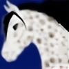
Because my sister is speshul and gets what she wants! It's another character from her upcoming novel, "Triptych". This one is Densay, a rather handsome lil' wolf who is partnered with Casiri and Alyech. Like I've said on numerous occassions before, keep an eye on =TsukiJewels ' account for uploads from her book - it's gonna be the shiz!

Thanks for looking everyone!

Image © Michelle Walker
Densay © Julieanne Walker
Credits
Photoshop CS2 & Wacom Intuos3
Pose copied from: [link] by ~ForsakeWolf

Swirly brushes courtesy of ~crazy-alice
<--- Casiri!
Related content


Comments: 69
Wow, very nice! I haven't seen any wolves from you in a while.
I do have a critique; I think the front legs could be farther forward, and the muzzle is a little long. I don't draw wolves much, those are just things that I could tell by looking at it. Everything else seems fine! I love the mouth and facial expression.
Very nice, Michelle!
👍: 0 ⏩: 1

Thanks, that's a big help!
👍: 0 ⏩: 1


Ok, the biggest thing that stuck out to me were the legs. The legs to me still have that horse-ish feel to them, especially the ankles. The back legs also should a smidge skinnier. I just quick drew a small diagram of legs which should a help alittle, it's not the best considering i literally did this in 20 seconds..and sorry for the little yellow doodle in the backround..think my brother was drawing hahah
Hope it helps
[link]
👍: 0 ⏩: 1
Thanks, I really appreciate your help!
 (Smile) - :)")
👍: 0 ⏩: 0

constructive crit coming right up lol:
1. the back legs: the knee area is too thick and the part right above the hock is too thin...the weight needs to be more evenly distributed among those two areas. Also, the knee joint needs to be farther down.
2. the front legs: they need to be less angular...less bending back at the "wrist" joint, and nothing that resembles a fetlock needs to be present.
3. the neck: needs to not be so flat...there should be a visible shoulder so it doesn't look so otter-like. also, the neck should be thinner at the base of the head and then widen as it nears the body.
4. the body shape: it should have more of a shape than a lumpy rectangle, if I may say so. Also, the tail should be a bit thinner. The legs all need to be longer, so the wolf is taller. The torso should be a but longer than the neck.
5. the head: just move the ears forward and make them a bit bigger and fluffier.
that is all, I hope this was all constructive, criticism as it may be.
👍: 0 ⏩: 1
Thank you -- all valid points, and all duly noted.
👍: 0 ⏩: 1


gosh Michelle, from the last wolf to this one... is an really AMAZING improvement 
To me the anatomy looks awesome, but I dunno anything about wolf anatomy
But that couloring 
and I love your way of doing reffrences! its very cool
cant wait for more wolves

👍: 0 ⏩: 0

wow , i wish i could draw like  - :(")
👍: 0 ⏩: 0

Great drawing! You have an remarkable talent for drawing animals!
👍: 0 ⏩: 0

he looks really good! thou the neck looks a bit strange
👍: 0 ⏩: 1
Thanks! Anything about it in particular that's making it look strange?
👍: 0 ⏩: 1
a bit wide i think.. as if he's got a flap of skin hanging under his neck. could also be my imagination
👍: 0 ⏩: 0


Thoes paws are AMAZING!
👍: 0 ⏩: 1
Thanks! It took a while - I smudged all the colours together using the smudge tool. A bit like how I did my grass in my digital background tutorial!
👍: 0 ⏩: 1


I love this. Looooooooooove it!! He looks so beautiful. Luckily I know very little about wolf anatomy, so I can just enjoy it instead of finding something that doesn't look right hahaha. Because I think he's beautifully shaped and drawn and I love his face so much and his fur, yummy. To me he looks like a wolf, a canine of wolfishness, and in your style and that's all that ought to matter, really. I love the satchel very very much, again you made it look magical like that saddle in the last ref  (Wink) - ;)")

👍: 0 ⏩: 0

He's sooo adorable! 
 - =D")

👍: 0 ⏩: 0

Oh cool - a wolf! Love it!
-Tip: The tail could be a bit smaller
👍: 0 ⏩: 0

 - :P")

his front end seems alittle off his neck is a bit to fluffy and the legs seem alittle to far back and the tail is alitte fat to maybe longer would help it but you did an amazing job on the fur!!! looks awesome sorry if you dont care for my comment what do i know about drawing like my user suggests i cant draw>.<
👍: 0 ⏩: 1
Thanks for that, I appreciate it! And sometimes advice from a non-artist really helps.
👍: 0 ⏩: 0


To me, the neck looks a little too thick, but in all, the wolf is well-ly drawn.
👍: 0 ⏩: 1
Thanks, I'll watch that next time then!
👍: 0 ⏩: 0

DOGGGIEEEEEEEEEEEEEEEEEEEEEEEEEEEE!!!! I WUVS doggies!
👍: 0 ⏩: 0

Oh my a dog! lol it must have been hard not to give him a horse face XDD
👍: 0 ⏩: 1
Rofl. Watch this space!

👍: 0 ⏩: 1

he is very good, but his eyes seem feline to me. perhaps limit the slant on them, and make them rounder? but i LOVE him, fyi! (L)
👍: 0 ⏩: 1
OK, thank you I appreciate that!
👍: 0 ⏩: 1
no worries; anything i can do to help an artist of your caliber! <3
👍: 0 ⏩: 0


'Daw, I love those fuzzy ears!
And I'm gunna help ya out a little bit, since I started drawing canine way before equine (and study canine anatomy in school)
the legs in general should be longer, and the front legs should slim out towards the "fetlock" (and be moved forward, yes). On the back legs, the knee actually should be further down from the body, and hip bone should be rotated more frontward- unlike a horse, pelvis bone is also a lot smaller, thus making the upper hindlegs thinner in proportion,especially compared to a horse lol. Here's a good anatomy reference: [link] (and if you like, I could always do a rough redline for you of your image)
Hope I helped/was clear enough 
New anatomy is a be=otch to learn, but I think you're doing an exelent job for being out of your element, so to speak! Plus, I love how you coloured your fur :]
👍: 0 ⏩: 1
Ahhh thank you very much for your feedback!
👍: 0 ⏩: 1
Welcome, glad I could help- it feels good to help another
👍: 0 ⏩: 0

His front legs should be up a bit more towards the chest, his ears would look more pleasing to eye if they were elongated and the nose shortened a tad. 
👍: 0 ⏩: 1
Thank you, I appreciate your feedback!
👍: 0 ⏩: 0

I looks awesome to me,however I feel that the front legs should be a little further foward? I love the fluff c:
👍: 0 ⏩: 1
Agreed. Thank you!
👍: 0 ⏩: 1
Your very welcome Michelle c:
👍: 0 ⏩: 0

| Next =>