HOME | DD
 minix —
Ionic Radius
minix —
Ionic Radius

Published: 2003-05-19 08:53:48 +0000 UTC; Views: 9887; Favourites: 191; Downloads: 1228
Redirect to original
Description
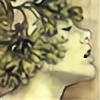
...self-contained. Is it easier to hide than to explain?I've been having so much fun with the color scheme and hairstyle of the girl from Ionic , that I decided to start a series of images of her. I guess that would kind of make her a character of mine? I don't have a story for her, but I do want to flesh out her personality a little.
This one started as a doodle on lined notepaper, and then I colored it in Opencanvas and refined it a bit in Painter7. I also have a wallpaper version of it that I can upload if anyone is interested. And, for once, despite my angry computer, I worked at a large enough resolution for printing.
*edit* I uploaded the wrong version the first time. This one is cropped and sized properly, but the edits aren't showing in the thumbnail.
Related content


Comments: 102

Oh, this is very eye-catching. I love this. In fact, you entire gallery is very impressive and professional-looking.
👍: 0 ⏩: 0

/// masterpiece, masterpiece, masterpiece, masterpiece, masterpiece, masterpiece, masterpiece, …!!!!
/// wow, amazing colour scheme and the idea to put the face into a hairstyle-ball is great!
///


👍: 0 ⏩: 0


it's really cool how two contrasting colors go together so well. i like the face a lot, and her eyes! they are so sparkly. and i love how her hair is done like that.
👍: 0 ⏩: 0

cool new grip... a bit like the famous bubble photographs futuring models floating around in a bubble in paris, by I don't remember his name...
I like this - it's refreshing would get a high point from me if this was the old originality comment system..
👍: 0 ⏩: 0

*heheheh* Cute! I lov ethe idea. She appears to be such an interesting character. ^^ I love the mix of greens and pinks as well. They do go so very well together, don't they? =3
👍: 0 ⏩: 0


oh this picture is veryyyyyyyyyyyyyyyyyy cooooooooool! i realy like it!
👍: 0 ⏩: 0

this just showed up on my devwatch today, but i thought you did this awhile back... i think i commented then too, weird...
anyway, as always, rad brushstrokes and style...
👍: 0 ⏩: 0

i hate to say it, but as nice as that face is, it's gettin kinda old..
👍: 0 ⏩: 0

will you read my comment? (j/k)
that s really nice, i love it !!!
the eye is the most impressive detail in it imho
keep it up !

👍: 0 ⏩: 0

Very cool, did this inspire your id or the other way around?
Quirk Out
👍: 0 ⏩: 1

Thanks. 
👍: 0 ⏩: 0

this is really great, but with over 80 comments already i'm sure you know that by now  (Smile)")
👍: 0 ⏩: 0

wow. that is fantastic.
I love the way a small segment is cut out of the sphere revealing the character.
The way the hair forms part of the shell I really like.
I also like the distant expression, but I think it would be better if there was something more in the background to add to the distance.
Some very subtle texture of some sort would be enough.
Unfortunately I dont really like the background colour, its just a few tones of perfect IMO.
Anyway very impressive work minix
👍: 0 ⏩: 0

 (Wink)")


Wow, this is beautiful. I like how her eye is much to big, but it doesn't really look out of place, and her hair just blends...very nice.
👍: 0 ⏩: 0


Cool! reminds me of the sony ericson logo thingie! Cool raw shading and brightness contrast!
👍: 0 ⏩: 0


Minix,
You are amazing.
You have successfully expressed SO much... in a style that is a mixture of popular art, 'classical' painting style...and something of your own...
This piece AMAZES ME.
The colours, the anime eye...they make this so PRETTY... so instantly attractive to anyone!
But you don't stop there...you don't create for the sake of other people getting a bit of eye candy...
You put SOUL into your work.
My GOD...I could rant and rave about this all night long... but I am SO utterly exhausted I would not nearly get out what I want to!
I have to say though, you are one of DA's truly fantastic artist that leaves us all feeling EXTEMELY inspired. Thankyou.
+ Favs.
👍: 0 ⏩: 0


This is so beautiful! I love the way in which you've drawn her hair. It's not textured, so it actually looks like it was a solid ball that has been cut away to reveal parts of her face -- not hair. The colors are beautiful, but I kind of question the way in which you've cropped it. Something looks sort of "off," but I can't figure out what. I'll get back to ya when I figure it out.
PS - I'm a big fan .
👍: 0 ⏩: 0
transporter [2003-05-22 22:16:51 +0000 UTC]
Brilliant eye, brilliant lips, all around genious... That's all I can say.
👍: 0 ⏩: 0

this is really nice minix. remind me of you greatly!
very very pretty work
👍: 0 ⏩: 0

mmm! that big beautiful eye!!! and the pinks are awesome! so very pretty! ^o^ I love your painty style!!!!!!!!!!!!!! heehee I've said that so many times
👍: 0 ⏩: 0


BIIIITCHIN! ...you know, you're awesome. I like the simplicity
👍: 0 ⏩: 0

OH NO!!! another one!
I still have to buy a print of the first one!
👍: 0 ⏩: 0

seeing something like this really lowers my self esteem...
cause its so much better than anything i could ever do.
nice work. one thing though. just an idea, but maybe you'd like it if her "hair" had a few lines in it, just for more definition. just an idea. masterful either way.
👍: 0 ⏩: 0


Rahhh! Your coloring is so amazing!! I love it! Mmmm!! Such a cute face! Ahh I love love love you!
kke such a cute design and idea! Love the color combination!
👍: 0 ⏩: 0

that is amazing, i love it. a WP would be great. she reminds me of newt from Aliens
Damn cool pic, u should be very proud +fav
👍: 0 ⏩: 0

that's amazing.
to me it seems like a lonely planet- lonely like sun and moon cause they can never meet.
the eye's expression is so sad - the colours itself are so soft and 'uncaringly' happy.
👍: 0 ⏩: 0


Very clever idea, althought that eye is a little disturbing in my opinion.
Im not sure what I think of the colours. At first I didn't think it worked but its starting to grow on me now.
👍: 0 ⏩: 0

I see the skill it took to make this, however the colors you used clash malevolently. I see that some people like the colors, altho i just cant stand it. sorry, but i think it would be better with a different background color at very least
👍: 0 ⏩: 0

saw this before DD, didnt have power to comment though hehe, great! i just love this.. amazing technics, the lightnings is just great the girl itself is just cute and how she is inside that sphere and blending into it with shadows is astonishing amzing work, i love the colors picked, canvas size and that background
👍: 0 ⏩: 0

ooooooh aaaaaaaaaaaah.... this is beautiful. With so much meaning behind it, i can't resist giving this a fav. How wonderful...You're so talented.
I can't wait to see whatelse you have instored for da.
👍: 0 ⏩: 0

I certainly have NO problem with the background...
I like how the subject seems almost like a bubble floating in the air, gradually downward... such a somber piece...
Cool how the sphere doubles as both hair and a cowl... the cowl connotation adds to the sense of her travelling, lost, drifting...
Most of all, though, just fabulous rendition... your sense of form is completely amazing... that craft is the treasure of this image that makes it more than just a nifty concept...
👍: 0 ⏩: 0

Very new and very interesting. I like the spherical aspect! The colors mesh well--the cyan and lilac.
👍: 0 ⏩: 0

I actually am turned off by the color composition. Maybe if there was a drop shadow or something to signify that the globe was linked to the background... In that sense, it seems like a blank paper that the globe was placed onto. Otherwise the globe is very well gradated and the colors are unified within it. As I said before, the problem is the background.
👍: 0 ⏩: 0

amazing job, great coloring and wtg on the DD you deserve it, as always!
👍: 0 ⏩: 0


shit... that's gotta be one of the most unique and interesting sketches i've seen since... EVER! +fav
👍: 0 ⏩: 0
| Next =>