HOME | DD
 procrastinate-later — St George and the Dragon WIP1

Published: 2010-04-13 17:23:01 +0000 UTC; Views: 4393; Favourites: 55; Downloads: 0
Redirect to original
Description
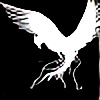
This is the dragon from the first panel of what will be a Triptych of St George and the Dragon. The plan for the triptych is in my scrap book, it will have a silhouette background, and the final one will be more inky and possibly bloody. Im not too sure about how his wings turned out, and I think I lost some of the swoop that I liked so much in my first quick sketch (before the rough in my scraps)Comments and critiques will be welcome before I start to finish them.
Related content
Comments: 45

so utterly badass... i don't have words.. except those words.
👍: 0 ⏩: 1

those words were pretty much what I was going for, so thanks!
👍: 0 ⏩: 0

looks really cool 
I want to see the completed version someday
👍: 0 ⏩: 0

If this came straight from your head my mind would be blown
👍: 0 ⏩: 1

well, i wouldnt say 'straight' from my head. it came via about 12 sheets of sketches and alterations ^^
👍: 0 ⏩: 1

WOW the work was well worth it
👍: 0 ⏩: 0

Wow awesome dragon! i havent drawn one myself but i really love all the detail you have going on!
So much movement and power in this drawing.. love the composition also..
My only critique would be is that you have a lot of midtones in your drawing.. i would love to see you push the darks a bit more to create some more depth..
Especially in shadow areas.. under the wings or anywhere opposite your lightsource that would throw a shadow.. for example all those horns and bumps would throw shadows even slight ones...
Thanks for submitting this.. i really enjoyed it.. makes me want to draw a dragon now
all those textures look like a lot of fun!
Naomi
👍: 0 ⏩: 1

thanks, it definitely seems i need to push the contrast in it when i come to finish it. unfortunately i really cant afford the time till mid june - but i want to start it now! still, current uni project must take priority, no matter how much i put it off i have to do it.
thanks again, and if u do a dragon make sure u send me a link!
👍: 0 ⏩: 2

your darkest tones should be black. if you scanned this, you may benefit from photo-editing software to combat some of the lightening that scanning does
👍: 0 ⏩: 0

i will def let you know when i do a dragon 
👍: 0 ⏩: 0

awesome, I think drawings like this should have an equal amount of views and faves
👍: 0 ⏩: 1

thankyou- and for the fave
👍: 0 ⏩: 1

lol, np. in fact, your work is pretty awesome, i might as well...
👍: 0 ⏩: 0

thanks, though in hindsight i think i tried too hard with the detail and shading, and its all kinda crumpled into one, especially the head. too many spikes and its lost its effect?
👍: 0 ⏩: 0

wow great job, you did a great job with detail and shading.
👍: 0 ⏩: 0

Cool! Looks a lot better than my dragon!
I like your composition with the dragon filling the picture plane.
You did a really good job of capturing the feel and character of the beast.
It's a good piece of work!
👍: 0 ⏩: 1

thanks 

👍: 0 ⏩: 1

You're welcome and thank you for the compliment on my cars.
Here he is. He's okay as big lizards go, but he is not much of a dragon and does not look like he is fighting for his life. [link]
I love the Ford GT40, and i have on in an old magazine, but i only do work from my own photo references now and have not found one in any shows or museums. Not all of my cars take 232 hours! Most of my drawings are only around thirty hours!
👍: 0 ⏩: 1

theyre even better for 30hours, the dragon here took about 2 days just to sketch out and get it to a position i was fairly happy with. at least another day to draw the head so i was happy with its angle, i couldnt get it to look like the side and the top of its head were in the same box- always looked like i drew the top and side on a carboard box, and then just squashed it into a net and stuck it on.
👍: 0 ⏩: 1

You ended up with a great pose!
👍: 0 ⏩: 1

You're welcome!
👍: 0 ⏩: 0

It looks fantastic. The dragon seems to be very dangerous and it looks like it wanted to attack somebody. You did a great job on the details and the shading.
👍: 0 ⏩: 0

very well done, i will repeat the earlier statements in that the only thing i can think of to critique it is to exaggerate the shading a bit, however i would have to see it done before i should say anything. keep doing it as good as it is now and it will be amazing! (er)
👍: 0 ⏩: 1

no prob. words can't describe how good it is
👍: 0 ⏩: 0

Gorgeous dragon! I love the details you put into it's body and head and wings and everything!! The only thing I might suggest is to definitely put in some darker tones to give this dragon more depth and to make certain things you may possibly want popping out a hint more (like scales/horns etc) Possibly smooth out some of your pencil work (with tortillion/blending tools) as well to give it a more finished feel? Course, that depends on what kind of feel you want going for the shading. As it is now, the shading gives the dragon a more coarse, rougher feel, which is nice.
The details in your wings is gorgeous. There's only one part that kind of stands out (to me) that I feel could possibly be touched up. On the dragon's right wing (our left, dragon's right) top portion, I think you have too much of a tattering going on. Looks too ripped and possibly making that wing useless if it were real. Maybe close up some of those two long tears at the top of that wing to make that part of the wing more full? That's just my two cents worth.
Hope this helps you out in some small way. I look forward to the finished piece! Great work!
👍: 0 ⏩: 1

thanks for ur advise- I have never used a tortillion before, i shall get one and play with it. I have blender and burnisher for my pencilcrayons that work nicely, but not with pencil. The background (general idea for it can be found in scraps) was going to be in ink (probably) and i wanted to work into the dragon with a some inky strokes, which would be darker.
As for the wing, my tutor insisted i didnt just have a standard batlike wing, and I was trying to make the wing a bit more eagle like, the first 2 fingers (he has six, cos polydactylism is a sign of the devil) are separate from the main wing, and i would like to think it gives him more manouverability in the air. *looks dubious*
👍: 0 ⏩: 2

I see what you're meaning about the dragon wings...I try to play around with dragon wings myself. However, as I look at it more, your idea would work better if perhaps you did the same thing to the other wing. The other wing at approximately the same area looks full rather than the eagle wing (polydactylism) effect you did with its right wing. (maybe part of it being cut off is giving me false impressions?) I guess it would just be a matter of making both wings either be fuller (as its left) or the polydactylism of the right that you were going for.
👍: 0 ⏩: 1

yea the left wing is cropped. the final peice was actually going to be cropped more than this, somethin like a 16:9 ratio- i may rethink that, but i didnt want it to be plain A4 ''dull office ratio'' as my tutor put it :>
👍: 0 ⏩: 1

Ahh, but going with the dull ratio's makes it SO much easier to frame! LOL
👍: 0 ⏩: 0

i should also add, that he had supports jutting out from his finger bones, I was going to make them just flattened and scaled like... cant think of a suitable comparison at the moment... but i couldnt get it to look right.
👍: 0 ⏩: 1

*should really think of everything he wants to say before pressing send* - the second peice to this is in my WIP folder, i would greatly appreciate it if you gave St George the same treatment
👍: 0 ⏩: 0

This is such an awesome dragon! I love how tattered the wings look.
The only advice that I can give as far as this drawing is concerned is that you make the shading a bit darker and more sharp (like making the scales and the horns look more 'shiny' to make it 'pop' out of the page). What I mean is; shade it so that the 'contrast' is higher giving the drawing more depth.
Other than that this is totally epic!
👍: 0 ⏩: 1

yea thanks, i agree- contrast and definition is a bit wanting. I might have to do it a bit bigger to reduce it for the final composite.
👍: 0 ⏩: 0

I like it too!
You gave this a good sense of motion!
I can tell he is swooping down to grasp something with his feet and sharp claws!
👍: 0 ⏩: 1

thankyou, the swooping was my main aim with it
👍: 0 ⏩: 1


