HOME | DD
 RobCaswell — Centerfold

Published: 2011-07-16 15:18:58 +0000 UTC; Views: 7895; Favourites: 129; Downloads: 658
Redirect to original
Description
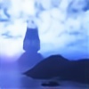
OK. I'm not even gonna TRY to make excuses for this. It's starship porn, pure and simple. So feast on the ship's lines without guilt. We're all doing the same thing.(I was SOOOO tempted to assign a nudity warning to this deviation....)
Model by DJ Curtis. Render by DAZ Studio. Background is a Photoshop composite from a ka-zillion sources.
Related content


Comments: 61


")

So you're not upset I left the nudity warning off?
👍: 0 ⏩: 1

Wonderful work for a impressive ship my friend. . . .
Live Long & Prosper
👍: 0 ⏩: 1


The only thing missing are the staples  (Wink)")
 (Smile)")
👍: 0 ⏩: 1
Oh. Yeah. Forgot...
* staples sold separately
👍: 0 ⏩: 1

Wow, look at those warp nacelles! And that saucer section is so, so...BIG and squeezable!
It just makes me pant like a collie...
Nice work, too. The image and its graphics look like an ad Lexus would use, if it sold starships.
The star field reminds me of that from "The Black Hole", which had a lousy spaceship design but a lovely backdrop.
Thanks for the starship porn. Must hide it from my wife...
👍: 0 ⏩: 1
Or maybe.... discuss it with your wife and uncover a secret passion she's been repressing all these years????
Good luck, mate!
👍: 0 ⏩: 1
Thanks. Considering how she feels about science fiction, it would be VERY repressed.
👍: 0 ⏩: 0
Well... any porn is subject dependent, really. "Garbage in, garbage out"
👍: 0 ⏩: 1

No no, I'm absolutely certain starship porn is the greatest.
👍: 0 ⏩: 0

That's a really awesome picture. I would love to see that as a poster. Nice angle and composition. The background is a bit... noisy, but hey.
I have a few small suggestions in regards to the lighting and because it's easier to show than to explain, I've taken the liberty and slightly worked over your picture. I hope you don't mind (it's just a suggestion): [link]
👍: 0 ⏩: 3
Well I guess mine is the "dark adapted eye" version
👍: 0 ⏩: 1
Ha! That explanation works for me!
👍: 0 ⏩: 0

Personally feeling, I don't dislike what you did.
I happen to take a light stroll through your own gallery after wards and noted you generally like the darker backgrounds imagery -so the contrast of the starship's lights and external illuminations stand out more.
In your version of "Centerfold" there is the loss of details in the background.., which I'm not speaking for Arcass here, -but feel the background elements are just as equally important to see since it is about the majesty of travelling through space as to what the image(s) is about.
Not of just the starship.
It is about of where the starship can take you.
👍: 0 ⏩: 1
I agree, but it's not so much the fact that I like darker backgrounds, I like it to be somewhat realistic, sci-fi or not. Of course taste varies and that's perfectly OK. Also I found that on different screens images look differently. It's always a problem with TFTs and I use a four year old laptop at present, so usually images that look perfectly OK on my screen will turn out a small tad darker for everyone else.
It's true though, I like to put emphasis on glows and lights and I admit I have been influenced by "The Lightworks" group of people and their artwork. 
👍: 0 ⏩: 2

I often have the same problem you mention here. My laptop screen makes dark colors lighter on my screen than they appear on older screens. That's great for making different shades more distinctive... on MY screen. But for posting at DA, I have to delberately make things look lighter than I like so that some details (such as drawing African Americans) are not too dark on other people's screens. I wish they could standardize the blessed things already!!
👍: 0 ⏩: 1
Well, it would help if there was some kind of app that could simulate what an image would look like on a different screen, even if it was only an approximation. There are screen settings in Photoshop, but I've been looking for such a 'look simulator' for ages. No such luck.
👍: 0 ⏩: 1
There are probably too may variations for there to be any point anyay. Every time I have gotten a different monitor the colors on everything I'd done before looked different on the new screen. As I draw everything on Microsoft Office the differences are probably even greater than they are with the dfrawing programs more sensible people probably use.
👍: 0 ⏩: 1
Gad, I need to check typos better. That last message of mine was almost unreadable!!!
Anyway, you guys are doing great work. Keep it up!
👍: 0 ⏩: 1
Didn't have a problem with it.
👍: 0 ⏩: 1
I love the past "Light Works" imageries as well.
👍: 0 ⏩: 1
I always wanted to get as good as them the moment I saw their work. Never wanted to copy them though. Sometimes they're a tad too oversaturated in their lighting! For my taste anyway...
👍: 0 ⏩: 0
That one looks pretty good too. The greater contrast makes details stand out more.
Wish we could see them side by side for easier comparison.
👍: 0 ⏩: 1
I guess the solution would be to find a compromise?
👍: 0 ⏩: 1
No need for compromise... each version is pretty good in its own way.
👍: 0 ⏩: 1
👍: 0 ⏩: 1
Pretty much; each is beautiful in its own way. I'd be hard put to choose between them if I had no idea who was the original artist.
👍: 0 ⏩: 0

Always nice to have a brand new class of ship to get catapulted to parts unknown with no way home. Great bit of starship porn
colouring and lighting not to mention clarity of detail excellent as always Rob

👍: 0 ⏩: 1
My blood runs cold
My memories
Have just been sold
My starship is a centerfold
My starship is a centerfold...
👍: 0 ⏩: 2
I should have thought of that one. They were constantly playing it over the radio station at my Dunkin' Donuts.
👍: 0 ⏩: 1
Maybe you're just not as big a cornball as I am. For me, it comes quite naturally.
Hell of a thing to brag about, but what the hey?
👍: 0 ⏩: 0
1) "Is your marriage over ...if your wife catches you with another starship?!!"
2) So what's the best position? Top view, from the aft quarter.
3) Hold on tight cause when she orgasms -she's going to jump warp to max speed.
vvvvrrrrmmmoooooo-vRWOOOSH!!!
👍: 0 ⏩: 1
I refrain to answer... if only because the way you're oogling her aft shuttle bay is kinda wiggin' me out.
👍: 0 ⏩: 0
You gone too far, Mister Arcass!
I'm reporting you to starfleet federation authorities.
Charge: abuse of starfleet property!
"Come here, little Century,... you're safe from the bad human."
Heh, heh, heh, heh... .
Now, strut those support pylons over here, plant that plump engineering hull on Daddy's lap
and tell me about all the nasty things Mister Arcass did."
👍: 0 ⏩: 1
Hey now, who should be on report?
Just remember: "Negative means negative!"
👍: 0 ⏩: 0

That's just beautiful, man. 

👍: 0 ⏩: 1
| Next =>