HOME | DD
 Shapetwisters — Orientation

Published: 2002-10-02 13:21:30 +0000 UTC; Views: 7826; Favourites: 101; Downloads: 1012
Redirect to original
Description
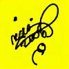
EXPERIMENT 002Orientation is project/style based on arabic calligraphy and btw this my name in arabic .. if anyone want have his name like that give me a note i would love to practice on my free time
Related content


Comments: 120


hey man I am in love with this style I wish if you cud do my name.......its عامر شهزاد
👍: 0 ⏩: 0


heh pamietam jak takie rzeczy tworzyles na zywo na spotkaniach  (Smile)")
")
👍: 0 ⏩: 0

your work is great man.... realy great... you are big inspir for me - Im from Czech republic - and Im starting with my own little cloth factory... heya man you write that you want some practice with this orient style - want you do for me design with this style - just write FOPA (its name of my company) - and one question - can I use that design if you will make it for some t-shirts here in czech???
👍: 0 ⏩: 0

good job man here !! i went to see my name writing like these ( Hamza )
👍: 0 ⏩: 0


that is really cool man +fav
if u can make SAMAD name for that wouldbe very nice
btw +devwatch
👍: 0 ⏩: 0

Your work is amazing!
Sweet typo and colour choice.
+fav
👍: 0 ⏩: 0


wow... this is absolutely enchanting... hehe, if free time permits beyond the million requests you've recieved, then do the name shaina. i hate my name, but i think that almost anything is beautiful when written in arabic calligraphy.. especially by such a stylized artist as yourself.
👍: 0 ⏩: 0


It si very beautiful and I would lovemy nam elike this if you would like to practice, either my devart name or Tiffany
👍: 0 ⏩: 0


Thank you for using this family of colors, the painter who used them in orination was David Roberts the grand oriantlist who came in Egypt and made alot of aquarelle sketshes for Egypt, and Prints. I saw an original print for him he ur pallette was close to him, I will suggest you a site to visit it as I advice you to see his print work, not only aquarelle. [link]
So those lines which you put beside each other has nothing to mean else you want to show ur pallette, it is logic sequence of colors, but this Violet has nothing to do in my opinion, it is not in harmony with other colors. may be another saturate of it will be cool.
I am not sure why did u put that window at top in right corner, cool. but it didnt add any thing for the design in my opinion. you tried to control charge arround ur form, that was great as u are good in layout and u have creative ideas, u also tried to break down the same way of lay outs which most designers try to do, from when 2advanced thing relased.
all of that was great, also to try to play with thos callegraphic lines as a case to write your name with ur own imagination for callegraphic was cool thats what I like. but i think it need to try again with deferent colors of that artist who i told u about, it will make new themes, also i wish if u try to apply some orintal shapes with it, try 3d, change the whole. and break the rule. but u need alot of orintal resources with you, I am ready to help u in that any time.
👍: 0 ⏩: 0

lemme add my voice
well done
i really enjoy your concepts and compositions
👍: 0 ⏩: 0

Looks great, owuld love one of my name, maybe even as a tatoo - that would be cool!
👍: 0 ⏩: 0


i love the way u wrote your name in arabic
perfect one , as usual , keep it up bro
👍: 0 ⏩: 0


unique mix of tech and oriental arabic styled calligraphy, very inspiring
👍: 0 ⏩: 0


Your work always takes on the most interesting and wonderful evolutions. I like the notion, here, of interchanging identities, and what "marks" identity more generally, especially on a visual or "graphic" level. The reproduction of the "signature" and its offset works really wonderfully to not only articulate a kind of topographical "orientation", but to emphasize a kind of socio-cultural orientation or "placing" as well. Your work always impresses.
👍: 0 ⏩: 0

I think it's nice and inspiring, idea and composition are pulled off nicely. Tho I can see many flaws... the whole thing looks kinda blurry. And the "orientation" typo seems not to be anti-aliased at all... some of the contrast colors look washed out, too.
But overall it's a really nice piece.
👍: 0 ⏩: 0


Totally awesome. I love the combination of technical with the smooth curves. Compliments brilliantly. Done well.
👍: 0 ⏩: 0

Nice form works i like that nice typo ... must be perfect as poster ...
👍: 0 ⏩: 0


elegant and well balanced - i hope your designs get as much exposure as possible.
👍: 0 ⏩: 0


eh .. great work man
You can do my name if you want to
👍: 0 ⏩: 0


awesome, i don't know what it is about this. but i really like it. great job
👍: 0 ⏩: 0
| Next =>