HOME | DD
 StAugustus — Space Gems

Published: 2010-11-24 02:14:39 +0000 UTC; Views: 2403; Favourites: 29; Downloads: 169
Redirect to original
Description
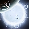
This, I think, is my best work yet. Perhaps that's up to interpretation, but regardless, I'm really proud of it. I learned a ton doing this piece too, which makes me happy, and I hope you guys like it. It's got a feel like I've always wanted to emulated, and I think this is the general direction I'll be taking my art in the future.Done completely in PS (I'm moving slowly away from 3Ds.. Isn't that the opposite of how you're suppose to do it?), took two days, probably 8 hours or so. Figured out a lot of new techniques for the planets, clouds, rings, the sun, etc. that I'm really happy with. Enjoy!
Related content


Comments: 23

I think that the brightness is perhaps just right. To me the star looks like its an F class
👍: 0 ⏩: 0
 (Wink)")

")

Very nice job on this piece. The only thing I can think of that might be out of place is the visible atmosphere on the dark side of the planet (which naturally there would be none). Other than that great job!
👍: 0 ⏩: 1

Thanks very much. I was wonder whether or not there was an atmosphere.. I figured since atmosphere visible on the "inside" of a planet is caused by looking through the gas, rather than it being illuminated by the sun, it might be visible on the night side. But perhaps not. Glad you like it
👍: 0 ⏩: 1
No problem. If you take a look here 👍: 0 ⏩: 1
great point about the night sky 
👍: 0 ⏩: 1


ZOMFG!!! JIZZ IN MY PANTS EPICNESS!!! I haz a new wallpaper now! Instafav!
👍: 0 ⏩: 1
Hahahah wow, quite a compliment! Glad you like it
👍: 0 ⏩: 1
No prob.  (Smile)")
👍: 0 ⏩: 0

I really like this. It's simple yet beautiful. It's probably my favorite form of space art. I'm glad you learned a lot. I know the feeling I get when I can make a piece that I'm proud of and I know I got a lot out of the creation of it. Great job and I can't wait to see where you take this style next.
👍: 0 ⏩: 1
Ah yes, I think most of what I liked about this piece was the process of discovery. Thanks for the good words
👍: 0 ⏩: 0


You define space and light sources quite well but the color scheme and blending is often confused with each other. Try placing a layer above all the layers in your file, fill it with a color of choice, set it to overlay, and adjust the opacity to what you want.
👍: 0 ⏩: 1
I considered the monochrome style, but rejected it in favor of a perhaps more "realistic" approach. Not to say this style is particularly realistic.. What parts in specific would you consider to be confused?
👍: 0 ⏩: 1
The objects just seem to be too light for the amount of light the sun is providing.
👍: 0 ⏩: 0