HOME | DD
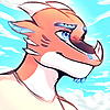
 Steve-does-art — Dreams of the Surface

#undertale #asriel_dreemurr
Published: 2017-02-03 16:28:52 +0000 UTC; Views: 910; Favourites: 113; Downloads: 4
Redirect to original
Description
Aaaah, it's been nearly a month since I last finished something and I am terribly sorry for the inactivity ;A;I've been ill for 3 weeks now and welp, let's just say that I woke up at 2pm today and it is now 5:30pm and I already feel like directly going to bed again :/
And that is how these 3 weeks basically were, no motivation or energy to do anything
Tho it is really my fault for not getting my stuff together and finish one of the many projects I have open atm. so sorry for that, I hope that it won't happen again but I can't promise anything
Anyways, this is a drawing for fun lil thing Kamex and Retro put together on their Discord servers were your giving a character every week and you can draw them when you want, the first week was young Asriel so here is something with Young Asriel o3o
Tho this thing here is already 5 days late cause the first week was last week and I should've had this done on sunday but yeah...
Tried some different brushes and stuff, am not that happy with it but I guess it isn't too bad either
Next character is Niko from Oneshot which is a game that got recommended very often to me during the last few weeks so that's gonna be fun ovo
Now on to replying to a lot of messages cause I didn't even do that ;A;
Asriel Dreemurr and Undertale belongs to Toby Fox
This artwork was made using Painttool Sai
*EDIT: changed the color of the pants and the trees to help guide the eye of the viewer based on the feedback from , thanks a lot for that :3
*EDIT2: changed some more things based on the critique from , thanks a lot for that too ^^
*EDIT3: changed parts of the mountains in the background based on the feedback from
Related content


Comments: 45

Overall
Vision
Originality
Technique
Impact
What stands out most to me of this is definitely the colouring, which is probably the most impactful part of this. The shading is nice and very well done, though it's a bit too bright around Asriel himself, particularly his jumper – the stripes seem to merge in with the main colour – and the upper half of his face, his hair seems to merge in with the background a bit there too.
The choice of colours is lovely, but I think the main colouring of his jumper is a bit too yellow (like I said, the stripes blend in a bit too much there), and the furthest tree should be very slightly darker than the front most tree.
Getting to the angles and proportions of the piece, they need a fair bit of work. I think I remember you saying that Asriel is supposed to be holding the hand of the viewer and showing them the scenery? But if I were to look at this with no context, I'd assume that he was taking some sort of photograph of himself with a smartphone.
To improve the impact, I'd have Asriel's arm much more straight – probably enough so to show a bit of his wrist/hand – and overall have his body and position a lot more straight-looking, angling him more towards the background and the trees, giving the perspective that he's either running or pulling the viewer along.
His fingers should also be a lot smaller in comparison to the palm/wrist of his hand, they should curve in towards each other a bit more, if that makes sense, sorry it's difficult to describe in text lol.
His facial structure is also a bit off, the right side (the viewer's right) of his face sticks out far too much and should be a lot less curved on that side as well, it's a little difficult for me to explain what I exactly mean in writing. His left (Asriel's left) pupil and overall eye are also a little off, his eye should be more rounded towards the left (again, his left) and his pupil should be closer to the edge of his eye, near the middle of his face.
(Okay my apologies for this next part in advance because I don't think this makes much sense in writing and I'd be much better showing what I mean here a diagram lol) Asriel's mouth also appears to look quite “flat”. The right-side corner of his mouth should slope down more and be a bit more rounded. His right fang should be also be little bigger and a bit more rounded in comparison to his left fang, as his left fang would be further away given the angle of his face. The starting lower line of his mouth (underneath his left fang), should start at just very slightly before the middle (the “point”) of the fang and have a short curve, go along the bottom a bit flatter, then curve up much steeper to the other side.
His tongue should be further set back into his mouth and also curve a lot more, the curve of his tongue should begin just above the “point” of the right side of the right fang, then curve down and connect to the bottom of his lip, this gives the mouth a lot more depth and makes more sense given the angle.
Overall, it's a nice piece and the colouring is my favourite part about this, but yeah you need some work on your proportions and angles, but aside from that it looks pretty decent. Again, sorry if a lot of that didn't make much sense because of my terrible wording lmao.
👍: 0 ⏩: 0


Impact
This overall is an amazing piece! The only thing that you could improve on, is the variation of color. around the trees, the character, and the ground, there's a slight lack of blue. The art looks slightly dry around those areas. Also, try improving on the outlines and details of the grass, while your at it, and try giving the art piece a little more shadowing depending on an object's distance from the apparent surface of the painting. Otherwise, this is a near-perfect piece! It definitely proves that you're a talented artist. Keep working on your skills, and you'll soon achieve something you never thought you could!
👍: 0 ⏩: 2

First of all, thanks for the critique and the compliments, constructive criticism is always appreciated! ^w^
I can see what you mean with the grass and I tried to fix the issue with the color, sadly I can't really fix much more easily, I'd have to repaint most of the grass since the artworks is mostly just 2 layers at this point :/
I'll keep that in mind for next time tho so thanks ^^
I tried to get some distance in too but I guess I might have to do it differently, not really sure... what do you think so far?
Thanks a lot again for taking the time to write such a critique, it's very helpful :3
👍: 0 ⏩: 1
Right now, you're amazing! Just keep in mind all the advice everyone else has given you, and add a little of your style in there too, and you'll soon get the perfect piece.
And you're welcome! Happy to help. ^^
👍: 0 ⏩: 1
Thanks a lot for that, I'll try to to that! ^^
👍: 0 ⏩: 1
Good luck, though you probably won't need it. XD
👍: 0 ⏩: 0

")


Oh Asriel, if only you could stay on the surface just a little longer...
Really love the picture, it has so many vibrant colours and I love what you did with the eyes! Great job!
👍: 0 ⏩: 1
That's really nice! I don't like undertale (no offence, sorry!) but I really like animals so the goats are a compromise! You drew such a lovely artwork along with the reddish tones you used for shading. Nice work!
👍: 0 ⏩: 1
I think it's a good game but nothing really great like many others say so yeah
Like what you like and dislike what you don't like, everyone has a different taste and that is completely ok ^^
And thanks :3
👍: 0 ⏩: 1

AAahh it's so pretty! It IS like a dream!
I don't think I'm experienced in digital art enough to give a proper critique, but uhh... The mountains kinda blur out a bit much from the middle of the trees to the left. It kinda gives it the look of a gray lake or smoke. Although that's the only thing, haha!
I'm just not sure about making it a critique... I guess this counts but an official one sounds beyond my skill. >,>' Welp, I hope this helps?
👍: 0 ⏩: 1
Thanks :3
Oh, you're right
👍: 0 ⏩: 1
Uhh, no problem! Thanks for accepting it?
👍: 0 ⏩: 1
Always! a constructive critique is one of the best things you can get as an artist ^^
Btw. I tried to fix what you mentioned, I hope that it is better now :3
👍: 0 ⏩: 1

nice colors, very dream like
Currently my eyes are drawn to those red-ish browns of the trees and Asriel's pants. Those brown are so much darker than the rest of the image. Either lighten that brown or darken the shadows to help balance out that brown. It will help move the viewer's eye through the piece.
👍: 0 ⏩: 1
Thanks :3
Also thanks a lot for the feedback, totally forgot about balancing out the colors
👍: 0 ⏩: 1
 (Smile)")

Quick, all share you're energy with Steve so he can power-up the spirit bomb (Niko)!
👍: 0 ⏩: 1
Wooooo! ovo
Thanks xD
👍: 0 ⏩: 0


hhh you've been improving so much!!
I love the textures and colors of this!! Great job!! ;w;
👍: 0 ⏩: 1
Awww, thanks ;A;
You've been improving a lot too tho ^w^
👍: 0 ⏩: 1


You are welcome
👍: 0 ⏩: 0
