HOME | DD
 Tarrigan — The Butterfly Thief.

Published: 2010-08-05 22:51:43 +0000 UTC; Views: 998; Favourites: 20; Downloads: 28
Redirect to original
Description
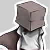
Meet the Butterfly Thief, he glides silently by night on silk wings... to steal your shiny stuff!okay seriously, this is another character from my 'Flight Captain' series ([link] ). He is not himself a Flight Captain nor did he ever train as one but is brought into Owl's flight squad when yet-to-be-named-expendable-character dies in combat.
He doesn't have the standard issue wings because he's never been a 'fledgling', but a pair of silk gliders which he painted himself to match that of the Holly Blue butterfly, earning himself the nickname Butterfly Thief making reference to his choice of wing but also his unparalleled stealth.
His helm also mimics that of the butterfly's, and because Flit has a taste for the dramatic he tends to wear it regardless of whether he is in flight or not.
He's a relatively shy fellow, but kind and jovial when comfortable.
To make up for his size (he is both short and extremely skinny) he is quite abrupt and to the point, especially when dealing with people he doesn't know very well.
He lives on the tallest tree in the desert (the Flight Captain fleet live in a clump of very very tall very very old Adansonia Grandidieriin trees ([link] ) in a desert and wears furs against the drastic drop in temperatures at night.
the hood and cuffs are lined with feathers so he has to be careful where he wears it, most Captains find it extremely distasteful and some think it should be illegal and severely punishable.
flit simply thinks he looks good.
i'm pretty darn happy with this picture because i haven't been able to draw much recently, and also because the colours and shading really work.
Related content
Comments: 33


Alas for yet-to-be-named-expendable-character! No one ever really loved him ...e.deviantart.net/emoticons/s/s… " width="15" height="15" alt="


Okay, so this I really enjoy to look at, I mean truly, there is so much personality and whimsy in this character. For the linework design, I don't really have any major faults, you have captured the elements of a butterfly (not just the wings and head, but the legs, balance, and posturing) and applied them very nicely to a humanoid figure. The detail work is great, I really like those little belts down the side of the paints, they are a nice accent and serve to bring a lot to the form.
It's really good to see so much thought go into this character, and it shows in the final design. I think what really amazes me is that this character (very distinct from the other two) still fits wonderfully within his world, excellent work.
But ... I think you skipped a step e.deviantart.net/emoticons/s/s… " width="15" height="15" alt="


Here's a quick thing to do. Take each of your darkest values of your hues, make a new layer on multiply, set your brush to an opacity of maybe 25% and just do some quick paintovers of the basic shapes. Another option to get some distinction between the hues. Grab an adjustment layer on hue saturation, go to each of the hues (refining them through the eyedroppers) and just shift the value (brightness ... ?) slider.
I think some of this washed out value effect comes from working on a white background. Unless this guy will always be on a white background, design him in a hue relative to his environment. If he's usually in a light sky, put him on 30% gray, if in a natural environment, 45%, then get your values working. If the background is on a different layer, just changing the value of that will drastically change how he reads. If you put this drawing as is, on a black background, even 90% gray, you'll see how weird all of the lights read.
Some material studies also might help, I want the leather, cloak, fur, and metal to read differently on more than just their shape, I want to see it in their texture and rate of gradation. How are the speculars of a metallic sheen different from a soft cloth?
I think that's it, but I have to go through your gallery (once I make it through some more of these critiques), as you have really intrigued me, I want to learn more about your characters and their world e.deviantart.net/emoticons/s/s… " width="15" height="15" alt="


👍: 0 ⏩: 1

Okay so I've finally gotten round to reading this, sorry it's taken me a while.
thank you so much, this is definitely why DA has enabled the critiques option, most of the things you have pointed out, never even occurred to me! I've had no training what so ever in character design or even digital art so what you see here is what i have worked out for myself and the ideas (especially setting the hue of the background to his natural environment) are all new to me, because i've never really considered things like that.
I will definitely have a look at my pallet again and if i have time i'll try to give it a re-working.
again thank you so much for your time, your advice is invaluable!
👍: 0 ⏩: 0

The pose alone is worth the fave
Your description/background of this character is amazing, and I am definitely loving the premise of your Flight Captain story
👍: 0 ⏩: 1

oh, thanks so much! yeah his pose reflects his character, i imagine this is what he looks like when he meets Owl and May for the first time.
👍: 0 ⏩: 0

really like this shifty guy!! id shake his hand..
👍: 0 ⏩: 1

he is a pretty shifty geezer, but a nice shifty geezer ^^
👍: 0 ⏩: 1

cool looking dude.. did ya just make him up or is he based on something?
👍: 0 ⏩: 1

no he's completely made up, i've got loads of drawings of this character and i'm working on his society now, stay tuned!
👍: 0 ⏩: 0

That's such a wonderful design, instantly full of character
👍: 0 ⏩: 1

thank you, I'm roleplaying with him at the moment, it's really good fun! do you role play at all?
👍: 0 ⏩: 1

The only roleplay I do is a fantasy one, so I play a half-elf scout character.
I've only done cosplaying at conventions, because it's such a good way to get free hugs
👍: 0 ⏩: 1

is that online?
ha yeah! i have to admit though, i've never actually been to a con, never been at the right place at the right time with the money, you know
though i do know of the high glomp rate
👍: 0 ⏩: 1

No, it's a live action one. Sad I know, but I haven't been in ages. Things (mainly university) keep getting in the way every time one is on.
I keep missing the conventions as well, last year a friend managed to arrange for us to go. It's the Leondon MCM (movies, comics and manga) the next one's in May. Must go to that...
👍: 0 ⏩: 1

omg i'd love to try larping! i've only done table top and online so far.
and it's not sad at all! EMBRACE YOUR INNER GEEK!
yeah the same problems happen with mine too, everyone's so busy!
yeah, my uni had an outing arrange for going to one in jan (can't remember which) but i just didn't have the time
👍: 0 ⏩: 0

I like this. Very nice character, (with interesting background information)
👍: 0 ⏩: 0

Oh man! The design/concept for this guy is great! I can really get a feel for it, definitely aesthetically sound. The anatomy could use a little more attention - mainly around the arms (they're a bit short) and maybe push the mechanical/hand made nature of his wings. You kind of get a sense for it, but I think driving that point home and giving it as much detail as the mask would really benefit the concept. As well, maybe experiment with textures and material coloring - it doesn't have to be anything super-rendered or extreme, but just to visually differentiate between skin and clothing and the like. Would love to see more of this guy!
👍: 0 ⏩: 1

Thank you 
thanks so much for such an awesome comment
👍: 0 ⏩: 0

I really like it. Looks like a good character. I really must get you to do some work for me before you become too famous and expensive
👍: 0 ⏩: 1

ha yeah! god we suck at super sneaky business meet ups!
having said that though, you and your wife... who i have never seen before :/ were in my dream last night, we were all in a castle with lots of white statues and red ornaments... it was pretty funky.
👍: 0 ⏩: 1

It's weird you should say that.... I live in a white castle full of red ornaments.... Oh no... That was just a dream
👍: 0 ⏩: 1

ha, it would be amazing. but you weren't the king of the castle... it was another guy who was kind of blue with a really tall spikey crown
👍: 0 ⏩: 0
I really like this guy, he looks really styilish and a really cool thief. My only problem with him is that his arms seem to be a little to small for his body proportion wise. The bottom of his hands should stop around mid tigh but here they are a lot shorter and are placed just a little below his belly button. I hope that helps you in some way. I didn't write a critique because that would mean writing tons of words just to say one little thing. Also, I really like your style of coloring. Could you tell me how your blending? If your blending.
👍: 0 ⏩: 1

thanks for the great feedback! i see what you mean with the arms, the idea is that the front one is a little foreshortened because of the way he's sweeping his cloak back, but i don't think i did that well enough. also i think the way in which his clothes hang around his body is quite misleading so it makes him look longer.
thank you, this is really encouraging because i've been having a bit of a crisis with my colouring style.
I've never been taught i kind of just do what i can to make it look as close to the colouring in my head, but if you like i could try and do a tutorial for you?
👍: 0 ⏩: 1

That would be extremely awesome and greatly appreciated.
👍: 0 ⏩: 0

I know you asked for a critique, but I really love this picture. ^_^ It makes me verra happy.
👍: 0 ⏩: 1

ha, that's cool if that's all you want to say i'm glad that you commented at all! thank you very much for the watch too
👍: 0 ⏩: 1

No worries! A lot of good artists get eclipsed sometimes. So I'm all for finding people like you! Who are good but don't draw comments!
👍: 0 ⏩: 1

comments are scared of me 
cheers though, it was nice of you!
👍: 0 ⏩: 1

*throws head back and laughs*
That's how I am with comments too.
👍: 0 ⏩: 0


