HOME | DD
 therogueone — Indira

Published: 2019-12-28 19:58:29 +0000 UTC; Views: 303; Favourites: 47; Downloads: 0
Redirect to original
Description
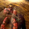
Mostly watercolor. Lined with India ink. Some details in acrylic paint pen.Related content


Comments: 10

Hiya from ProjectComment !
First off, absolutely LOVING the mixture of mediums you've got here. India ink can be super hard to work with but you've got really nicely defined lines down with very little bleed, and I can see that you're also using diluted gradients here and there which gives the linework a sense of weight and depth. The little metallic paint highlights on the watercolor make the cloth really pop, giving it that traditional kinda coarse feel (I'm from Singapore, and it reminds me a lot of the bolted cloths that you see on sale at the markets for sari and other garment-making). Your anatomy is pretty spot-on too; and it's really obvious that you put a lot of thought into the shading for the skin tones, especially around the shapes of her hand structure and around her eyes!
The one point of shading that I think could use a bit of revisiting is the highlights on her irises - the rotation in the two vertical light spots seems really unnatural to have at a 90 degree difference between her right and left eyes, because it makes the left eye feel a bit 'squished' if that makes sense? They shouldn't be perfectly symmetrical, of course, because of the foreshortening adn the angle of tilt on her face, but maybe try putting the highights in a different spot relative to the iris rather than rotating the shape. Otherwise, the overall shape and shading on the eyes is really so well done; you can even totally feel the makeup-texture on her lashes!
Fantastic work!!

👍: 0 ⏩: 1

👍: 0 ⏩: 0

👍: 0 ⏩: 1
Ty for your comment!
👍: 0 ⏩: 0
👍: 0 ⏩: 1

👍: 0 ⏩: 1
👍: 0 ⏩: 1
👍: 0 ⏩: 0