HOME | DD
 Turquoisephoenix — Kirby Collab - Coo the Owl

#coo #kirby
Published: 2014-08-13 06:59:12 +0000 UTC; Views: 3776; Favourites: 94; Downloads: 9
Redirect to original
Description
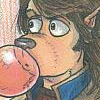
EDIT: Tweaked the wings.Kirby is as graceful as a giant pink marshmallow with an owl twice his size perched on his head is going to be.
Coo the Owl for the Kirby Collab on Twitter. It gave me a good excuse to finally draw fanart for the Kirby series, something I've oddly never done (besides the many Escargoon doodles I would draw in high school, but thankfully I never posted those online)
Always liked Coo's design. An owl with an Anime style hairstyle always wins in my books.
I always kind of loved how awkward the animal companions in the Kirby games (well, the two games that had them anyways, since it was a concept that got dropped fairly quickly) looked when "riding" Kirby. Kine had Kirby shoved in his mouth, Kirby had to awkwardly carry Chuchu and Pitch, and Coo...Coo just plain looked like he was flattening Kirby or at the very least, pinching him very painfully in his giant owl talons in those games. Coo was HUGE compared to wee little Kirby.
And let's be realistic here: In Kirby's Dream Land 2, the best partner was Coo. The only partner anyone would use was Coo. The only time I would not play as Coo is if the game forced me to not play as Coo. Occasionally the game would throw up some lakes or some narrow doorways that wouldn't fit a giant purple owl in, just to slow Coo down. I actually had a hard time with the final boss because I got so used to playing with Coo.
But Coo knew he was the star of that game, and that was why they nerfed a lot of his attacks in the sequel. I saw what you did to the Cutter attack, Nintendo. I saw. I saw and I CRIED. (and then promptly used Nago more than Coo regardless of usefulness because big roly poly cat)
Hah hah, I had signed up for this collab back in May. I am just dropping all sorts of balls in terms of making art in a timely manner...
Still working on commissions, but at least my art mojo is slowly returning. I feel better about this picture than most of my summer drawings anyway...
--------
Disclaimer: Reposts are fine, but don't make that signature disappear and I would prefer sources back to my page.
Related content


Comments: 19


Just markings. He has three claw shaped marks on his chest and one's covered up by his wing.
👍: 0 ⏩: 1

I'm kinda getting it.... but mind changing it a bit cuz' its kinda out of place
👍: 0 ⏩: 1
The markings? Well Coo the Owl has those on his design. He has three marks on his chest. vignette.wikia.nocookie.net/ki…
That and this picture is almost four years old so making changes to it now seems kinda silly.
 (Smile)")
👍: 0 ⏩: 1
It's too confusing because of that black thing!! Its not on his design!!!
👍: 0 ⏩: 1
That black thing is his left wing. His design happens to have two wings. Be hard to fly if I went into a four year old drawing and erased his entire left wing.
Anyways you're being kinda silly. It's one thing to be like "hey this looks weird" and another to demand changes be made on old artwork.
👍: 0 ⏩: 1
the black tips are kinda outta place on one of the sides
👍: 0 ⏩: 1
That was done for the sake of the pose he's making.
I'm not sure how else I can explain this. He's got three claw shaped markings on his belly and the tips of his wings are black. Sorry I'm not 100% faithful to the design?
👍: 0 ⏩: 0
Nice. I think Kirby's full name should be Kirbert.
 (Wink)")
👍: 0 ⏩: 1
Awww, I like that. ")
👍: 0 ⏩: 1


Just as a little critique, I'm kind of confused about the black thing(s)... that I assume are supposed to be his left wing-tip, in sort of a beckoning position towards Kirby? It's just drawn a bit confusingly, I can't see the rest of the wing it's meant to be attached to so I'm not sure what's going on. Took me a minute to figure out what it was supposed to be.
👍: 0 ⏩: 1
They are in fact his left wingtip, converted into a cartoony wing-hand as Coo calmly accesses the situation that is riding on Kirby's head. His right wing is folded up against his body.
As for the rest of his wing, you can see his shoulder and part of his upper wing, so I probably just did a bad form of foreshortening in that the rest of his wing arm isn't reading that well.
What might probably make it more readable is if I move the right wingtips up a bit so that it doesn't look like a stretch for his wingtips to be that long? It was probably bad form to have one limb read one way and the other read the other way.
Do you have any other critiques? Like on shading or coloring? I would like those if possible. I always feel like I have no idea what I'm doing when it comes to shading.
👍: 0 ⏩: 1
Yeah, I think the main problem is his right wingtips look so delicate and teeny-tiny while his left seem much bigger. And I can see his shoulder but his "fingers" don't really seem attached to anything. Maybe if you could make his "wrist" a bit visible and have some of his wing-feathers puffing out to the viewer's right?
Oh man, I'm always just feeling my way around in the dark when it comes to those things too XD So I have a hard time giving critique. Plus it honestly does look fine to me.
👍: 0 ⏩: 1
Okay, following your advice, I decided to tweak his wings a bit and did the following:
*lengthened his right wingtips so there's less of a drastic contrast
*shrank his left wingtips and moved them slightly
*sort of shrank his left knee too on top of it to fix a minor foreshortening issue
As for making his wrist visible and having some of his wing feathers puffing out to the right...this is what I ended up getting in my lineart. Not sure if it fixes the issue. It sort of eliminates the readability of the pose. Here's the lineart of what I got. See what you think.
Not sure if this completely fixes the problem, but I think it's slightly better than it was at least...
And of course, feel free to add more critiques.
👍: 0 ⏩: 1
I had sort of a different thing in mind, I'll see if I can show you what I meant tonight.
👍: 0 ⏩: 0

Hah, cute. And I'm seeing a definite improvement in your line-work in this.
👍: 0 ⏩: 1
Thank you! It's digital inking, something I still need practice with, so I'm glad the lines are improving.
👍: 0 ⏩: 0