HOME | DD
 TwilightAmbiance — Luxury
by-nc-nd

Published: 2007-03-17 06:25:23 +0000 UTC; Views: 2337; Favourites: 35; Downloads: 177
Redirect to original
Description
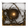
Created with Apophysis 2.05b Z+C++.I don't really know what to think of this one. I really wanted to show the long lines protruding from the heart of the fractal, yet I think there's too much space untouched. Tell me what you think!


Comments and critiquing greatly appreciated.


Related content
Comments: 30

I have submitted this artwork to the thumbshare forum as one of my favourite under appreciated artworks [link] . I hope this is okay and also hope that your artwork gets the attention it deserves. Although this forum can only be used by subscribed deviantART members, it is an opportunity to be featured in the News Journal 'Digital Thumbshare Feature' [link] (the most recent version). The news journals can also by accessed from [link]
Good luck!
👍: 0 ⏩: 1

Thank you very much! I appreciate it.
👍: 0 ⏩: 1

"yet I think there's too much space untouched"
i think there may be too mich space touched
well i love minimalism and this has the right ammount of lines (or a bit too much).
if your background was all black but the lines you might be right... but as it's smoothly blurred out with colours it's fine the way it is
👍: 0 ⏩: 0

Almost looks like it is shattering or something, which is a cool effect.
👍: 0 ⏩: 1

One of your best in my opinion
One thing I noticed in your gallery - file sizes are too big. It's cos you submit PNGs. You should submit high-quality JPGs.. if you have Photoshop, use Save As, then JPG.. then setting of 10-11 on the 1-12 scale... it will look the same but be 1/6th the size.
👍: 0 ⏩: 1

Thanks a lot! It certainly is one of the unique ones in my gallery, in terms of use of space and form.
I don't have Photoshop, but I do have Gimp, and I know it can do the same thing in there, so I'll try that. Thanks for the tip!
👍: 0 ⏩: 1

Ah I never used GIMP. Just be sure to use a high JPG setting.. it should look the same
👍: 0 ⏩: 0

Having some empty spaces lets us notice the lines... although I see why you may want to add two or three more lines, I don't really see the need to it. Less is more, as they say, and a few strokes are enough to hint at your intention.
👍: 0 ⏩: 1

Ah, I see! Thanks for your critique, man!
👍: 0 ⏩: 1

I think the empty area lends to the look of the entire piece, this is gorgeous.
👍: 0 ⏩: 1

If I could weave the sun into a basket, that is exactly how I would do it. Of course, I'd have to wear sunblock +5000 SPF. 
About your piece: A lovely design, TA! The gradient is definitely well chosen and the colours quite balanced, making this design a definite 
👍: 0 ⏩: 1

Thanks a lot, Fyrebird!
👍: 0 ⏩: 0

This is nice ! I like the balance between the 'cristallized metal', the reflections and the colors/lights. untouched space is needed to avoid cheap feeling and go to 'luxury' I think.
👍: 0 ⏩: 1

Thanks a lot! Apparently, the empty space is needed.
👍: 0 ⏩: 0

i like the apparent simplicity of it, and then as you move towards the right it gains complexity.
very nice.
👍: 0 ⏩: 1

I like it quite a bit...Good design with nice colors and composition.
👍: 0 ⏩: 1

Thank you very much!
👍: 0 ⏩: 0

I see what you are talking about, but I think it looks fine. Very nice design and color usage. 
👍: 0 ⏩: 1


