HOME | DD
 valkea — Elina

Published: 2004-09-16 11:54:48 +0000 UTC; Views: 847; Favourites: 20; Downloads: 76
Redirect to original
Description
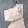
Oil on canvas board.First work in a life painting class, which will continue the whole fall. I arrived a bit late, and got a bad position, where I would have had to paint her directly from the front. So I decided to fall back on what I do best, and do just a portrait. Everyone complemented on the likeness, and the teacher criticized the contrast of my use of color and the realistic style - well, you can't please everyone. But methinks not a bad start for this fall. Quite effortless to paint, and I managed to achieve pretty good likeness. She was pretty.
Related content


Comments: 47

Great work!! Perfect color, light and texture.
👍: 0 ⏩: 1

Thanks a lot
...that's starting be a oldie by now.
👍: 0 ⏩: 1

She is pretty -- you portrayed her well!! First, I am very impressed with your choice of color, because I would not have thought to use it, but it is very effective [this is the first picture that struck me in your gallery]. She looks regal and thoughtful, determined. She seems very comfortable with herself as well. Good ear -- and her hair looks thick and wavy, great texture. I would have liked to see a different background, but I understand this was your first piece, etc.
If I look at just her face, it looks a bit dirty -- but when I look at it all together it looks okay. Nice highlights as well... hmmm, I think that's about it!! Impressive, especially for your first work!!
👍: 0 ⏩: 1
Thanks for all the kind comments
👍: 0 ⏩: 1
No prob!! 
👍: 0 ⏩: 1

I think that you did a fine job! I think that your lights could have been a bit more punchier, ya know the contrast on her face. But I love the fact that you used the reds and oranges to play with warmth in her face! If i could offer you a tip for next time_when you do a portriat, the background colour should have the lighter side towards the dark side of the face. It is reversing the dark and light, to create a higher contrast between the face and the background. Oh god, i so dont mean to sound condescendin. How could I, I dont want to be mean to a fellow listener of Ben Folds! It's just that I hear it all the time at school, that the light and shadow should be reversed. I go to art school, so as much as i am payin i guess that i should take that information and dispense it freely to others! haha ANYWHO, good job!!!

👍: 0 ⏩: 1
Thanks, this is actually a bit of a quickie, and I did not have very much time to work on the background - I sometimes do use the light-dark revearsal. Thanks again (Smile)")
👍: 0 ⏩: 1
HEY THERE!!! No problem babes!
So Ben Folds new disc SONGS FOR SILVERMAN is in stores now!!! Its sounds a lot like Ben Folds Five work. So if you adore BFF as much as i do you should like the new album as much as I do!!!
👍: 0 ⏩: 1
Went and bought it. Sounds good on two listens
👍: 0 ⏩: 1
EXCELLENT!!!!!
I know, this band sounds a lot like BFF.
I am so happy to be hearing new ben folds music!
👍: 0 ⏩: 0

I don't know alot about painting, but this caught my eye. I love the colours and how you captured her beauty.
👍: 0 ⏩: 1

Fantastic! beautiful color and brush work, great transitions.
I'd love to give a more thorough critique, but I don't have anything else to say, this is just great!
The picture seems a little out of focus, but that has nothing to do with the art.
👍: 0 ⏩: 1

Personally it's the contrast and your use of colours which makes me like this so much. Not to mention that I've always been a fan of compositions like this for portraits... I love the dashes of orange and teal in her flesh, I really admire people who can paint loosely (I'm not one of them, you see) yet still retain a likeness and also manage to articulate lighting and volume. You are exceptionally good.
👍: 0 ⏩: 1
Thanks a lot
👍: 0 ⏩: 0

Your use of color is an anspiration for me as a portraitpainter.
Wonderful portrait, very strong!!!
👍: 0 ⏩: 1

Personally I am always impressed by the use of "non real" colors to create a realistic portrait. Your teacher can stuff it
Excellent job.
")
👍: 0 ⏩: 1


I don't know why I had not commented on this before as I remember seing it and loving it.
So, I liked your use of colors it's really good. The colors of her skin reminds me of a painting but I can't remember which.
Good work!
👍: 0 ⏩: 1
Hey, thanks a lot for the comment
👍: 0 ⏩: 1
Yes Ill tell you that as soon as it comes back to my mind. I think it must be like a painting by Van Gogh, not the technik but just the color composition. agh, now Im torturing my mind to remember lol Help me people!
👍: 0 ⏩: 1

I like your use of color; it was the first thing that really struk me about this. And they way you've managed to portray a far-away look on her face is a great added touch-- it's like it makes the viewer wonder what she looking at, and thinking.
👍: 0 ⏩: 1
Thanks. LOL. I guess she must have been thinking that I don't wanna do this, because we've had a different model lately.
👍: 0 ⏩: 1

A powerfull portrait, I guess the model was happy with it.
👍: 0 ⏩: 1


Loistava malaus,
Kaunis Suomalainen nainen ja taitavasti maalattu muotokuva, olisi tietenkin mielenkiintoista nähdä kokovartalo perspektiivistä, wink wink, mutta ihan tosimielellä hyvää työtä, toivottavasti opintojeni jälkeen pääsen yhtä näköis-kykyiselle tasolle omien maalauksieni kanssa, olen nimittäin para-aikaa työstämässä isoa muotokuva maalausta siskostani, ja lupasin pyrkiä realismiin...
Terveisin,
Turkka
👍: 0 ⏩: 1

Blah, the hell with the teacher! I quite like the strong colors contrasting with the realism. You still got the values down, and she's beautiful. It's very interesting, and I like how her strong tones contrast with the pale, pastel background. I really like the textures of the paint more than anything, especially in the background. All the colors blend together in chunks and streaks rather than smoothly, and it gives your eyes a lot to look at, instead of being just a blank, flat backdrop. Really nice!
👍: 0 ⏩: 1
Thanks for the detailed comment
👍: 0 ⏩: 0

The colors and textures make for a very interesting portrait...nice job!
👍: 0 ⏩: 1

what you are doing; it quite lovely. I'm always amaze at how you keep your planes.
It tell me that you are nuderstanding the language color. what school are you going to?
👍: 0 ⏩: 1
Thanks for the comment
This was done in a painting course in a local adult education center. I've graduated with an MA in English (did some art history as a minor too), and am qualified to teach and translate English. I currently have a part-time teaching job, and I'm applying for art schools in the spring. Better late than never.
👍: 0 ⏩: 0

The tones around the bottom of the neck and the cheekbones are lovely.
👍: 0 ⏩: 1

wow stunning nothing i can really crit here, i jus wish i could do something as good as this myself
well i guess the only thing i can point out is the chest as it looks a bit flat ( maybe she was ) lol excuse me
great piece with a great shading technike*
👍: 0 ⏩: 1
Nooo, she wasn't flat. Lol. I just started with a portrait, but we'll have the same model whole autumn, and I'll give a fuller view next time
 (Wink)")
👍: 0 ⏩: 1
maybe u shoulda cut that bit off would make it look more complete
lucky u i dont think i could do a live model thing hehe
👍: 0 ⏩: 1
Thanks. I could try that, and test it by cropping.
👍: 0 ⏩: 0