HOME | DD
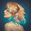
 KokoKiero — Chelsea

#chelsea #friend #hair #painting #portrait #kokokiero
Published: 2015-03-11 15:13:19 +0000 UTC; Views: 915; Favourites: 42; Downloads: 0
Redirect to original
Description
Portrait I did of a friend of mine. I'm pretty happy with how it came out, the facial details are a bit skewed but overall I think it's one of my better works!Picture I worked from (it's cropped a bit though): sta.sh/017hv2zo0i9z
Related content


Comments: 54

Comment War soldier of Here to report!
Texture:
The hair texture is definitely detailed. I see you used the help of different shades colours and made the little strands sticking out to create the thin, soft, and a little bit untamed feature of the hair.
As for the texture of the clothes. I think it is pretty close to the skin. A little bit of suggestion here: you can use a different kind of brush/ a texture image overlay/ shadings to make the shirt look more unique, or clear in its material.
Colour:
In general, I like your use of colours here- it's neatly arranged. The upper part and a large proportion in the middle of the artwork are in warm colours, while the lower part and around the edges are mostly in cool colours.
Contrastive colours are used for the hair! Purple for the dark area, while yellow and orange for the light area.
Space:
Please bear with me when I point out the obvious first: the head occupies a large proportion. Almost the whole artwork consists of positive space! That is one of the things that make this one unique- it creates an impact, to shock viewers or/and leave a deep impression.
Value:
I can clearly see which parts are in the front and which are at the back- just looking at the lighting: Usually, the lighter colours indicate the front while the darker ones indicate that it's further from the camera. To my best guess, the light came from either a camera flash, or a very near window when your friend was in a dark area. (A car?) The strong, bright light has a clear direction that sort of resembles a spotlight. That and plus the heavy shading of the parts hidden from light, you created a clear 3D nature.
Additional stuff:
I took a brief look at the reference picture you put in the description. But only a brief, because- in my opinion- the picture is just for guidance. As I'm quite sure your know: when doing artwork, we are expressing our creativity instead of photo-copying, right? Even when making an artwork off from a photo, adjustment- big or small- can be made to further improve the artistic side of the final product. You increased the contrast, added the shirt, adjusted the position and composition, etc. I salute to you!
It would probably take me a long while to point out every detailed object in this one. So I'll stop right here. Good luck, fellow warrior!
👍: 0 ⏩: 1

Thank you for the kind comment! I love looking at how other people do textures, it baffles me when I try though. XD I will try to work on it going forwards.
👍: 0 ⏩: 0

Hey there, comment wars!!!!!! rawr!
There are so many people this time too, yaaaaaaay! I love that you included the reference picture, it will help a lot in critique.
So first off, beautiful portrait. You have amazing blending skills! The face really looks flawless. I have no idea how to do that digital things escape me 
The biggest problem I have is..... for the first time I am not really sure what's wrong with it. The perspective looks off to me. I feel like It is a large face, but with a huge narrow perspective so the darker spots are her shoulders, and it funnels down to two little anime legs where her shirt is. Almost like she is taking a selfie and looking up, and you can see tiny feet below. I have no idea how to fix this! I might be the only person who is seeing this. I don't see it in the reference picture at all, and I think its because a lot of different reasons:
1. in the reference, the shot is more of a "head on" shot, and yours looks more angled down. 2. Her face is more curvy in the reference, you can see the indent where the eye is, and the roundness of the cheekbone; yours is more of a smooth line. 3. The crop. As you mentioned, because the reference is cropped it just looks more full because it cramps the space more. Between the length on the bottom, and the sides, the face takes up like.... 3/4 of the picture? And yours has the added shirt on the bottom, so a lot less face is showing, which therefore messes with the proportions.
(This also I think adds to the weird proportion, but it is important enough it gets its own paragraph). The shadows don't really match.... each other. I see in the reference the underlying hair is really black in the shadows. This makes sense because the whole lighting has a lot of contrast, so the parts of the shirt are also really dark. In yours, you kept the same black hair, but the shirt is much brighter blue so it doesn't match. So next time I would say darken the shirt, so the overall piece matches the hair and a dark scheme, or lighten the hair so it matches more of a medium toned scene. I would recommend the second because her hair is so light, it really wouldn't be that dark (unless in a huge contrast situation) so It would be a dark brown probably indead of a black.
I'm curious if the picture you used was not cropped, but you linked to the cropped one? Or did you fill in the shirt on your own? Also, I'm curious if you also see the weird proportion thing I am seeing (or am I just used to pieces like that HMM). Also I'm thirdly curious if Chelsea saw it and LOVED IT!!!!!! Because she should have!
Good luck with your next piece!

👍: 0 ⏩: 1
Thank you for the comment!! I don't see what you mean with the perspective, I've been trying for the past 10 or so minutes but I just don't see it, artist eyes bias I guess! Nonetheless, thank you for the notes on the proportions, those help me out a lot! The original picture I used wasn't cropped but I deleted it when I was done with using it and all she had was the edited one so that's what I linked to. And yes she did see it, she had it on her Facebook for a while.  (Smile)")
👍: 0 ⏩: 1
That, or I'm just crazy, if no one else saw it either! XD
👍: 0 ⏩: 0

When I first saw this piece and the source, I thought it was done pretty well but could be improved in some areas. I first started off by comparing a thumbnail of the painting to a thumbnail of the original image to see if there were any glaring issues that first needed to be address.
Link to Thumbnail
I immediately noticed, your eyes were too dark and your skin tones were too harsh.
When some people paint, they tend to focus on the fine details of their painting before really solidifying the big picture and I think you've done that with this painting, especially with the eyes. Your eyelashes are very thin and fine, but in comparison to the photo, her eyelashes are very thick and full! I'd recommend repainting them with a larger soft brush and at the bottom, I've included a paint-over where I've done so.
I think it's better to work zoomed out at first, and then zoom in to focus on more details, paint more, zoom in in more and focus on more details and eventually you'll zoom out and have a very finished looking piece.
Looking at the painting you did, I noticed there were some issues with facial proportions. The first thing I noticed was the left eyebrow. The left side of the left eyebrow ends just a little bit before the eyeball in your painting. But in reality, it should extend a little further left, past the eyeball. The reason for this is that the location your eyebrow is right along the top of your eye socket. The area of your eye socket is larger that the eyeball which is contains. And you can actually take your hand and feel this yourself: your eyebrow will exactly follow the top of your eye socket and extend past your eyeball, which it encases.
Now to talk about the skin... Skin, is very difficult to paint! There are many subtle color transitions in skin, and I noticed that you tried to replicate them, but a lot of the transitions from darker colors to lighter colors were too harsh!
In addition to the issues with skin, the eyes also suffer from edges which are much to hard! The iris of the eye in the painting has a very hard edge when in all reality, the edges of the iris are usually much softer. I usually paint them with a soft round brush. The transition from the upper lip to skin was also too harsh.
To sum it all up though, I think you've made a pretty decent piece! And if you'd worked on it for just a bit longer, really perfecting it, it would be amazing. But, you know, you've done a pretty good job. The more you paint and the more experience you get, the better you'll be. I hope you keep painting and making awesome art works!
Link to Paintover
👍: 0 ⏩: 1
Thank you very kindly for the critique!! I found it really helpful when you explained how you were looking for issues, and the thumbnail comparison is really eye-opening.
When working on a painting, or at least to start with, how zoomed out should it be? Just enough that the whole painting still fills the screen or zoomed out to the point where it looks smaller (more like the thumbnails I guess)?
The paintover is also really helpful, thank you so much for taking the time to do that for me, I really appreciate it! I will do my best to keep all of this in mind moving forwards, and thank you again for being so helpful!
👍: 0 ⏩: 1
I start off where my canvas is zoomed out far enough that it doesn't fill the screen so I can see the big picture. And yeah, you're very welcome!
👍: 0 ⏩: 0

Hi there, I'm here as part of Comment Wars.
Overall, nice job on drawing your friend from a photo. I'm always nervous about drawing people as they never look the same. I quite like how you've brightened up some details, like the shirt, and overall created some additional contrast in your portrait.
Excellent job on her stare, her gaze is really intense and I like again how her eye color is brighter. Overall, her face matches quite well with the photo, and you even caught the tips of her teeth well. I think the eyebrow on the left side looks like it should be a little bit longer, and maybe lengthening out the right side of the lip will help make it seem more natural. The skin is generally well done and well shaded, however, I might add some additional shading, although it might just look a little flat on my screen.
Her hair is great - it really adds some contrast to the painting and frames her face. You've done well to capture the major curls and individual hair strands sticking out here and there. Some more details within the main locks of hair could add interest as some areas seem a little flat - I'm thinking of the areas more towards the ends of her hair, like the one curling across her neck and the orange one on the right side.
I also really like how you portrayed the necklace - you can see the highlights on the individual links and the stones almost sparkle. It looks so delicate!
Overall, there's not a lot of things to change at all. Keep up the great work!
👍: 0 ⏩: 1
Thank you for your comment! I think I chose really strange colours for the skin now that I go back and look at it, so I agree with you that some additional shading was probably needed. I'll try to keep this all in mind for next time!
👍: 0 ⏩: 1
Cool, although I don't think the color you chose were at all odd or anything - her skin looks pretty natural. Keep up the great work!
👍: 0 ⏩: 0

And so the comment war begins... ProjectComment
The good
Things to work on 
Overall
You have a very strong piece here. It's gorgeous. It was also a wonderful thing to do for your friend. I think you did a great job at bringing it all together, and I hope that my suggestions can help take your piece to the next level. Either way, great job!
👍: 0 ⏩: 1
Thank you very much for the critique, and I love your formatting for it too it is really easy to read! I've always had trouble with chains and patience , so I totally should have taken my time with that a bit more. Thank you for the ref pic for next time, and I will do my best to keep your points in mind moving forward!
👍: 0 ⏩: 1
Of course, I'm glad that I could help. I really like formatting things so >.< I tend to try to dress up the comments I can with fancy things like lines bullets and titles. I'm glad that it makes it easier for you to take in
👍: 0 ⏩: 0

I'm also here from ProjectComment 's comment wars.
First of all, I have to say that I love the colors of the hair. I think it's the strongest part of the painting. The variations in the oranges/reds/yellow is really well done. I also like the way you painted the face, especially the cheeks. The coloring on her face isn't super smoothed over and it has a painterly effect, which I think gives her a lot of character. The detail on the necklace is really impressive. I lover her little smirk/lip bite.
For critique:
-A few other people mentioned this, but her nose could stand out a little more. In the reference photo it looks fine, but for this sort of painting style, I think the nose could have a bit darker outlines, or maybe a little bit of red/pink color added in.
-The reflections on the eyes look a little strange. Some of them appear to be behind the pupils rather than over the pupils.
-Her right (our left) eyebrow doesn't extend out far enough. Generally (and this is the case in the photo), if you go to the bottom outer corner of the eye, and follow that angle up and to the side of her head, that's where the eyebrow ends.
-Her shirt kinda disappears into the background and I don't really know where her shoulders are. The effect seems okay on her left/our right, but the opposite side is strange.
-The neckline of her shirt looks paper thin with the bright light across the top of her chest/bottom of her neck. It might help to darken the very edge a bit to give the shirt fabric a bit of thickness.
-Not critique but I really like how the shirt button turned out.
-The stripes on the shirt aren't consistently placed. You could also give a bit of curve here and there to stripes to give the impression of slight wrinkles (especially if the shirt is made out of a stiffer fabric).
Overall I think you did a wonderful job of translating the photo into a painting, so I had to get a little nitpicky
👍: 0 ⏩: 1
Thank you very much for your critique, and I really like the way that you format your comments as well! I don't know why I placed the reflections so weirdly, that one really stuck out to me when I went back to look at it. All of your points are super helpful for me to go back and look over though, I will do my best to keep your points in mind while I move forward onto new portraits, thank you!
👍: 0 ⏩: 0

Hi there, I'm here from ProjectComment !
The commenters below me seem to have beaten me to most of the possible suggestions for improvement here, so I am going to leave those be for the most part I think. Instead I'll say that what stood out to me most about this portrait once I really got looking at it was the hair and how you made it seem more natural by having strands separate from the rest. I think that her hair up in the top right corner could have benefited a lot from more of that, the way you did everywhere else, because that one corner looks a lot more "smudgy" than any of the rest. That smudginess (sorry, I don't exactly know all the best words for this stuff) is still good to have though, because it makes for some really interesting interplay of light and colour in her hair.
I also like her eyelashes and the way you use just a little bit of variation of colour to make it clear that she's biting her lip (or at least, that's what I'm getting from the picture). The reason that all those things stood out to me the most is that, especially with the hair, those details show me that you have really paid attention to what these things should look like in real life. In contrast, some other parts of the painting don't give that same impression, like the shirt. And, after writing that sentence I realized that you did use a reference picture where the shirt wasn't very visible. So for that reason, my main suggestion to improve your drawing skills overall would be not to be afraid to use reference pictures, and also just to pay close attention to how objects look in your day-to-day life. For example, spend some time looking at how shirts fold when people lean forward or backward (just don't stare too long, especially at strangers). If you do both of those things enough, eventually you'll have a strong sense for it and won't need the images anymore, but you will have learned how to draw as realistically as possible.
Overall, though, this is a good portrait that makes good use of colour, and with more practice you can get even better!
👍: 0 ⏩: 1
Thank you for your comment! I agree with you on the hair strand you pointed out, it really does look unfinished compared to the rest of the hair, dunno how I missed that! I will try and keep your points in mind while I move forward and practice.
👍: 0 ⏩: 0

Comment incoming for the comment war in
Lovely use of colors! I absolutely adore how you variated the color in the hair. I do think the eyes could use just a tad bit more color, though I really like the shine in the eyes.
Looking at the photo I'd say you may have drawn the nose a bit too small making the mouth look weird too. The mouth itself is in the right place, but because the nose doesn't come far enough down it looks like the mouth is too low on the face.
The eyes are great in proportion with each other, but the left eye (from our pov, that makes it her right eye) doesn't come out far enough to the side of the face and is also a bit too close to the nose I'd say. This makes the whole left side of her face a bit weird, especially the temple on that side looks a bit big for a face that's looking more or less straight at us.
I also think you might need to add just a little bit more contrast for the nose. Everywhere else in the face looks okay, but the nose doesn't really stand out. I'm aware that the nose in the photo is also a bit lacking of contrast and if you are aiming at perfect copying of the picture that's definitely great, but if you want to really make your own version of the portrait you might want to make sure all the facial features are always easy to distinct from the rest of the face.
It's an awesome work though and it definitely isn't bad or anything.I actually also really love how realistic the little chain looks!
I hope my feedback can be of use to you, if something I said (read: typed ")
👍: 0 ⏩: 1
Thank you for the critique! Proportions are a big thing I need to work on, so it really helps me when you point all of those out, thank you thank you!! I think everyone (including I now after it being pointed out to me!) agrees with that darn nose, it definitely does need some more contrast, whoops!
👍: 0 ⏩: 1
You're welcome! It's really a beautiful work
👍: 0 ⏩: 0

I am here for the comment war from Project comment, and I must admit that this is a stunning piece!
The eyes are beautifully highlighted, the hair is wonderfully colored, the shirt is well colored, the mouth has a good shape to it, and even the necklace appears to be studded in diamonds! BEAUTIFUL!
Things I do not like about this picture, well... I am not sure what her expression is---it seems to be surprised, but maybe her eyebrows are just naturally arched that way, I can't tell. Furthermore, you have good shading around the eyes, but the nose seems like a smudge--try to give it a more defined outline with just a touch of darker shading. Furthermore, the stripes on the shirt are a wee bit too curvy; I know it must be hard to get them perfect, but perhaps if you go a little slower next time, you will get them looking more uniform. Furthermore, does this shirt have no collar? And what is that dark smudge near the silver snap? Is that a piece of fabric? What is it supposed to be? Perhaps if you make it a little less dark I can tell what it is. Also, the necklace seems to dissapear into her neck... or is that her hair? Perhaps if you made that darker I could tell it was hair... or... whatever it is.
Anyway, overall this is a lovely piece---wonderful job!
👍: 0 ⏩: 1
Thank you for the critique! The dark part by the snap is a shadow being cast on the shirt (if it's the one I think you mean, it's the same colour as the shadowed fabric by the left edge of the picture). Should I make it the same colour as the rest of the shirt to improve that? And I'm not sure where you mean with the necklace going into the hair...? It's probably artist eye bias, but it's orange on one side where it's disappearing and dark over the heart so I can't see where it's confusing you, would you be able to clarify a little bit?
👍: 0 ⏩: 1
The left side of the necklace dissappears into orange.
Yes, make the shadow a color similar to the shirt to clarify that.
👍: 0 ⏩: 1
Okay, thanks for the clarification!
👍: 0 ⏩: 0

I'm here about the Comment War in , but I'm glad I came. This piece of art is beautiful, with many great things about it. The piece has beautiful lighting, like she is looking out of a window in a dark room. That adds an extra level to it, some symbolism and beauty most artists wouldn't think of. I also really love how realistic the eyes are, and they seem like they're actually looking at you, while not too creepy.
However, one thing I think needs work is the face. Like you said, the facial details are a bit off, and it looks more 'smooth' than a person's face would normally be. The eyebrows also don't look that realistic, but they do match the beautiful hair.
Seriously, the hair has some great detail. The different colors all work together, and look pretty realistic. In fact, all the colors do. The reddish-orange from her and the blue of her shirt and eyes are a great combo.
The only thing I'd suggest is working a bit more on faces, but I can't really talk, as this is way better than anything I could draw. I can see why you think this is one of your best, as this is already quite great!
👍: 0 ⏩: 1
Thank you for the kind comment! I find getting faces the same as my source is really difficult, but one day I will get a good likeness! The hair was a lot of fun to do so I'm glad that you like it.
👍: 0 ⏩: 0

Hey there from the pages of ,the name's RyugaSSJ3 and I'll be your commenter for the noon.
To start shedding a little light on this scene,I have to say wow..this chick is hot to the T. I'm not even joking to say this but this girl reminds me of a red-headed SSJGoshin4: youtu.be/sDzVhSnWdtw?t=5m24s (Oh wait,she is red-headed? Naw,she changes her hair color,man. XD) The details of her red hair are very varying in detailing color schemes from light,medium and dark brown along with a touch of orange and red to keep the hair looking natural and it does its job very well. Nothing seems out of place for the color scheme of the hair and that is something I'm not gonna complain about. There are strands of hair to make the hair feel alive even though science told us that hair are dead blood cells but eh,good enough for me. The strands of hair make the hair look real and well 3D to make the figure pop.
The necklace on her neck is nicely detailed with a variety of colors like red,brown,orange,silver and grey and white. The white circles on the heart make it look shiny and it instantly catches your eye like how jewelry suppose to do. Nice job. The girl's red luscious and kissable lips is the most tantalizing aspect I can talk about since it is oozing with great detail. Red,pink and white and sometimes a little shining thing. It makes me wanna reach out and kiss her...but hey,no suggesting manners in this part of the woods so let's keep going and oh,to keep it short,lips are gorgeous,it makes me wanna kiss this girl. Next.
The eyes are fairly done well to look like actual eyes and I like how the eye lining isn't overdone,the top of the eyelids make this even more attractive and the crystal sapphire eyes are just beautiful on a girl I'll say. The eyebrows are done fairly well,not too much and not too little I always say. Her skin is sooo..soft and so delicate..I wanna touch it,man. It's healthy,looks soft and it just looks great.
Though the only flaws to this bust is the nose and the clothes. The nose just blends in with the face and it doesn't look that cool. Maybe with a little shading or indication that the nose is there,that could work too. The blouse looks fine but it doesn't look that dynamic. Maybe it's because it's only a portrait of a person's face but the blouse should have something like some creases or ruffles or something to make it look interesting but otherwise,it doesn't harm the pretty face tho.
Overall,this is a really delicate and innocent face you created,man. The innocence of the person is well made into this and while I do not know this person,I can tell she is a very lovely and good person. Overall,this is a great piece.
 (Wink)")
👍: 0 ⏩: 1
Thank you kindly for the comment! I'm glad I got some character into the portrait, it's always a good feeling when they seem lively instead of a flat picture. I'll keep your points in mind for the next portrait I try!
👍: 0 ⏩: 1

Hello, here from ProjectComment !
Wow! This is very nice! I really like the details on the necklace, in my opinion, that's the best part! The eyes are really stunning, too! Even if her facial proportions are a bit skewed, I think it adds to her emotion and the overall impression of the piece. Great job!
Things to possibly improve: I'd probably make it easier to tell where the shoulders are, as well as make it so that her eyes don't slope down as much (does that make sense?) I'm not sure if you had this intentional, but the top of her head seems a little bit big out of proportion, but then again, it's probably because she's leaning in.
Overall, amazing job! I can't wait to see some more of your stuff!!!
👍: 0 ⏩: 1
Thank you for the kind comment! I didn't even really think of defining the shoulders, I don't know why... that would probably make more sense, yeah? XD Do you mean the eyes slope down too much inwards or outwards?
👍: 0 ⏩: 1
I'd say the eyes slope a little too much inwards. But just a little!
👍: 0 ⏩: 1
Okay, thanks for the clarification!
👍: 0 ⏩: 0

Thanks for the llama and I must say that this is a wonderful portrait! The eyes are fantastic, how they shimmer... I'll watch more now
👍: 0 ⏩: 1

I just remember the song by Nightwish ... But yes she is beautiful
👍: 0 ⏩: 1
Oh I see!! I'm not familiar with the song. I'll have to go look it up. Thank you kindly!
👍: 0 ⏩: 0

Usually I am not a big fan of teal and orange but this is incredible!! ^^
👍: 0 ⏩: 1

Thanks! The picture she gave me to work off of was indeed a selfie, so I'm glad that got through to my painting.
👍: 0 ⏩: 0

Amazing work! This should have way more favourites!
👍: 0 ⏩: 1
Thank you very much!! It usually works that the ones I'm most proud of don't get as much in the way of traffic as my fanart. But that's okay! I can still look back and know that this piece was a milestone for myself personally.
👍: 0 ⏩: 1
Ahh I'm sorry, it is a bit like that at the beginning, I'm really pleased it's a mile stone for you and don't worry, I see that too

👍: 0 ⏩: 0
| Next =>