HOME | DD
 Mad-Sniper — Insight

Published: 2005-02-25 03:25:01 +0000 UTC; Views: 1468; Favourites: 23; Downloads: 37
Redirect to original
Description
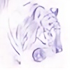
This is my boy Wren from White Noise, which is one of my webcomics at [link]Ugh. I have the hardest time getting him right. I don't, most of the time, but here I think I'm getting close. I underestimated the amount of time it would take me to nail the style down >_<. Looks like its going to take years.
I really like this piece, because it pretty much embodies Wren's spirit, his brightness and kindness. What does he see when he looks at the world? I wish I could ask him. In my better moments, I think I have an idea.
Done in photoshop.
~mad sniper
Related content
Comments: 22

our is it someone you made up hehe eeeeeee sorry for the last message i can't take it back [hits swelf in head
👍: 0 ⏩: 1

*chuckle* No problem.^^ He is cute, isn't he? With his skater hair...
👍: 0 ⏩: 0

i have a ? is that what you look like cuase if it is your l_l ah never mind [l///l]
👍: 0 ⏩: 0

Wow. I love your work. The muscles are totally believable. And the lighting creates an exciting mood. Righton!
👍: 0 ⏩: 0

I followed Haruo's link to your page, and this immediatly caught my eye. When I read that this was a character from a comic you wrote, I felt that I had to read it so I could comment about both it and this piece in one fell swoop. ^_^
There is a sort of melancholy freeness about him in this image that reminds me of the film Waking Life (don't know it? Try to rent it, if you can--it's awesome!). *Blinks* You did this on a computer? Impressive!! There is a certain analog quality to it that you rarely see.
As for the comic, I don't fully understand what's going on, but I'm in love with it! It's bittersweet and mysterious, kind of reminiscent of Merry Melony [link] My only complaint is that your characters are a little androgynous (sp?). It's hard to tell who's male and who's female some of the time. *Wags a finger in your face* You'd better do some more soon, missy, because now I'm addicted! Don't make me go through withdrawl!
WHITE NOISE IS AWESOME!
~Da Poofles
👍: 0 ⏩: 2

Lol, I totally love you. Your one of like five people I think of when I try to get up the will to do pages
👍: 0 ⏩: 1


👍: 0 ⏩: 0

Sorry, skrewed up the Merry Melony link. Here. [link]
👍: 0 ⏩: 0

Snizzipe! Nice, I really like the perspective and the watercolorish style is always a fresh of breath air from the usual DA fare. Prettyness! Me go check out White Noise!
👍: 0 ⏩: 1

Yess! Go read the comiiiic!!
Thank you for the comment. I love the watercolorish style, but the paper costs so much T_T
👍: 0 ⏩: 0

Oh My Goodness! Snipes updated X>
This is awesome. Aside from the fact that 3/4 from below is the hardest angle to draw, you pulled it off and the piece is delightfully completed by the color and shading. Minimizing the amount of gradation and different values used (e.i. 3 shades of gray for the skin plus some red) adds to the completeness of the piece without taking it out of the WN style. Less is more and this proves it. It would be fantastic if you could afford to do the whole novel at the level. How long did it take you to complete this?
👍: 0 ⏩: 1

*chuckle* Thank you! It is rather sparse on the shading, but it really works. I would actually love to do the whole book like this, I'll have to figure out how. My watercolors were always so much better than my CGs, but I have the darndest time translating the watercolor style to CG!
Let's see... I think It took me an hour. Not too bad, especially considering how long it takes me to do a comic page *_*.
Linx, what about this one do you think is different from the typical CG in White Noise? I need help! I need your eyes, my friend!
👍: 0 ⏩: 1

Line
Clear cut, black, lines only outline parts of Wren that are either, closer to the camera/picture plane, or are use to bring an element closer through the use of line weight. These lines are used effectively to draw the eye to the center of his face. I especially enjoy how only the corner of his jaw is outlined while the rest is defined through simple lighting techniques. The crayon like impressions and whispers of color add to the clarity and depth of this picture. You could almost say it has a watercolor feel to it
Even though we are taught to draw inside the lines all of our lives, we understand that this world is not made up of clearly defined black outlines. The piece feels looser—perhaps due to the fact that you’re drawing/coloring ‘outside of the lines’. Yet solid anatomy keeps it from feeling childish, thus escalating the level of the piece. The style itself is controlled but not to the point of being static or dull.
Hair
The hair is not trapped by the lines and has a life of its own. I really like how there isn’t a harsh black outline on the upper right part of the top of his hair. It feels richer and flows like real hair. The hair also feels like it’s a part of him and not just drawn on top of the figure.
Ref.
Since I can’t physically talk to and show you I’ll note some instances in your comic that I think are more attune to this style/pic/feel, in one way or another.
- The bright windows on p.11 and their casting on the floor – note the shading of the window interior and how there is no outline where the light and window meet.
- The bottom left panel on p.7 has a gestural feel to it.
Closing
All and all I think the key here is to remove some of the black lines in your comic. Perhaps in your earnest quest for perfection, you overlooked the opportunity to break free of some traditional rules. I feel that the gestural and free use of the brush displayed in this piece will enhance the WN style overall; thus adding to the visual enjoyment of the novel.
(btw I find that this piece look better at it’s preview size. Oh and keep it up ^.^)
Well those are my
p.s. why are they draging Quatre by his hair? Where's Sandrock? Xp
👍: 0 ⏩: 1

Haha, he does look like Quatre.
OK, so less restriction to lines and free-er linework. I agree, that's sort of what I thought it was, but again, I have no perspective on this side of the art. Thank you so much! You make me want to update more ofter here ^_^.
~ms
👍: 0 ⏩: 0


