HOME | DD
 Raven30412 — gallery of modern art, olomouc

Published: 2008-06-05 20:29:51 +0000 UTC; Views: 9787; Favourites: 76; Downloads: 297
Redirect to original
Description
my 4th term architectural project.where to start...
the place is a vacant lot of street inside the very historical center of city of olomouc. maintaining the integrity of this street and it's concept was one of the main objectives I gave myself. which doesn't mean I didn't try hard to create new view point, extreme and even brutal in certain way, but still, the street line, height of the building, parterre, "shop-windows", access to the inner yard and other basic principles of the street were preserved.
the gallery itself is formed by two buildings, "organisms", one growing on the other one. this way I separated main functions of fasade, and created "membrane" between the street, city, and the gallery itself. this place, beeing also part of the parterre, works as well as public sculpture gallery, place to sit and drink or just do whatever you want.
the "outer" fasade is created by pink double milk-glass, leaking the sun light inside but not letting you to see through, with head-lamps inside their end caps. these parts, even though they looks as the only windows during the day, are the only "dark" parts of the fasade, windows beeing the rest. it's well visible at the night view. this is adding it kind of surprise element, it's something else then you think it is at the first sight.
it also creates interesting contrast: the look of the fasade is beeing inverted at night, making it "live two lifes".
the inner house contains, besides the own gallery, also library and lecture room at the second floor (from which are windows to the parterre main hall, creating not only interesting views to it in bit "kahn style", but also making possible to see the large sculptures beeing viewed from various levels.
well, there's a lot more to be said, ask if you'd like to.
big big thanks to for the render illustrations.
Related content


Comments: 107

Wow..Olomouc by takova zmena ozivila, napadita praace kazdopadne..
👍: 0 ⏩: 0

Waaaaaaaaaaaaaaaaaaaaaaaaaaaaaaaw
That's really awwwwwwwwesome ..

👍: 0 ⏩: 1

thanks mate, glad you like it
👍: 0 ⏩: 0

no ja bych byla pro
a kde by to tady jako melo (teoreticky) stat?
abych si predstavila jak by to tam zapadalo/nezapadalo..
👍: 0 ⏩: 1
nepamatuju si uz jak se jmenuje ta ulice, ale jezdi tam tramvaje, je to velka proluka hned vedle muzea moderniho umeni... ted je tam jen dira a plot...
👍: 0 ⏩: 1
ajooo..no asi by to tam vypadalo dost monumentalne..ale proc ne
 (Wink)")
👍: 0 ⏩: 1
snazil jsem se o monumentalnost...  (Smile)")
👍: 0 ⏩: 0

Let me begin by commending you a very interesting and imaginative project. One can not help but sit and stare at your panels!
The physical form of the building and its relationship to the existing buildings reminds me a lot of Gaudi's work in Barcelona. From what I understand, and you may have to clarify, the idea (conceptually) was that facade was one organism grafting itself onto another, the other being "inner house"? Sorry for the confusion, I am just trying to wrap my head around all that I am seeing.
As far as the facade is concerned, I really love it. I would like to know how it was derived organically. From the diagram above, it seems as though some sort of matrix of points were pinched/distorted which eventually arrived at what the facade looks like right now. I am just interested on what compelled you to do it, whether it be data or something else.
In terms of materiality, I only have one concern. You mentioned that the facade is made up of a "pink milky glass," and I am wondering if this would also be how you were intending on lighting the gallery spaces? If so, I would be a tad hesitant to use anything which might filter the light... giving it an un-natural pinky tone. I don't think this would be viewed favorably by any artist of any medium.
All in all, its a wonderfully represented project. Nicely done!
👍: 0 ⏩: 0

cool... I like ofis architects, didn't know this one though.
I found some even more similar projects during working on the gallery, these shapes at facade were used by leCorbusier, Hiroshi Hara, FOA, A. Sramkova (local architect) and so on...
Even though I originally thought they are quite unusual and original, I'm not the 1st one who used them at all.
👍: 0 ⏩: 0

I loved your previous project, the tower, as well.
Architecture is one of those areas where the divide between technicality and imagination is harder to breach.
Personally, I don't like getting hung up on technical details (i.e. - who is going to clean the windows), granted, my understanding of architecture is still very limited but I leave the fabrication to the engineers and the cleaning to the cleaning lady.
Being able to remove yourself of all limitations is great, in my opinion, especially when none of our projects are being built yet.
👍: 0 ⏩: 1


your human scales are the cheese!
the project is amazing, i'm watching it better when i'm done with my own project
👍: 0 ⏩: 0

very interesting use of facade material, looks great at night
👍: 0 ⏩: 0

oh wait nvm, you just used his illustrations. interesting project. it would have been cool if you could have used some sort of modeling script so that the building could technically grow "organically" similar to organisms....like your concept.
👍: 0 ⏩: 1
he created the illustrations directly for the renders - it was a collab.
yeah that would be kind of cool... acutally I wanted to make this one rather symetric, but I am planning to use some script for some of my next projects...
👍: 0 ⏩: 0

first off, very cooool...
secondly, I do think this concept has great metaphoric value in the 'empty window' impression it generates; your use of materials is also well thought-out! guess my only criticism is the internal planning- sure, it's a gallery... but this doesnt mean it should just be an empty box inside!!
Think of how the facade relates to the interior and how those spaces would be affected by it, maybe add in some detail about structure systems there too and you will have a sure-fire competition winner!

👍: 0 ⏩: 0

I think this is more Le Corbusier then Kahn, especially considering the windows I see a lot of Ronchamp in this. That being said, my one issue with the project isn't the idea or concept which are strong but its the form.
I'm a bit confused how you made the leap from the idea of organisms to the final form you derived. Your description is beginning to lean to something organic and I'm not convinced. Also, you say you didn't want to force anything like a view, so you kept the heights minimal. Thats a great step but when you consider the final form in my opinion you created a new point on the skyline. May not have been intentional but you did it. You also mentioned a special glass which I found interesting but what about the rest of the materials? Its rendered in what seems to me as concrete but am I right? Concrete is a good choice as a skin but not so sure for the structure.
Graphics are pretty nice, good renderings except for the scale figures. I see you used some drawn ones to kind of lighten the image but in all seriousness the renderings lack scale. Simple stuff like that helps a project. Be interested to see a night time render of this work.
👍: 0 ⏩: 1
yes the inner-side of outer-facade is Le Corbusier for sure, what I was refering with Kahn is something else: the "inner" house, and the fact that it's windows are staring into the inside of the building, not outside. I think this is pretty much typical for Kahn, especially his libraries...
the thing with organisms is only theoretical, for helping to understand the idea of two houses inside of each other - from the very first moment, I knew I actually Don't want to create organic-shaped building. The form of it is refering to other things - cubistic architecture, which has very big tradition in Czech Republic, specific Czech baroque style and so on. Also I wanted to create something sharpe-edged, since my previous project was rather organic.
My point absolutelly wasn't not to create new view point of the street, the institution is very important, the house is large and I did want to create something very strong and visible at the first sight. The thing is, that at the same time, I didn't want to destroy the concept of the street, which allready exists. So many people doing this project didn't respect the street-line, integrity of the street, parterre and shoping windows (so people actually have something to watch when crossing by) and so on. So, within these rules, which I believe I did preserve, I created bit brutal, experimental architecture, which is what I also wanted... But the street wouldn't be corrupted by it. And that's the whole reason of making "outer house" with facade respecting these rules, and then "inner house" - which may allready look anyway I want, becouse it's not directly visible or comunicating with the street anymore. And the "tower" isn't visible from the street at all as well.
Nope, there is absolutelly no visible concrete. The whole outer facade is glass as I said, only the lowest level is just glass-covered, not leaking any light. It could be also covered by corian for example. The inner house is covered by acrylate. I saw it being used in many interiors and it looks pretty good. The construction system of the outer facade is kind of hidden in the connection of glass panels.
The drawing were made directly for this project by great Canadian illustrator, sadly - and as almost always - there was not enough time to create enough of them to make the scale really visible. I didn't want to use some boring photo-based pics or the stuff that is usually being used in arch. renders, wanted to make it more interesting this way... But it took too much time. It was an experiment.
And I don't understand the thing with night-time render, the second picture Is a night time render so I think you can see pretty well how it looks... Only the night interior view is missing since it took too lont time to render, but I think you can get the idea from seeing the exterior one...
Anyway, thanks a lot for the comment!
👍: 0 ⏩: 1
Wait a tick, all glass and not letting any light through? And the program is an art gallery? Forgive me its late and I'm tired but, is there a secondary skin working too because from a functional stand point all glass for a gallery is a bit rough. Also besides the function have you thought about the environmental implications in that too? Heating, cooling, and especially glare? I think bellow a1106047 is right and leading onto something; thinking beyond the shell. I now feel that the interior must show response to the issues that come up with the exterior especially considering its a gallery and has plenty of programmatic issues.
Don't misunderstand me, I think you've done a good job and are graphically well represented, I'm just curious if you thought about these further design implications.
👍: 0 ⏩: 1
It is letting light inside... in a reduced amount since it's a double milk glass. see the interior render... it's not that well visible in other renders becouse it's all done in Maxwell... which is a good software, but everything takes a hell amount of time (the night one was beeing rendered for 100 hours for example), so they aren't finished, it would be more light inside then.
Yes, the heat would be a certain issue. Even though the the southern and eastern side of facade is in shadow for most part of the day. This is why does the inner house facade look as it does - it's covered by aircondition system. Yes, it is not too enviroment-friendly.
But then again this is an experimental design, the approach I chose has pros and cons... Pros are specific atmosphere, light, exterior, and "game" with inverted day and night facade, cons are overheating and certain enviromental unfriendlinees contected with that. I did focused on design, since this is what my tutor wanted from me in this term, I'm aware of the problems contected with it.
For the gallery programmatic issues... yeah, I've been working on the typology itself for about 3 days before the deadline...
but on the other side, most of them do look the way I wanted them look from the very beginning... I did wanted to make empty spaces, I was kind of inspired by the inner typology of New Museum of Contemporary Art in NY (SANNA)... which is all about totally sterile, empty space. Even though the upper gallery levels aren't actually boring, I must finish the gallery - interior renders so it's visible...
So once again, yes I am aware that working on many issues is unfinished, that the building would be problematic in real life... But I beleave that school work is, rather then doing building that would 100% work in every way and wouldn't have any issues, about experimenting, finding the edges of certain approaches, trying how far can you go - and even finding out that this is not the way, when you actually Know about the issues and are aware of the fact that they would have to be taken care of in real life. This is also the approach that our tutor wants from us - experimenting, with the form for example - even if it means we will not have time focusing on other problems conected with it accordingly. But I am aware of them and of course, next time I will go another way.
👍: 0 ⏩: 0

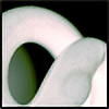
I really like the "mouths" and the passageway to the other building.
I hope it rains a lot in that town because if the glass isn't self washable the milky glass effect will be dirty glass effect.
I think that the tower on the courtyard is completely different from the rest but also with a lot of strenght. I think that the Project without the tower as you have it now would stay much more calm, much better.
the pillars you have inside the gallery are also very strange, I don't think it combines with the rest, and the WC are note very pretty but it's difficult to design a huge and pretty WC
good and interesting concept, I like your respect to the street and the architype of the surrounding building.
👍: 0 ⏩: 1
yeah, it would need some steam-cleaning I guess...
yes, the tower is part of the inner-building, which is and has to be completelly diferent. also, it's there only becouse of function, I needed this kind of space inside... it shouldn't kill the design though, becouse it's not visible from the street, at all... it's like if it wouldn't be there visually.
the pillars and wc stuff are only in the lower decks, which is different from the rest, even it's shape is diferent. I think it's shouldn't matter, anyway something Has to be there... and honestly, I didn't work too much on this part (did it in about a day or so), the rest took too much time and I just had to finish it allready.
thanks a lot for the comment!
👍: 0 ⏩: 1
it's easy to understand that you didn't take much time thinking in that!
even like that, good work.
")
👍: 0 ⏩: 0

wow... an outstanding vision. especially the night rendering.
much congrats.
👍: 0 ⏩: 0


cumim , vypada to huste ne jen z venku ale i ve skleniku tam bych chodil v zimne na brko :] . skoda ze render neni dodelanej
")
👍: 0 ⏩: 1
"komin" je dodelanej... akorat jde videt jen na jednom pohledu. je udelanej tak, ze z pohledu z ulice nejde videt, zamerne. hodne ustupuje dozadu. 3D model je kompletni, az na interiery.
👍: 0 ⏩: 0


omg... this project is just too much for me!! it's really impressive! good job!
👍: 0 ⏩: 1
thank you very much Claire, glad you like it
👍: 0 ⏩: 0

jako vzdycky uzasny,mas neuveritelny prace,moc bych si pral aby aspon nektere byly zrealizovane, treba tahle ta by byla super,kdyb nekde fakt stala
👍: 0 ⏩: 1
nj... na prvni realizaci si ale asi jeste chvilku pockam
👍: 0 ⏩: 1
a myslis ze by sesi mohl dockat?
👍: 0 ⏩: 1
no, zrovna tohohle baraku asi ne... jinak verim ze jo, vzhledem k tomu ze to bude ma prace .)
👍: 0 ⏩: 0


haha, I kind of don't know... ")
thanx a lot mate...
👍: 0 ⏩: 0

Dokonale, takhle si predstavuju moderni galerii!
Kdyby se to realizovalo, byla by to opravdu pocta umeni
👍: 0 ⏩: 1
dekuju...
nj. ale nerekl bych ze si tohle mysli moc lidi. beton / sklo / minimalismus dnes (u nas) vitezi.
👍: 0 ⏩: 0


| Next =>