HOME | DD
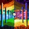 scorpion016 — Fountain - 1.3

Published: 2016-02-29 20:15:28 +0000 UTC; Views: 205; Favourites: 25; Downloads: 0
Redirect to original
Description
.: Purchase Prints :.Related content
Comments: 16

Is this digital?
Looks like this was done with pieces of paper.
It would be helpful if you would talk a little bit about this piece.
Anyhow, I think it's awesome!
I love your choice of colors.
But yeah, it would be nice to know how you did this.
👍: 0 ⏩: 1

Yes, it is digital. I am not sure how it looks like paper, but I will take that as a compliment.
I started by making a series of lines, I then layered color over them, followed by lighting effects. Then I made it a pointillism. Then I fooled around with the colors until it was just right.
Thanks for liking it and commenting
👍: 0 ⏩: 1

You can take pieces of paper and shred it into confetti and glue them together...😄
Its ts a very nice and vivid piece.
👍: 0 ⏩: 1

Oh wow, this took me a back, in a good way, but wow!
👍: 0 ⏩: 1

Ahh, this looks like you spent a lot of time on it, getting the colour variations just right. I wouldn't have the patience to do that. The result is something that is really enriching, and full of vibrance. Seeing it from farther away increases that feeling, which I love.
It's already been mentioned, but the shape seems a little off because of how much it rounds. I'd say taper it about halfway through the curve, perhaps. Otherwise it seems oddly like a mushroom slice to me, and I don't think that's what you're going for. :s Something else to think about is if you'd like to make the fountain stream outwards towards the viewer, and have the fountain flowing in a full circle. It's perfectly doable without that, but it would add another layer of intrigue, and give it some more realism.
Not quite sure how to perceive the white orbs. Are they lights? Or drops of water? I'm tempted to say the latter, as if the water was sprayed onto a lens of a camera, but then the colour wouldn't be as bright, I would think, and would be slightly transparent. However, I do like the colour scheme of them -- it contrasts nicely with the rest of the work, and presents a nice variation of shades in each orb that's neither too bright nor too dark.
As a whole, the art is nicely appealing, and just the impression of time put in alone gives this high merit. Excellent attention to detail.
👍: 0 ⏩: 1

Thanks so much for the feedback!
Now that you mention it, it does look less and less like a fountain to me. You should have kept quite! : P
But seriously, adding in that realism I think would have really improved the piece, thanks.
As far as the orbs, they are meant to be abstract. Just to give the feeling of a romantic, lamp-lit evening or something.
I appreciate your critique!
👍: 0 ⏩: 1

Ahh okay, I can see the orbs that way. 
As for the fountain, that's just my worldview. Others may see it as how you intended it. Such is art.
👍: 0 ⏩: 1

Yes, I think they are too overpowering, now. I should have experimented more with them to start.
Art is different things to different people in different ways! That's what is amazing about it.
Have a great week 😊
👍: 0 ⏩: 0

This appears to be a promising piece. The use of circles as color is definitely a good method to establish a sense of familiarity and simplicity. Colors are in a very good fashion, the orange, red, and yellow are perfect for showing the water reflecting the light. Dark blues and purples interact with black to give the illusion of water droplets reflecting light. I am personally astonished at how good it looks. Your orientation of the circles is very good, as well. It is so perfectly aligned that I can tell you've spent many hours carefully aligning this piece together. Taking all of that into consideration, there is room for improvement. I know that it sounds much more tedious, but making the circles smaller could make your picture appear very more realistic. Some of them do stand out just a little too much for what I can see here. Another thing that stood out a little too much for me was those bright spheres; what are they? If they were smaller then it would be obvious that they are water droplets, but they are really big. Could they be fireworks? And they last thing I wanted to mention was the shape of the fountain; the curves round too much. I perfectly understand if you are mimicking this from another picture, but it would look a little more majestic if the water didn't touch itself. All in all, you've got some great potential here.
👍: 0 ⏩: 1

Wow, you gave some good pointers here.
As I commented to someone else, you are totally right about the fountain being off. That was a huge mistake!
The orbs are abstract light sources. They are just there to give the illusion of candlelit evening or something like that. But they are quite massive. I will have to avoid that next time.
Smaller points will make me go crazy! Please take that part back! X P
Thanks for all the advice and critique!
👍: 0 ⏩: 0


